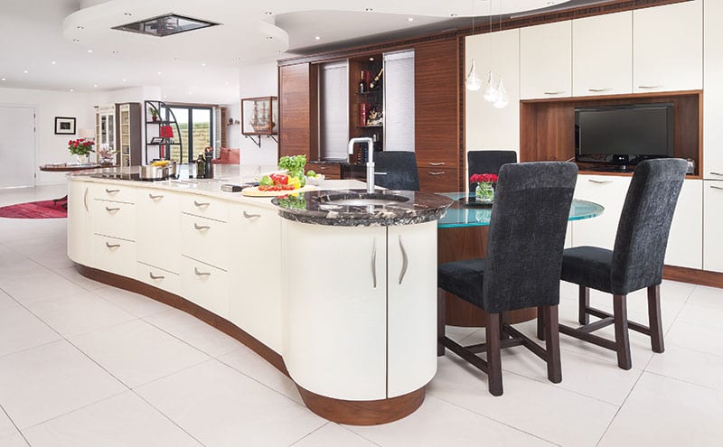
BRIEF To give the owners an open-plan kitchen where they could spend time together without getting in each other’s way.
WORKS REQUIRED Everything – the new room was a blank canvas.
BIGGEST CHALLENGE Making the best use of an extensive space in order to give the kitchen a sense of flow.
BUDGET £77,000.
SUPPLIER Kitchens International, www.kitchensinternational.co.uk
Photography Neale Smith Photography
We’ve all heard of the his’n’hers bathroom – but what about the his’n’hers kitchen? The creation of distinct zones for the two occupants of this house on the west coast of Scotland was a key part of the brief – and, however unusual it might sound, it has resulted in an amazingly successful design.
It all started when Kitchens International was asked to come up with ideas for a new home that was undergoing a substantial reconfiguration. Part of a Grade-B-listed mansion that had been converted into apartments, this property had been formed by knocking three of those flats into one single dwelling. The resulting space, not surprisingly, was enormous, with a substantial area allocated for the new kitchen, open-plan to a dining area and living room.
“The owners, the Laings, were very keen to get the flow of this room just right,” explains senior designer Helen Taylor. “Mrs Laing had some specific requirements, such as a walk-in pantry and a dedicated area in which to cook and prepare food. Mr Laing, meanwhile, requested a section where he could mix drinks, prepare breakfast or simply relax without either of them getting in each other’s way.”
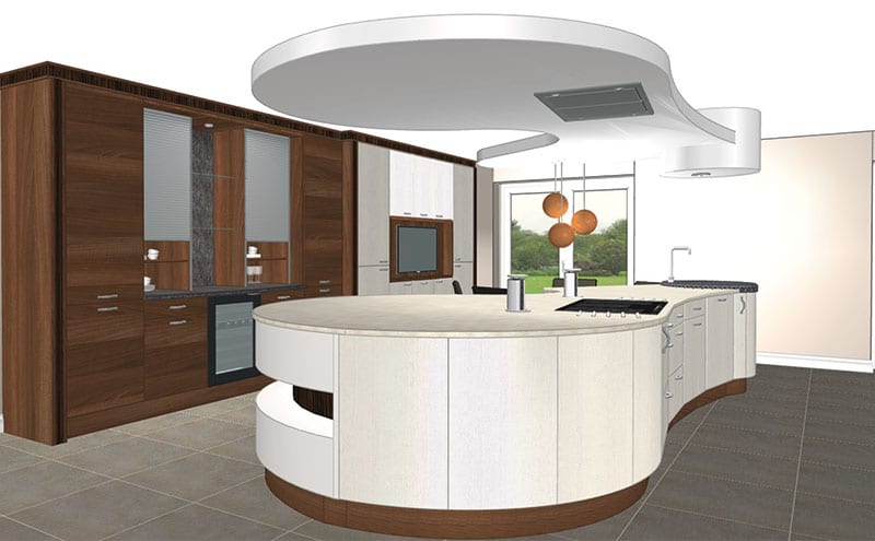
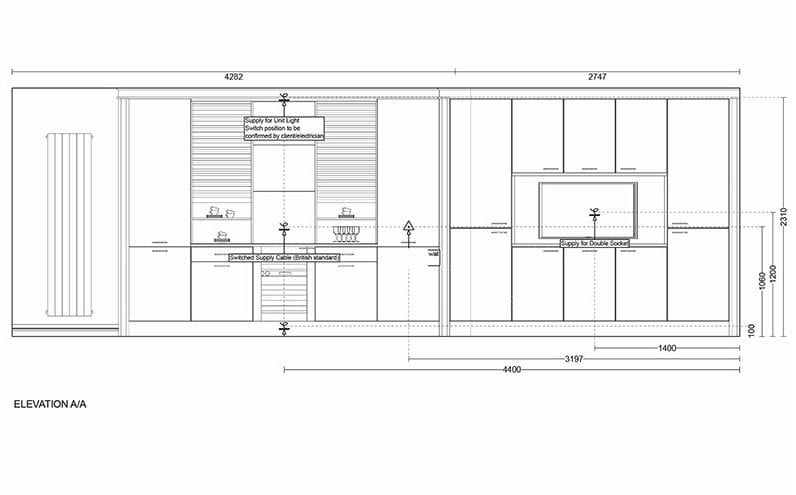
The generous footprint (the kitchen alone covers 7m by 6m) presented Taylor with two challenges: first, how to fill the space without overfilling it, and second, how to make the different zones work independently yet still flow together as a whole. Her solution was to use Stoneham’s stunning island as a centrepiece and then carefully arrange the appliances around the perimeter, with the position of each depending on which of the pair would be more likely to use it. “The water and ice dispenser, for example, are in part of the room where they won’t interfere with the cooking,” says the designer. “Similarly, the food prep areas are near the pantry – it doesn’t just mean ingredients are within easy reach, it also gives Mrs Laing a dedicated zone so there’s never a fight for elbow room!”
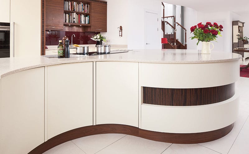
Marital harmony is enhanced even further by the shape of the island, whose organic curves contribute to that all-important sense of flow. Mrs Laing had seen some of the Stoneham pieces in the Kitchens International showroom, and was particularly taken with their sinuous lines. “The curves are an ideal way of accommodating areas for food prep, cooking and relaxing,” says Taylor. A toughened glass table from Intaglio nestles into one of the curves – a good place for breakfast out of the way of the main cooking area.
Taylor suggested exotic wood veneers to add warm notes to the room and give it a more homely, comfortable feel. Stoneham’s American walnut plinths are teamed with cupboard doors in Ivory and walnut, with Corian’s gold-toned Sahara topping the island. Burgundy glass acts as a splashback around the sink, where black granite work surfaces help to anchor the kitchen in the space.
Separate but together, while working in perfect harmony: sounds like the dream kitchen of the future.
KITCHEN
- Two of Stoneham’s contemporary Avant-Garde collections were combined in this kitchen – walnut from the Ambience range and Ivory from the Mode range.
- The island is topped with Corian (Sahara), with other work surfaces in black granite.
- The toughened Optiwhite glass table next to the island is from Intaglio.
APPLIANCES
- With the exception of the Liebherr integrated wine cabinet, all the appliances are by Siemens, including the built-in fridge, single oven, compact oven with microwave, warming drawer, induction hob and ceiling ventilation.
- There is also a Blanco Evolution food waste disposal unit.
FINISHES
- The tap on the island is a Quooker Fusion boiling water tap.
- Both sinks are stainless-steel Blanco designs.
- The red/burgundy glass splashback is by Intaglio.
- The owners sourced the flooring, the tiles and the soft furnishings.
THE DESIGNER’S NOTEBOOK
Not sure how to make it work for you? Helen Taylor gives us her top tips for what to think about when embarking on a new kitchen layout.
- It’s never too early to appoint a designer/supplier: The sooner the team is in place, the more easily a plan can be formed, meaning less stress all round.
- Work out what you want: Putting together a list of key requirements (in order of importance, if possible) will really help to formulate a clear brief.
- Think about how your kitchen functions for everyday living, not just for big occasions such as Christmas: Acknowledge the positives and the negatives, as again this will help to give the brief clarity.
- Consider storage: Which items are to be left out on display? Which are to be put away after use? (And how easily do you want to access these?)
- Space planning: Make sure there are good walkways and that the appliances, sink and hob are positioned in a way that are relevant to the way you use them.


