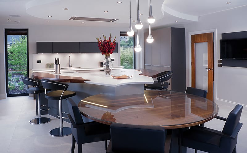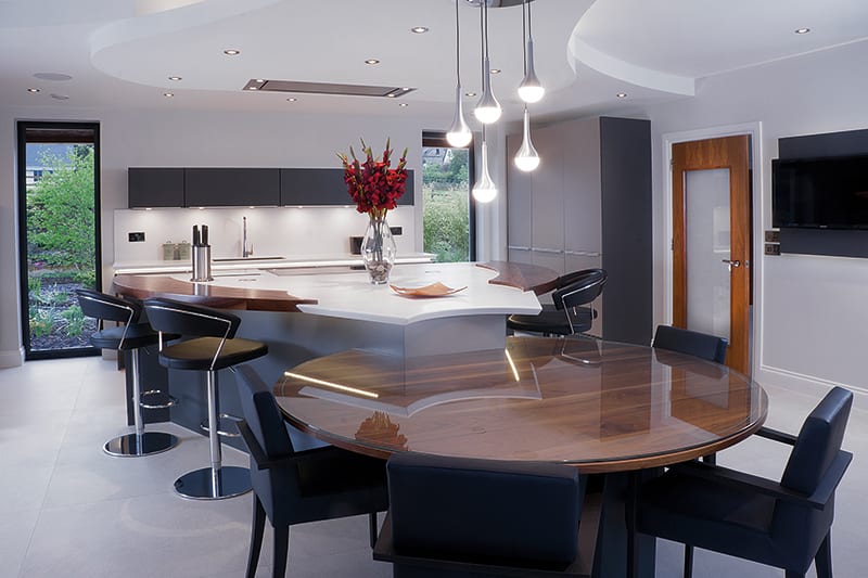
BRIEF To design a kitchen that wasn’t dominated by straight lines and hard edges, using Poggenpohl units; to have space for a large dining table; and to have plenty of work surfaces.
WORKS REQUIRED Everything. The existing kitchen had to be completely removed to repair the underfloor heating.
BIGGEST CHALLENGE Getting the shape of the island exactly right.
SUPPLIER Kitchens by JS Geddes, www.jsgeddes.co.uk
Being able to find the silver lining in a bad situation is a talent that not everyone can claim to have. But the owners of this house in the Highlands certainly demonstrated an ability to make the best of things when they discovered problems with their newly purchased holiday home.
Despite it being less than ten years old, the two-storey property had some serious underlying issues that needed resolving – and quickly. Before the couple really had a chance to sit back and enjoy the glorious scenery that had persuaded them to buy it in the first place, they had to bring in a team of builders to get things fixed.
Hearing that the kitchen floor was going to have to be taken up might have been the last straw for some people; not here, though. The owners were actually quite pleased; it meant they could legitimately replace the kitchen they’d inherited from the previous occupant (who, it was now becoming clear, had cut corners all over the house). Given that it worked fine and was still relatively new, they hadn’t been able to justify getting rid of it, even if they’d never liked it. Now, though, they seized the chance to put in something that would be more to their taste.
Shaun Dunbar, principal designer at Kitchens by JS Geddes, was given the task of coming up with something to replace the units the builders were busy dismantling. “The clients knew from the outset that they wanted a Poggenpohl kitchen with Miele appliances,” he recalls. “They also asked for a design that would include plenty of worktop space and leave enough room for eight people to dine together in comfort.”
And they had one further, rather unusual, stipulation: “They wanted a look that embodied ‘softness’ – instead of the straight lines that are a typical feature of just about every kitchen, they hoped theirs would have a heavy emphasis on curves.”
All in all, it was quite a complex wishlist, but Dunbar was unfazed. He is part of an award-winning team (JS Geddes has won the UK Kitchen Retailer of the Year award five times), and has himself been highly commended on several occasions in the national design awards for his work. He had also been given free rein in terms of colours, textures, materials and layout, and was certain he could produce something that would meet the brief.
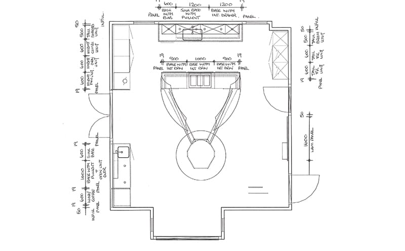
He took his time balancing the various demands before showing the clients his concept. They loved it straight away and immediately commissioned Kitchens by JS Geddes to undertake the work. Nevertheless, there was still much for Dunbar to do, as the design of the island in particular was far from straightforward. “It went through about a dozen adaptations – just minor tweaks to its shape and size as we endeavoured to get it exactly right,” he recalls. “Something like this is always going to be an organic process – whenever one thing changes, other aspects need to be subtly altered in turn.”
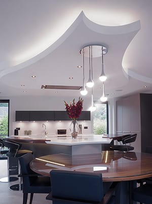
The curves of the island and dining table are echoed in the bulkhead above it. It’s a striking, sculptural addition that really sets this kitchen apart – and it’s not mere decoration: as well as providing a home for the extractor and the light fitting, it neatly disguises ugly pipework and a beam. “I wanted to turn a structural detail that was a bit of an eyesore into a positive part of the design,” says Dunbar.
Seems like he found the silver lining too.
KITCHEN
-
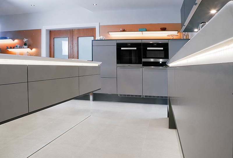
The designer used Poggenpohl’s +Segmento units, topped with plain white Corian with walnut accents. There are several different textures and tones, such as the Sand Grey doors with Diamond Grey accents. Copper glass wall panels add warm notes.
APPLIANCES
-
The clients requested that all appliances should be by Miele and Westin. The designer has found space for a combi oven, single oven, warming drawer, induction hob, dishwasher, wine cooler, coffee machine, fridge freezer, washing machine and tumble dryer.
FINISHES
-
Flooring: the large soft-grey porcelain tiles were supplied by the builders
-
Paint: Farrow & Ball’s Strong White with accents of soft grey
-
Light: the central light fitting was sourced from Leyton Lighting
THE DESIGNER’S NOTEBOOK
What should you think about when tasked with designing a kitchen? Shaun Dunbar tells us what really matters in his experience
- Don’t be intimidated by large spaces. This room measures 6.6m x 6.3m, which is enormous, but it gave me room to try something different.
- Practicalities or aesthetics – which comes first? Think about them separately, then together. Work through your layout to make sure it’s practical, and then add in the aesthetics – the two things have to work hand and hand.
- Listen to your clients. Understanding their needs is the key to successful design.
- Don’t be scared to think outside the box.


