The fresh connection
Linking the garden to the house and opening up the interior to bring in more light and air has transformed life in this Edinburgh townhouse
Edinburgh’s Georgian architecture is among the finest in Britain. It still surprises me, as a thirtysomething Scot, every time I hop through from my native Glasgow and take to the cobbled streets to find the city-centre townhouses, stacked above like stern elder statesmen keeping a watchful eye on the neighbours. The front doors alone, with their fanlights above and classical pillars on either side, are worthy of their own Facebook page.
So, it is perhaps understandable that anyone who approaches the council’s planning department with proposals that might alter such beautiful and historically significant streets is met with a flat refusal – the city’s architects are all too well aware of the challenges they face when clients ask them to adapt a Georgian property for 21st-century living. But some have been able to devise solutions that successfully preserve history and heritage while giving the owners homes that suit the modern world.
Nigel Somner is one who has mastered that art. He has been in the business for long enough to know what has a chance of being accepted by the planners and what won’t even reach stage one. He also knows this particular Edinburgh townhouse inside out: he and his practice Somner Macdonald made alterations to it back in the early 2000s. Even within that brief 15-year gap, though, advances in technology have changed what is possible in building and design. Interior trends, too, have come and gone. What has remained, however, is the reality that people today do not live the same way their Georgian forebears did.
Most of Edinburgh’s New Town follows a template: townhouses tend to be arranged over three or four floors, with the first floor being the prime position. This is where the formal drawing room would be, the furniture grander and the decor richer to go along with the higher ceilings and the taller windows. Servants would sleep in the attic and work in the basement, in both cases tucked away out of sight. And it’s this basement level that causes most difficulties to today’s owners, whether they’re in a conversion or they have all four floors to themselves: there is very often a lack of natural light, a disconnection from the garden and a sense of being isolated from the rest of the house.
These were precisely the issues confronting the owner of this three-storey property, and it showed in the brief: “We were asked to remodel the basement level to create more spacious living areas, with more flow and better connectivity with the private south-facing back garden,” recalls Nigel. He set about drawing up plans to show how the basement rooms could be opened up to create a large kitchen with a living and dining area, complete with an extension that leads out to the garden.
“The house is part of a very simple but fine terrace – it’s listed and is in a conservation area,” says the architect. “The planners didn’t want to allow any significant extension, and in fact there are very few to the rear of the terrace. But we persuaded them to allow it by taking time to observe the changes to property in the area and by referring to local area planning policy and the encouragement for innovative and contemporary adaptations and additions. It was all presented thoroughly and robustly, and it worked.”
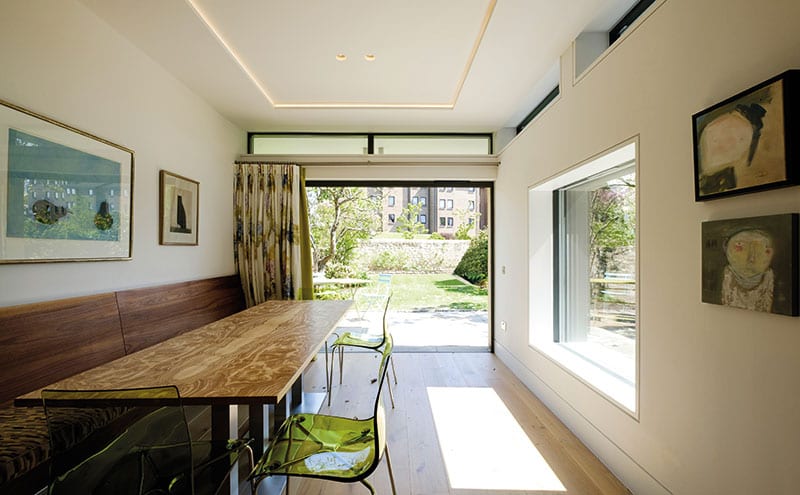
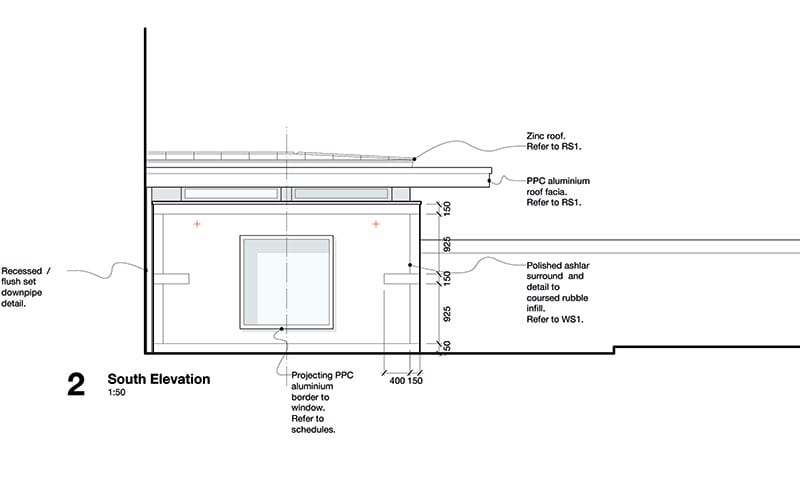
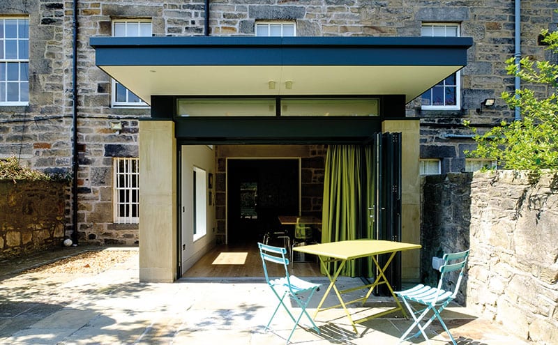
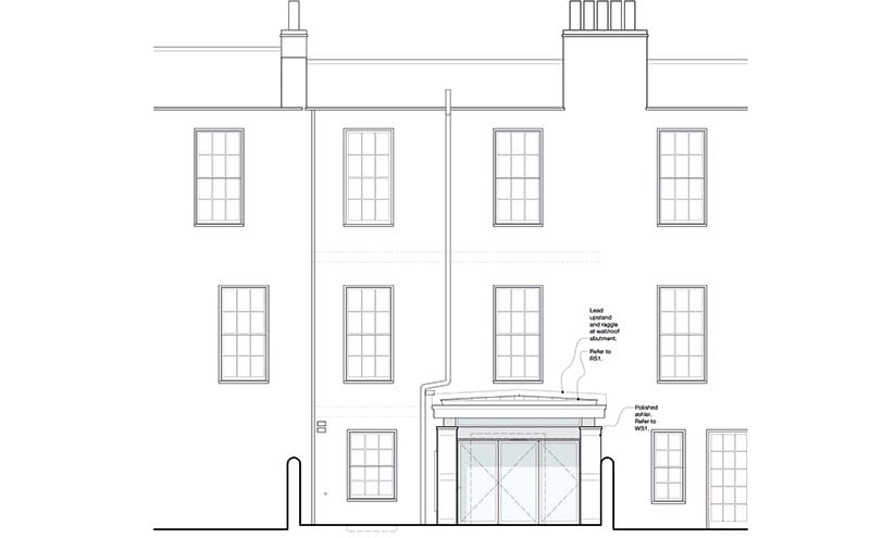
The extension has been designed as a deliberately simple, sculptural structure that sits discreetly, relatively low down, so as not to obscure views or interrupt the original adjoining wall heights. It is constructed predominantly from glass and stone, with sliding glazed doors, a low-pitch zinc roof and several different sizes of window to maximise the light coming in and offer a connection to the patio garden.
The contractor for the build was Gloss Projects, a firm that, according to Nigel, always works with the same group of local, trusted trades. “We all had a really good team,” he says. “There was a lot of respect around, good collaboration and a sense of humour on site. And it was high energy. One of the highlights was certainly seeing tradespeople taking a pride in their work and obviously enjoying being part of a team that appreciated their efforts.”
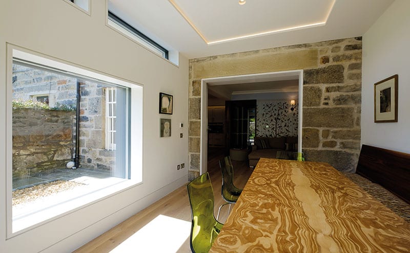
A central element of the whole project was the creation of a very clean, complementary stone wall around the extension. This frame, explains the architect, was conceived to help to make the extension distinct from the rest of the house – the planners would not have permitted any kind of Georgian pastiche. “The stonework and glazing details are not revolutionary but they are neat and simple. A zinc gutter is tucked right into the corner which again means that, visually, the new stonework doesn’t meet the old.”
The roof is perhaps the most strikingly modern part of the new element. It has been pitched to shed rainwater – a sensible and time-honoured option in Scotland – but, because it is visible from the upstairs rear windows, Nigel knew it would have to be aesthetically pleasing, too. The cantilevered portion acts as a shelter in winter and as a sunshade in summer. With the bi-fold doors (from Ayrshire Agencies) open, the house and garden connect fluidly, as the client had requested.
Inside the extension and through into the opened-up kitchen-living-dining area, there is a far greater sense of light and space than previously. The client wanted subtle, modern lighting that wouldn’t date, and Nigel and his team were tasked with designing a scheme that would suit both the old and the new elements of this part of the house. “We liked the idea of lighting that appears simple and discreet, where you see the light but not the fitting,” he says. “It helps to avoid ‘ceiling acne’ and creates interiors that are unfussy, where the space is allowed to speak for itself.”
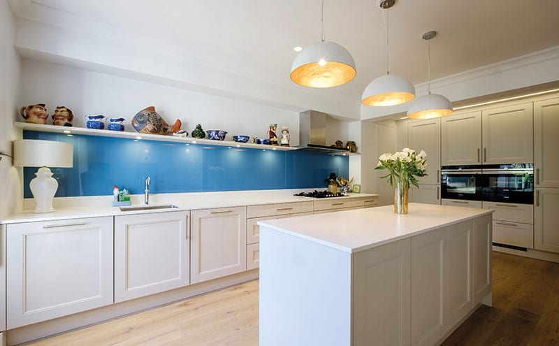
Here, Nigel used plastered-in downlighters, in pairs, as opposed to scattered single downlights all over the ceiling. LED strips have also been employed, to allow the creation of different lighting moods. For example, strips have been embedded in the ceiling of the extension and around the perimeter of the kitchen; these emit a soft, atmospheric light that works with the wall sconces of the living area and the three eye-catching pendants (sourced by interior designer Bryce McKenzie, who worked with the client on all the decoration) that hang above the kitchen island.
The Kitchens International kitchen is beautifully simple, with a design that is nicely balanced between being neither too modern or not too traditional. Keeping the units to a pared-back white allows other aspects of the decor to take centre-stage – the graceful pendants above the island, for example. The blue painted glass splashback and the quartz worktop, meanwhile, inject personality to the space, but have earned their place by being hardwearing – this is, after all, a kitchen that has been designed to stand the test of time. The Quooker tap is a favourite with the client, both for its simplicity and the convenience it offers.
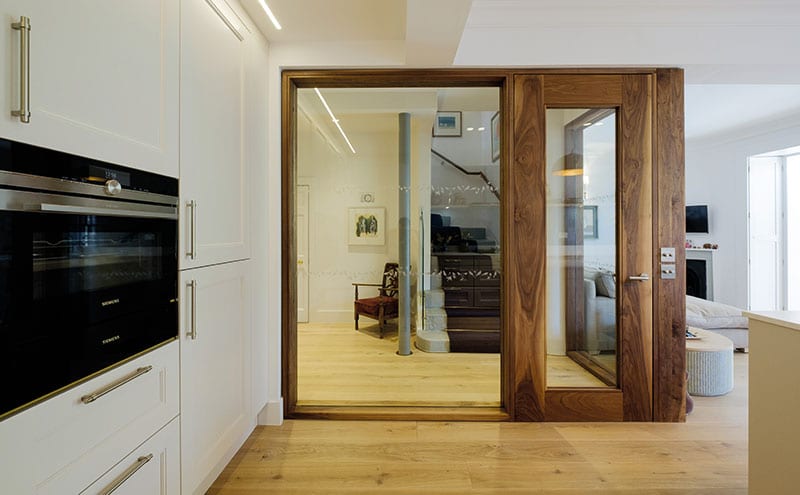
“We wanted as much glass as possible in order to get light deep into the plan,” says the architect of this bright room. “We designed the walnut kitchen doors and screen as a key feature, adding warmth while creating a fire-resistant barrier between the kitchen and the stairs. The concealed overhead door-closer and hinges make them feel extra special. Gloss Projects’ in-house joiners come from a fine cabinetmaking background, which helps immeasurably with the quality of the end product.”
The pale engineered oak flooring by Russwood complements the deeper walnut of the door frame, and the interior furnishings, such as the bespoke dining table with a handmade top by cabinetmaker Michael Hart, speak of the understated quality that helps to make this a timeless classic, much like the Georgian architecture from which it stems.
DETAILS
What A remodelled and extended Georgian townhouse
Where Edinburgh
Architect Somner Macdonald
Contractor Gloss Projects
Structural engineer Burnt Siena
Quantity surveyor Thomson Gray
Photography Sean Gaule
Words Catherine Coyle


