Adding an extension to this Edwardian villa gave its owners new space inside – and more space outside
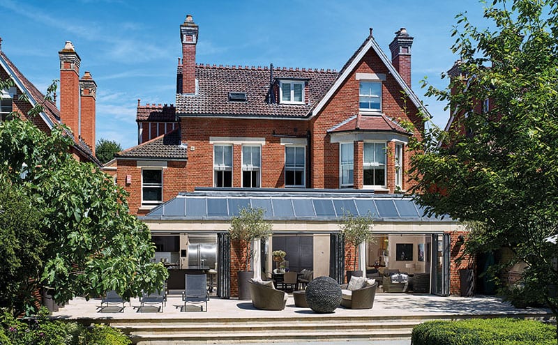
When Jim and Henrietta Simpson of Glasgow-based Designworks were approached by a long-standing client to design an extension to their handsome Edwardian three-storey red-brick house in Richmond Hill, it became apparent from the outset that sensitivity to this venerable, verdant London suburb would be key.
“Initially we were commissioned to refurbish and renovate the master bedroom suite, along with the rest of the bedrooms and en-suite facilities, and to hard-landscape the front garden and off-street parking area,” says Jim. “Thereafter, we were asked to design a contemporary extension to the rear, incorporating a new open-plan kitchen, family dining area and snug. We were also asked to put forward proposals for the landscaping (both hard and sculptural features) to the rear of the building to link the new extension with the garden.”
As the house lies within the Richmond Hill conservation area, full planning permission and conservation consent was required. Following a pre-application meeting with the planners, it became apparent to the architecture and interior design firm that if the extension was to get the go-ahead, it would have to be as low and as unobtrusive as possible, addressing the outlook of the neighbouring properties on either side.
However, keeping it as low as possible would create a problem for its designers: given that the ground floor was slightly higher than the level of the garden, how would they be able to achieve the seamless flow from the original parts of the house through to the new extension and exterior patio space that the owners had charged them to create? The solution they came up with lay in the roof form.
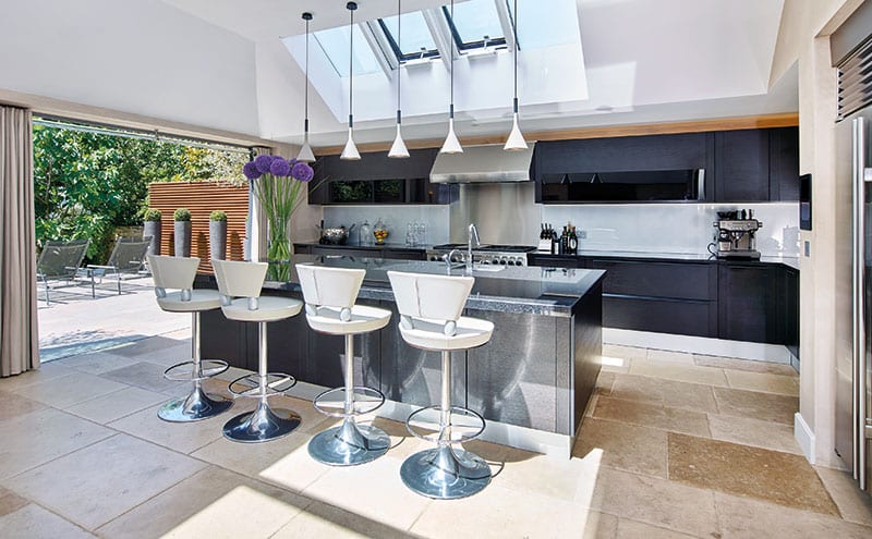
“We worked closely with the planners to go as low as we could while still giving the clients the spatial feel they wanted,” recalls Jim Simpson. “In order to visually create the low-level roofline required by planning, a glazed mansard-style panelled roof was formed to the extension to reflect natural light via the use of reflective glass.” This glass served a second purpose, namely preventing the neighbouring flats seeing into the building. Light was also introduced to the interior via a large rooflight in a flat section of the roof and the creation of two new traditional sash-and-case windows in the gable of the original lounge.
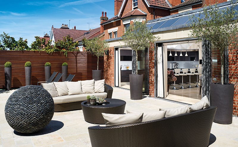
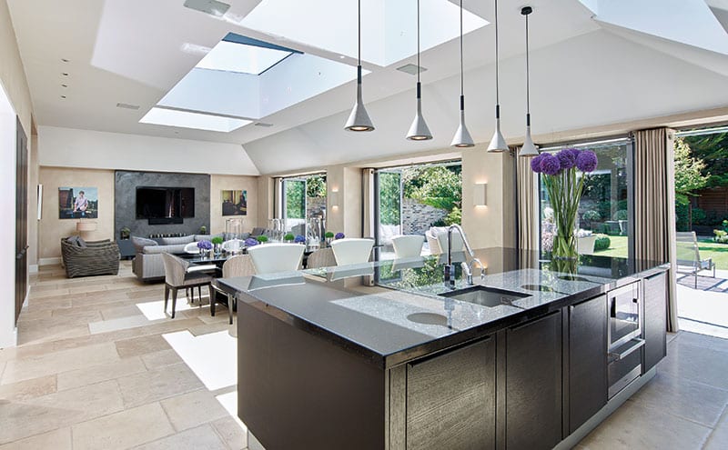
The extension’s steel frame has beams cranked in three directions to take the shape of the mansard. A break front has been formed to the garden façade using three folding doors, faced with London red bricks, with open access to the wide rear patio and the garden beyond. The new kitchen, dining and lounge area that has been created in the extension runs the full width of the house. The old kitchen, in the existing house, now serves as a corridor connecting the extension to the rest of the rooms. This corridor is lined with panels that conceal a study, a store room and an existing utility room.
The nine-month construction went relatively smoothly, but it wasn’t entirely without its challenges, particularly when it came to access. “There is only a gap of about four foot on either side of the building, so no heavy machinery could come through,” explains Jim. “It meant that everything had to be carried in or out by hand.”
The family stayed in situ while the building work was taking place, with just the demolition of a little conservatory scheduled to coincide with their holidays in order to minimise disruption. “The old conservatory to the back of the building was very small compared to what we have now,” says Henrietta. “It wasn’t pretty and was more an annoyance rather than a useful space.”
The most nail-biting aspect of the build involved retaining the upper bay window. “This was the window to an upstairs bedroom and was connected to the lounge below it,” says Jim. “But the bay at ground-floor level had to be removed to make way for the extension, so we had to temporarily prop up the upstairs window. It was incredibly challenging because of the ground conditions, which were very soft.
“Thankfully, we were working with a local building contractor, Green County Developments, who knew all about the ground conditions in this area and were able to handle it well. In fact, we’ve since worked with them on three other projects.”
Jim and Henrietta travelled to London every month for the duration of the project, to make sure everything was going according to plan. But Jim acknowledges they were fortunate in having clients who were “very well versed” in what was going on, and who were keen to supervise and take on some of the project management.
Now that the extension is complete, the success of what Designworks have achieved can be seen quite clearly. “By considered use and integration of the new extension roof light, the garden folding doors and other peripheral windows, balanced together with the pale palette of the internal finishes, the light source was maximised to its full potential,” says Henrietta.
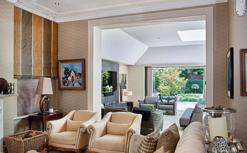
The creation of a smooth transition between the old and the new is just as successful. “With the principal challenge being to link the features of the original house with the new contemporary style of the extension both internally and externally, we chose a simple background palette of colours to enhance and reflect the internal fabrics, furniture and fittings,” she adds.
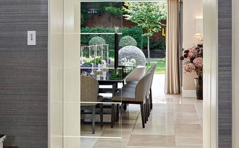
The original entrance hall is a good example of this, with its limestone flooring, grasscloth wallcovering and antique lacquered console table. The inner hall features the same flooring and wallcovering, and has concealed doors. What is not concealed is the glass pocket door that leads to the new extension.
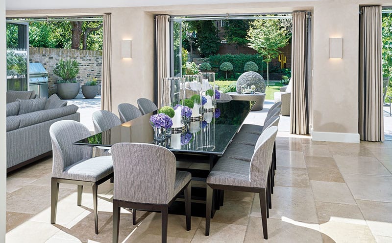
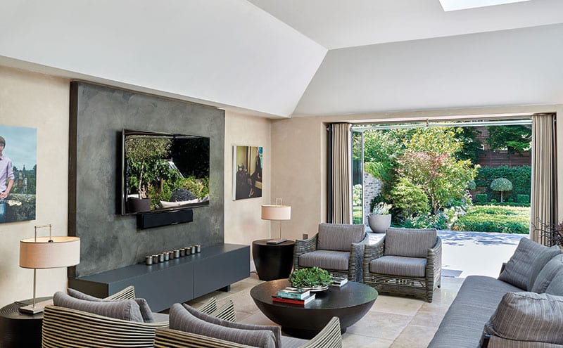
The pale limestone flooring flows all the way through to the edge of the back garden. The open-plan space is full of harmonious pale greys and neutral tones with the odd sharp charcoal or black note for emphasis. The timber kitchen units, stained dark grey, are topped with slabs of granite and accompanied by glass upstands. The urban, industrial-chic note continues with concrete pendant lights, a dining table whose top is of dark-grey stained and lacquered wood, and a TV unit custom-made in a charcoal hard-plaster finish. The dining chairs and sofa follow the same muted, natural palette and are upholstered in a woven outdoor fabric.
Like the new room itself, the spectacular patio stretches the full width of the house. Paved in the same limestone flags, it both visually and physically extends the interior spaces into the garden, effectively giving the owners a whole new room.
The garden too has been remodelled: block and screen planting divided by textures and strategically positioned ornamental features give it several contrasting landscaped spaces. A pebble ball by David Harber takes a central position on the patio, acting as a focus both during the day and in the evening, when it is illuminated internally. The two large steel cacti sit at the bottom of the garden to extend the visual perspective from the house.
Jim and Henrietta are pleased to see how the changes they’ve made have improved the way the owners now live in their home. “They love the extension and spend all their time there,” says Jim. “In fact, they tell us they spend more time in there than anywhere else in the house.”
DETAILS
Photography David Gadsby
Words Caroline Ednie
What A three-storey detached Edwardian home with five bedrooms
Where Richmond, London
Interior designer and Architect Henrietta and Jim Simpson, Designworks
Contractor Green County Developments


