Long-distance relationships, as any agony aunt will tell you, need a lot of work to keep both parties content, but as long as there’s plenty of commitment and understanding, they can turn out to be a marriage made in heaven.
That, certainly, was the experience of the owner of this house in Essex, who fell in love with Kitchens International, a company with showrooms across the central belt and in Fife and Aberdeen, but none in the south-east of England. “Being hundreds of miles apart was certainly the biggest challenge we faced,” confirms Karen MacArthur, the designer in charge of the project. “But we were determined to make it work. The client came up a couple of times and in fact the installation was incredibly efficient. The team worked on it solidly for about a week and it went very smoothly.”
[sociallocker id=”19958″]
It’s easy to see why someone would fall in love with KI’s kitchens. It offers stylish designs from some of the top manufacturers in Europe, including Poggenpohl, Callerton and Mowlem. In this case, it was a Leicht model that caught the eye of the client. “It works really well in what is quite a traditional property,” says Karen, “and, more importantly, it suits the brief, which was to create a stylish and modern kitchen that included accessible working areas and an open-plan living area.”
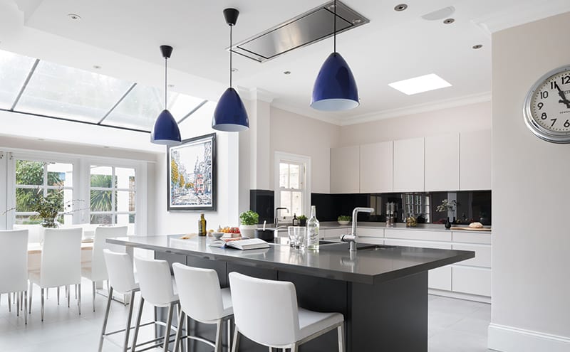
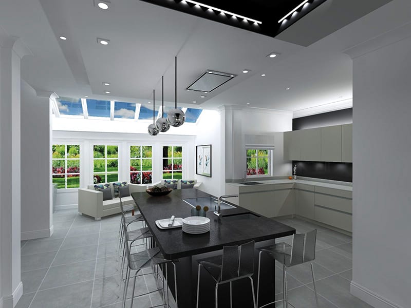
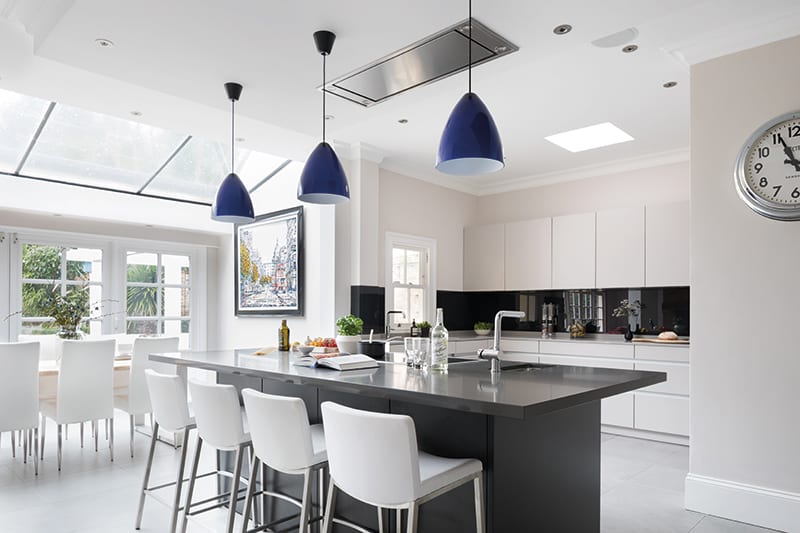
The client wanted a sociable space for entertaining and relaxing with family and friends, so Karen centred the layout around a substantial island, with the kitchen on one side and a dining table on the other, in front of the French doors. Connected to both is a sitting area.
Kitchen
• Leicht handleless Classic FS-A Avance range in silk matt lacquer, colour mohair/graphite, with aluminium handrail
• Worktops: 20mm Kensho Silestone
• Island: 40mm Marengo Silestone
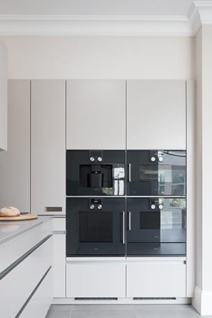
• Glass: graphite colour matched to the Gaggenau ovens
Gaggenau appliances
• Oven: BOP221100 200 series
• Built-in coffee machine: CMP250100
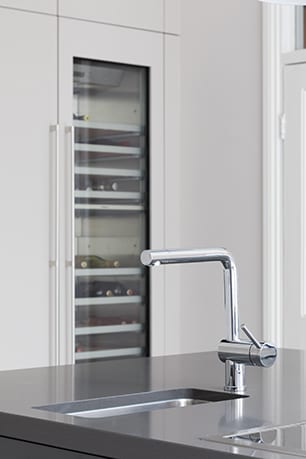
• Wine cooler: RW 464361 61cm
• Combi microwave, steam oven and warming drawer
• Integrated refrigerator and freezer
Extras
• Tiles: Strata ID263 GUBI Cloud natural tile colour
• Blanco sink and tap, plus Quooker hot-water tap
“The new room has great balance, which has been achieved by mixing old and new elements together,” says the designer. “We retained the traditional cornices and were mindful of the style of the glazed doors leading to the garden and the overall colour scheme for the space.”
The muted tones took their cue from the Leicht units: “The main colour is called Mohair, a soft light grey/off-white. It’s slightly reflective (with a silk finish for added texture), so it adds depth and contrast to the graphite grey of the island, and makes the room feel spacious.”
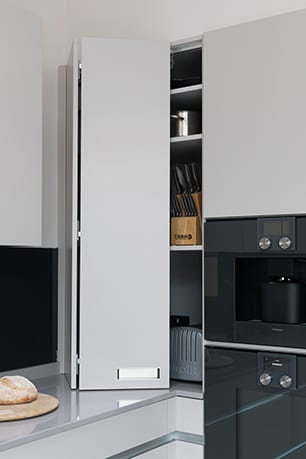
Handleless cupboards and drawers and fully integrated appliances contribute to the sleek, seamless feel generated by the polished surfaces, such as the Silestone worktops and the glass splashback. These in turn contribute to the light and airy ambience, which is enhanced further by the large roof light that allows sunshine to flow in unimpeded.
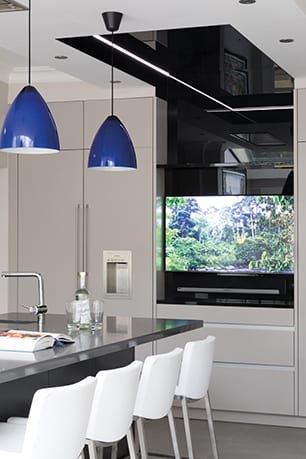
With the island and the canopy above it the corner-stones of the design, Karen focused her attention here. The canopy and the wall of units and appliances are both set at the same height – another element of the balance she was seeking. “I linked the island to the tall section of units with a canopy made from black glass, and by using different lighting to accent specific areas of the design it adds height and depth to the room,” she explains. “The black glass continues to the centre of the tall section, where there is a large TV/multimedia area.”
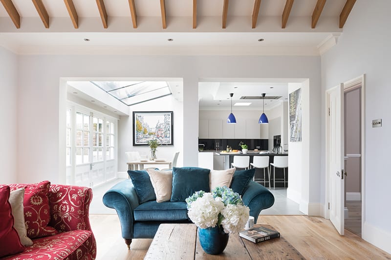
In another room the black glass, the dark graphite cabinetry of the island and the deep grey of the Silestone worktops could have felt oppressive and dated, but the opposite effect has been achieved here.
“The layout is light, airy and spacious, utilising the space to its maximum, which makes this kitchen such a successful and enjoyable place to be.”
The Designer’s notebook
Karen MacArthur discusses the ideas behind her design for this kitchen
- A wall of French doors and windows open up the room, allowing plentiful light to flow in, giving the illusion of there being more space – which was a key element in this kitchen.
- The kitchen links the various spaces together, with the island as a focal point in the centre of the room connecting each area.
- The design lends itself to extending the kitchen into other areas of the interior, creating a larger kitchen with bold feature areas. The island and prep area gives a warm sociable feeling as well as supplying casual breakfast seating. It acts as a focal point for guests while the owner cooks.
- Silestone is a very durable hardwearing surface that’s great for large prep areas. As well as being antibacterial, it can withstand all sorts of stains, knocks and scratches.
- The storage mostly consists of long drawer systems, which are more accessible than traditional cupboards. Leicht’s handless Contino door style gives the sleek continuous feel we were after.
[/sociallocker]
DETAILS
Brief To create a kitchen in an open-plan dining-living area that would be both highly functional and attractive enough to be used for socialising and entertaining.
Works required Everything – they had to start from scratch.
Biggest challenge Dealing with the logistics of client and designer being at opposite ends of the country.
Budget Around £75,000.
Supplier Kitchens International
Photography Paul Craig
Words Judy Diamond


