Repeat business from the same client is nothing new to Murray & Murray, a company that has forged a reputation for creating kitchens with enduring appeal. And that enduring appeal is the very reason why the firm is rarely invited back to the same house by the same client – but that’s what happened in this Edinburgh property.
It wasn’t the design that the owners were tired of, however, but the actual room itself. It had always been a dark and cramped space, despite a utility taking some of the appliances, and they had finally decided something had to be done. The removal of a load-bearing wall between the kitchen and a study that wasn’t much used gave them a much larger, brighter open-plan kitchen and dining space, almost doubling the length from around 3.5m to 6.8m.

“It hasn’t just improved the layout,” says Rhoda French, the designer who led the project, “it has transformed the owners’ lives, creating a much more sociable space.”
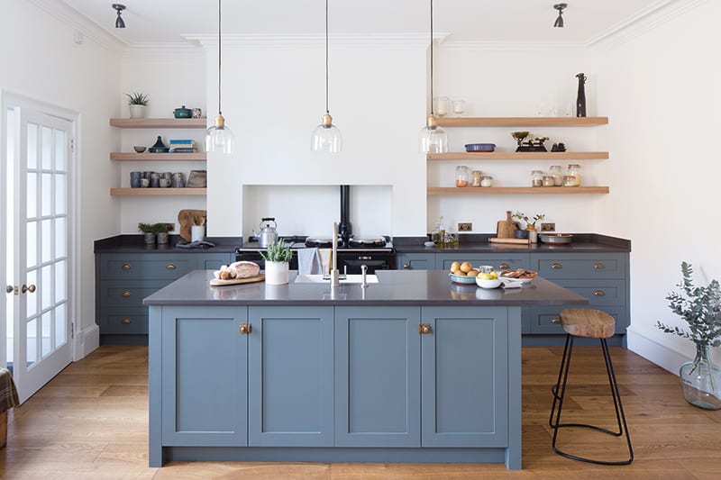
The newly configured room was more or less a blank canvas, with just the Aga having to remain in its original position. A blocked-up Edinburgh larder and a lot of redundant boxed-up pipework along the stove wall were removed. “This allowed the chimney breast to become more of a feature,” says Rhoda. “Previously it had been a bit lost. Designing around the Aga didn’t create any limitations as it was in the right place for the space.”
From her first meeting with the owners, Rhoda realised they did not want an overly ‘fitted’, standard box-like kitchen. “It was to be much lighter, almost Scandinavian in feel, with a more social, open-plan combined kitchen and dining space,” she recalls. A timeless hand-painted Shaker style of cabinetry was chosen to complement the Victorian terraced property.
Like all of Murray & Murray’s kitchens, this was a bespoke order that was designed and manufactured by the company. “The doors hang on concealed hinges and provide just enough detail without appearing too stark or too fussy within the overall space,” points out Rhoda.
During her early visits to the property she noticed that the clients had a beautiful collection of crockery and cookware. “I felt it would look great displayed on shelves for everyone to see – there was no need to have it hidden away behind doors,” she says.
Flooring
The kitchen’s semi-engineered floorboards were supplied and fitted by Strathearn Stone and Timber. The material is from the Dijon range in the Vieux finish. The same floorboards have been used in the adjoining hallway to continue the sense of flow as you enter the property from the main door.
Fixtures
• Kitchen sink: Villeroy & Boch Farmhouse 600mm ceramic sink.
• Kitchen tap: Perrin & Rowe Orbiq sink mixer with C spout and rinse in Pewter.
• Utility sink: the client’s old Belfast sink was reused here.
• Utility tap: Perrin & Rowe Mayan in Pewter with crosshead handles.
Work surface
The work surface is a 30mm-thick engineered quartz by Caesarstone called Piatra Grey, with 80mm upstands along the back wall. It was chosen not just because of its timeless good looks, but because it is relatively maintenance-free. It won’t stain or scratch and will still look like new for many years to come.
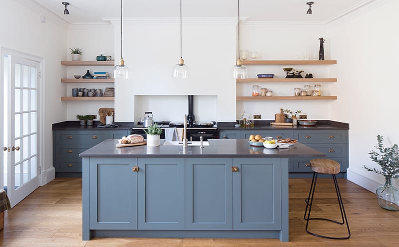
It was quickly decided that wall cabinets were not right for the space and that the use of floating shelves would be much more suited to the brief. “This, of course, meant that we reduced storage options; but, with clever use of drawers and inserts, we maximised the potential of the base run of cabinets. We also discussed storing grains and various other dry food goods in glass jars, which also look great next to the crockery on the shelves.”
The design is frameless to maximise the amount of available cabinet space, while the handmade drawer boxes are manufactured from a grey waxed solid oak to match the floating shelves. Those shelves are a great feature of the space: “The kitchen is ever-changing stylistically depending on what happens to be displayed on them,” says Rhoda. It’s just one of many reasons why this design really will stand the test of time.

The Designer’s notebook
Rhoda French discusses her favourite aspects of this kitchen design
- The Caesarstone worktop is a beautiful slate grey with a charcoal marble-like vein: “Dark tops can be difficult to keep clean but there is just enough variation here to hide the odd crumb.”
- With just a single window, the old kitchen was gloomy: “Natural light now floods in though a glass door that opens directly to the back garden.”
- The kitchen is incredibly easy to maintain: “The hand-painted finish is by Borthwick Decorators and is easily wiped and the work surface requires no maintenance whatsoever. In many years, if the paintwork does begin to tire, a fresh coat can very easily be applied.”
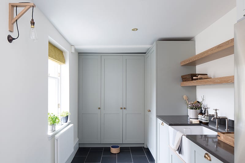
- The scullery/utility houses the washing machine, dishwasher and fridge-freezer. One of its tall double-door cabinets has an internal work surface to accommodate the food mixer and juicer: “It’s a great space to conceal small appliances that would otherwise clutter up important worktops. It also means any mess can quickly be hidden away when guests arrive unannounced!” There are also large spice racks fixed to the doors and shelves for dry foods.
DETAILS
Brief To create an open-plan kitchen-dining room in a large new space following the removal of a wall between the existing kitchen and an unused study.
Works required Everything – the new room was more or less a blank canvas.
Biggest challenge There was not enough space within the kitchen footprint to accommodate all the appliances while also achieving the aesthetic that the client wanted.
Budget Murray & Murray kitchens start at around £35,000
Supplier Murray & Murray
Photography Kevin McCollum
Words Judy Diamond


