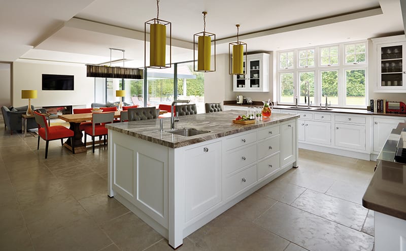
Designing a small kitchen is challenging, because there are so many essential elements to include – how will they all fit in without everything feeling cramped? But having acres of space to play with doesn’t necessarily make the designer’s job any easier, as Andrew Wartnaby discovered when he was asked to create a new kitchen for this house.
Andrew, a senior designer with luxury handcrafted kitchen company Martin Moore, knew the extent of the project when he got involved: “The clients told me they wanted a kitchen on a grand scale,” he explains. “It was to be both a comfortable family room and a party area, and everything had to be the highest possible specification.”
[sociallocker id=”19900″]
The house was relatively new but the owners – a family with three teenagers – were keen to make it look and feel more traditional, and were in the middle of a complete renovation of the exterior when Andrew was called in. It didn’t take long for him to realise that the house would flow much more harmoniously if the kitchen was moved from the front to the rear of the building. Persuading his clients of such a drastic change was no easy matter, but once he’d shown them how this could open up the space and lead straight out to the patio and garden – and through to the indoor swimming pool – they were happy to have a complete rethink about the project.
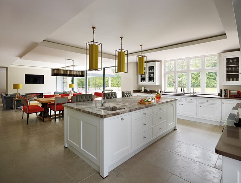
Andrew’s idea won them over and he was given a new room measuring a massive 12m x 7m, with 2.5m-high ceilings, to work with. He had to find a way to balance the different areas – and resist the urge to soak up some of that space by filling it with unnecessary units.
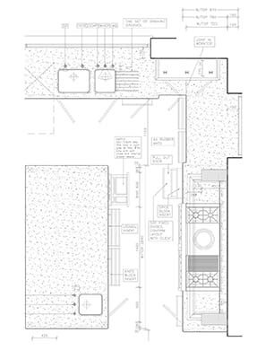
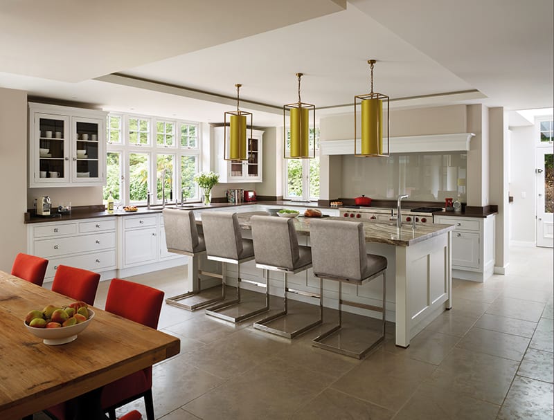
He has used careful zoning and precision planning, as well as an experienced eye, to produce a design that feels unified without being cluttered, and spacious without being sparse. “I wanted to create a carefully planned, well-organised room, with a place for everything,” he says. “The design brings all the elements together, right through from the furniture and choice of appliances to the work surfaces, colours and even the purpose-designed internal fitments.”
Storage
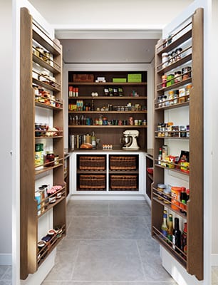
Storage throughout has been purpose-designed, with as much attention paid to the inside of cupboards and drawers as to the outside. Specific features include pan drawers, china drawers, knife blocks and racks. The walk-in pantry is also completely fitted out with shallow shelves that allow everything to be seen.
Appliances
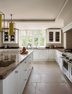
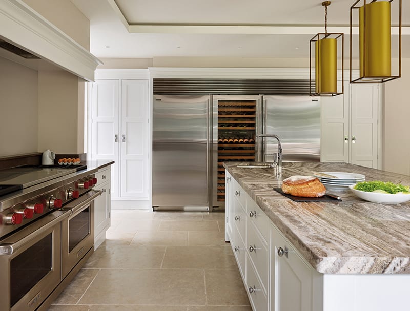
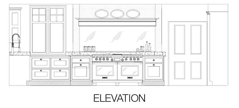
• Wolf dual-fuel range with four gas burners, simmering plate and chargrill.
• Sub-Zero built-in classic stainless-steel wine cooler (with multi-zoning, for red and white wine; UV-blocking glass; and an extended grille to match the wine cooler to the fridges on either side).
• Kohler sinks.
Flooring
The floor tiles are Aged Woburn by Martin Moore (£76 per sq.m.), a textured light-grey flagstone with a consistent colour and tone. This is a durable, hard, frost-proof natural stone – the perfect choice for running right through the kitchen and around the swimming-pool area and out onto the terrace.
In fact, every last detail was individually tailored to suit the owners’ lifestyle. Classic English furniture combines beautifully with high-tech appliances and features to create a room that is both elegant and highly functional. “All the many different aspects of the room were designed to come together seamlessly in this beautifully light, spacious, clutter-free living and entertaining space,” says Andrew.
Helping to provide ‘a place for everything’ is the impres-sive walk-in pantry and the secondary kitchen (for caterers to use when the family entertains on a grand scale), while the central island creates a focal point. Top-quality materials and high-end appliances complete the brief for the highest-spec possible.
The Designer’s notebook
Andrew Wartnaby discusses some of the thinking behind his design
- Natural light played an important role in defining the space. The room is flooded with light via massive windows and remote-controlled bi-fold doors.
- As well as opening up to the garden, the kitchen and dining room link to a snug, concealed behind a false wall. The snug leads straight to the indoor swimming pool.
- One of the most remarkable visual features is the way that the single flooring material flows through, uniting inside and out. Overhead, though, things are deliberately not unified: suspended ceilings define the kitchen’s zones with diffused and direct lighting.
- The back kitchen and walk-in pantry are accessed via a pocket wall, which slides smoothly open or shut as necessary.
- Martin Moore’s Yorkshire workshops, where this kitchen was made, employ a wide range of traditional craftsmen, from cabinetmakers to joiners. The kitchen was also fitted and hand-painted by Martin Moore’s own team. The Martin Moore stone floor is yet another craftsman-made and fitted element of this kitchen
[/sociallocker]
DETAILS
Brief To create a high-spec, highly functional kitchen-dining-living room that could be used every day as well as for parties.
Works required Everything – the new room was a blank canvas.
Biggest challenge Persuading the owners to move the kitchen from the front of the house to the back so that it could open to the patio and create a better flow.
Budget The Martin Moore Classic range starts at £35,000.
Supplier Martin Moore
Photography Darren Chung
Words Judy Diamond


