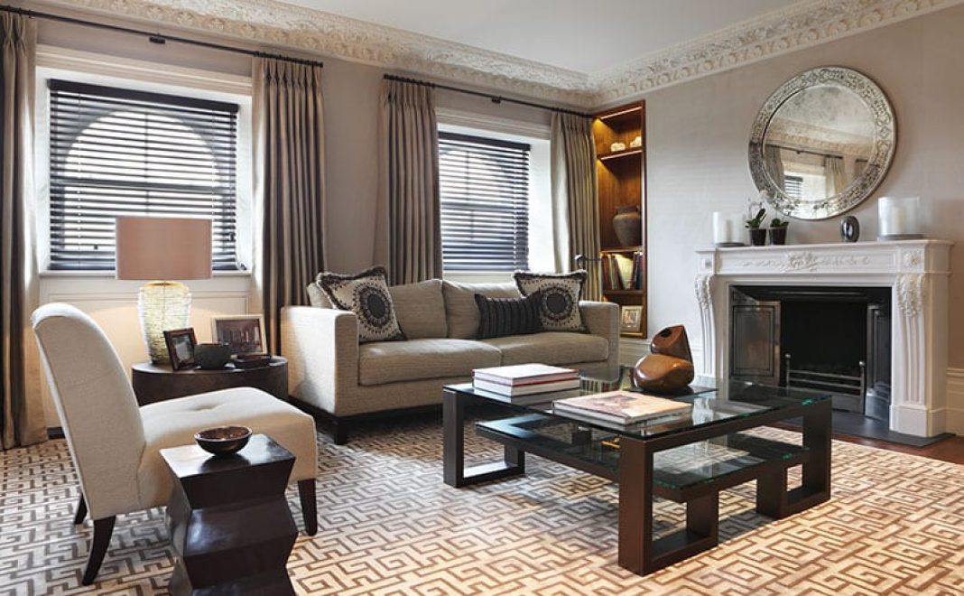
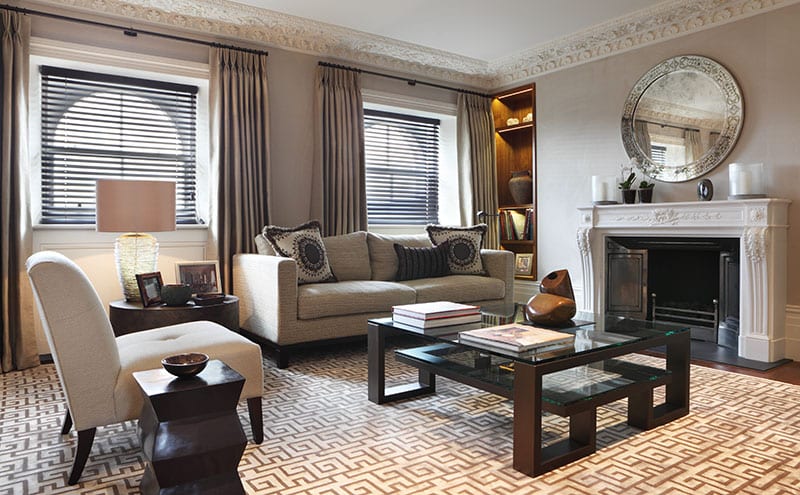
This stylish apartment overlooking a famous park suits its glamorous, grown-up makeover
Great interior design is often the result of finding solutions to difficult problems, but some commissions must surely feel more challenging than others. How, for instance, should you approach the design of a home that is essentially a blank canvas when the client is mostly absent? And how do you marry said client’s contradictory demands for high-end luxury on the one hand with home comforts on the other?
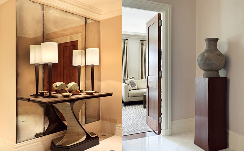
This was the conundrum facing Mark Gillette when he was commissioned to remodel a prime piece of real estate a couple of years ago. His client, an international businessman, had asked for his pied-à-terre in the capital to be overhauled and refurbished to suit the demands of both business entertaining and family visits.
The duplex apartment in question is part of the Lancasters, a recent development of 77 properties on the site of what had once been a terrace of mid-Victorian townhouses. The developers had demolished the building and retained only the stunning white stucco French Renaissance-style façade, which looks out across the green acres of Hyde Park. Behind that grade II-listed exterior, they constructed a range of contemporary interior spaces, aimed at buyers attracted by the combination of grand classical architecture and convenient modern living. Having one of the city’s best outdoor spaces on the doorstep was an added bonus.
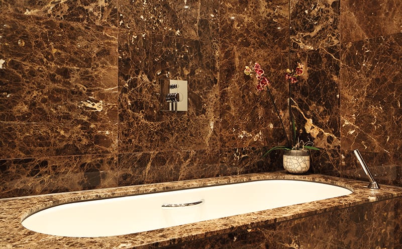
The location was a major draw for the client, and the apartment, while not particularly big, was the right size for him and his family. Before he or they could settle in, however, it needed to be turned into a home. The flat was in fine condition when Mark first saw it – there simply wasn’t much there. “It had a basic kitchen, marble bathrooms and white walls – and that was all,” he recalls.
The client, accustomed to staying in hotels all over the world, was keen to replicate the kind of luxury he had experienced on his travels, while at the same time having a comfortable, tailored space to spend time in whenever he was in London.
Finding a way to balance these two requests was uppermost in the designer’s thoughts as he considered the brief, as was how to create an international look within a traditional English setting. The original Victorian townhouses might have gone, but the developer had lavished the newly constructed interiors with ceiling roses, fireplaces and cornices. A pleasing reminder of the grandeur of the terrace that had once stood here, these period-style features ended up significantly informing Mark’s scheme. Using the experience he had gained tacking the interiors of large, historic homes, he was able to blur the line between the traditional and the contemporary. There was one further consideration – size and the use of space: 1,500 square feet makes a decent-sized pied-à-terre, but is perhaps a little restrictive when it comes to large-scale entertaining.
The client took a commendably hands-off approach. “We had two initial meetings to talk about the overall interior design and thereafter everything was done remotely,” recalls Mark. “He was happy for us to source fabrics, furnishings, artwork, decorative objects, all the furniture – everything, right down to the bed linen, china, glasses and kitchenware.”
This is just a taster, you can browse the full article with more stunning photography on pages 216-222, issue 112.
Subscribe nowDETAILS
What A two-bedroom duplex apartment
Photography Alexander James
Words Catherine Coyle


