This considered renovation has gently coaxed this grand Georgian country house into the 21st century without sacrificing any of its period charm
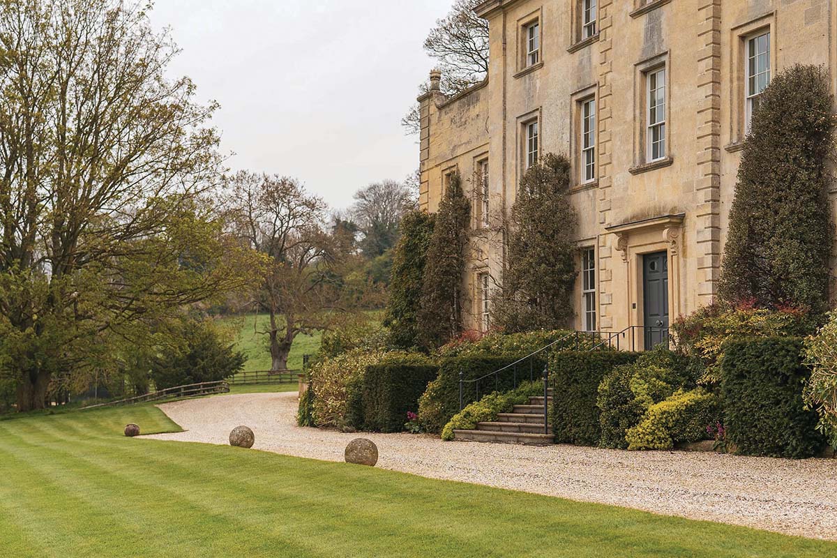
There’s no such thing as an easy renovation, but the bones of this Georgian country house were good. The previous occupiers had taken great care of the garden, and the exterior was in pristine condition.
The style inside was pared back and neutral – inoffensive, and certainly liveable, but the new owners wanted it to have a bit more life. They were returning to the UK to create their ‘forever’ home and wanted the place to suit their young family.
Sims Hilditch, an interior design practice known for its tasteful and luxurious aesthetic inspired by traditional country living, seemed like the best fit to update this sprawling manor and inject a bit of joy.
“The owners were still living in Singapore when they purchased the house,” says project lead Becca Powis. “They’d been waiting for the right property to come up and they jumped when this one in Cheltenham became available. It’s Grade II-listed, Georgian, and extends to about 9,000 square feet [830 square metres] in total. They have three teenagers and regularly have lots of guests staying with them, so it needed to be a very practical space, not just nice to look at.”
The property is spread over three floors, with living spaces on the ground floor, most bedrooms on the first, and an attic space for the two younger daughters. The formal entrance is very traditional, with a grand, dark door leading to the main hall. Inside, a heavy curtain can be drawn across it.
“It isn’t used all the time – it’s actually the secondary door now. There’s an entrance around the side of the house which the family prefer for day-to-day use. It’s much more practical, leading into a boot room with tumbled limestone flooring and a direct route through to the kitchen-living area.”
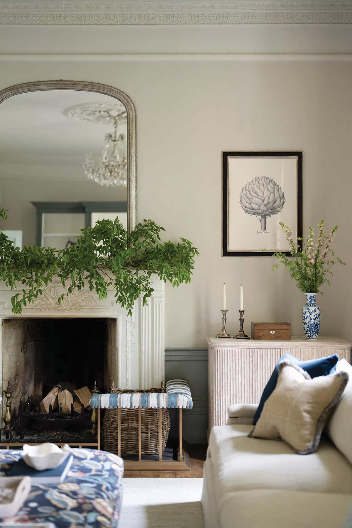
The formal rooms are towards the front of the house, while the family spaces are at the back. “The living room is the most formal,” says Becca. “It has a very high ceiling and is more of an adult space, perfect for when they’re entertaining grown-ups. It’s a place to have a drink before dinner.”
The room doesn’t feel solemn, though, thanks to a textured linen wallpaper (used generously, to soften the cavernous dimensions) and expert layering of different fabrics and materials.
“We were still quite playful in here,” smiles the designer. “The ottoman is a punchy colour and we included leopard print on the armchair. Opposite the fireplace is a tall piece of cabinetry to display the owners’ objects and artworks. They’ve travelled a lot and have a really interesting, curated collection – we wanted to show it off.”
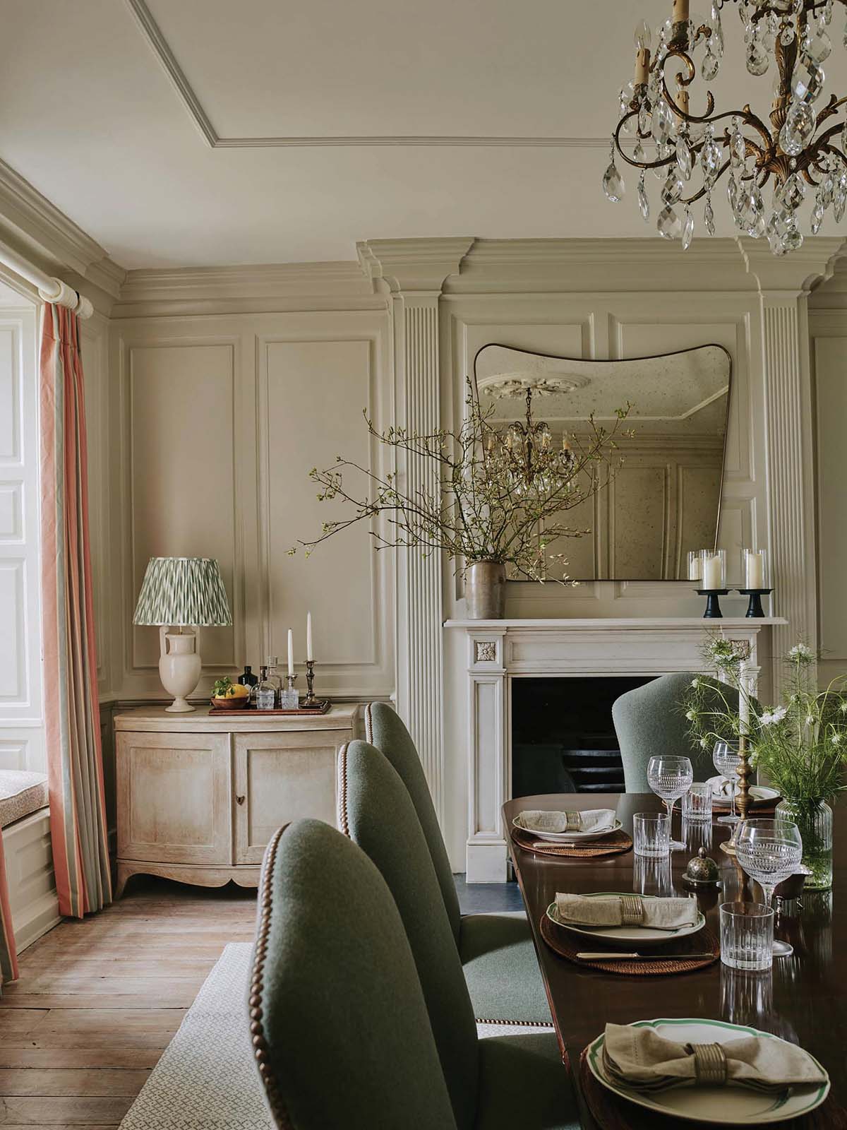
Luckily, the existing timber flooring was in good nick; it was stripped back, cleaned and stained to match the floors in the rest of the house. An oversized rug keeps things cosy in the living room but the boards are on full display in the formal dining room.
“The dining table was our starting point for this room. It’s an antique mahogany piece that fits the room perfectly – it was actually purchased from the previous owners. We picked a traditional style of chair to go with it but added a fun pattern and stud detail to give them more of a contemporary feel. Similarly, the curtains are a bold pink stripe. The combination of old and new gives this room a real freshness.”
Next door, the kitchen is a showstopper: wraparound cabinets, a huge range and a glorious bank of glazing leading through to the orangery. “We were very lucky – the kitchen was already here,” confides Becca.
“All we did was repaint it and have the wooden worktop on the island stripped back and refinished. We did change all the handles, though, and we tiled the wall behind the Aga and added the display of copper pots at the request of the clients.”
The kitchen table and chairs were also purchased from the previous owners, with Sims Hilditch just painting the legs and refinishing the top. “The clients felt it was important to have something in here that wasn’t too precious. The children can work here, have dinner; it’s more informal than the antique mahogany.”
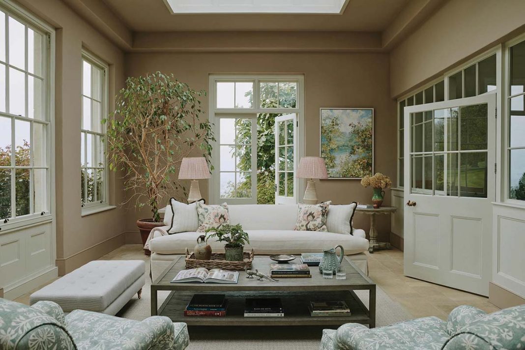
Just off the kitchen, the orangery is the kind of space that crops up on inspiration boards. It has plaster-pink walls and tall windows that offer views of the garden beyond. “The idea is that this room can be used all year round. It has a summery feel, but when it’s dark outside it still feels warm in here. We added side lamps to create low-level lighting. The family are really happy with it – it’s one of their favourite spaces. It’s the hub: a beautiful but functional space that works for them all.”
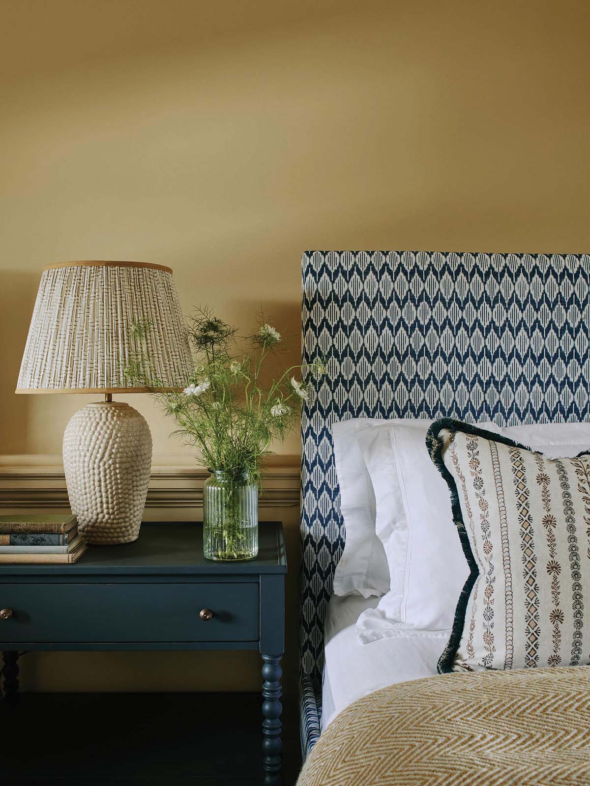
There are two guest bedrooms on the first floor. Each is bright, fresh and inviting, with flexibility built in: one has twin beds that can be combined to create a double, and the other has an external door. A third bedroom on this floor belongs to one of the kids, while the top floor is a sanctuary for the youngest two.
“It’s quite neutral, but they both went for really fun headboards,” says Becca. “They each have their own en-suite and the rooms are a good size for them to grow into. They won’t be outdated any time soon.”
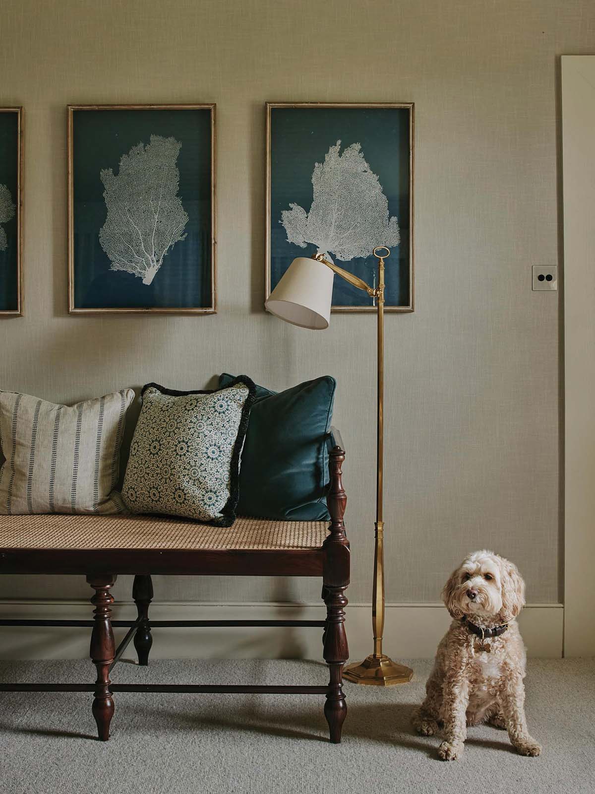
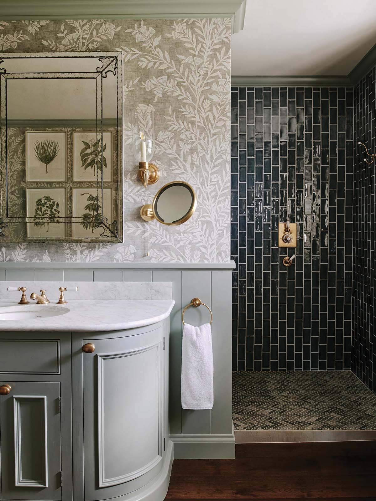
The master suite, also on the first storey, was completely recon- figured. Sims Hilditch knocked through three smaller rooms to create it, its en-suite and dressing room. “The whole suite is very grand, but the bathroom is particularly lovely. It has a large double vanity with concealed medicine cabinets above. There’s a big shower and the loo is tucked away, which gives the roll-top bath some breathing space.”
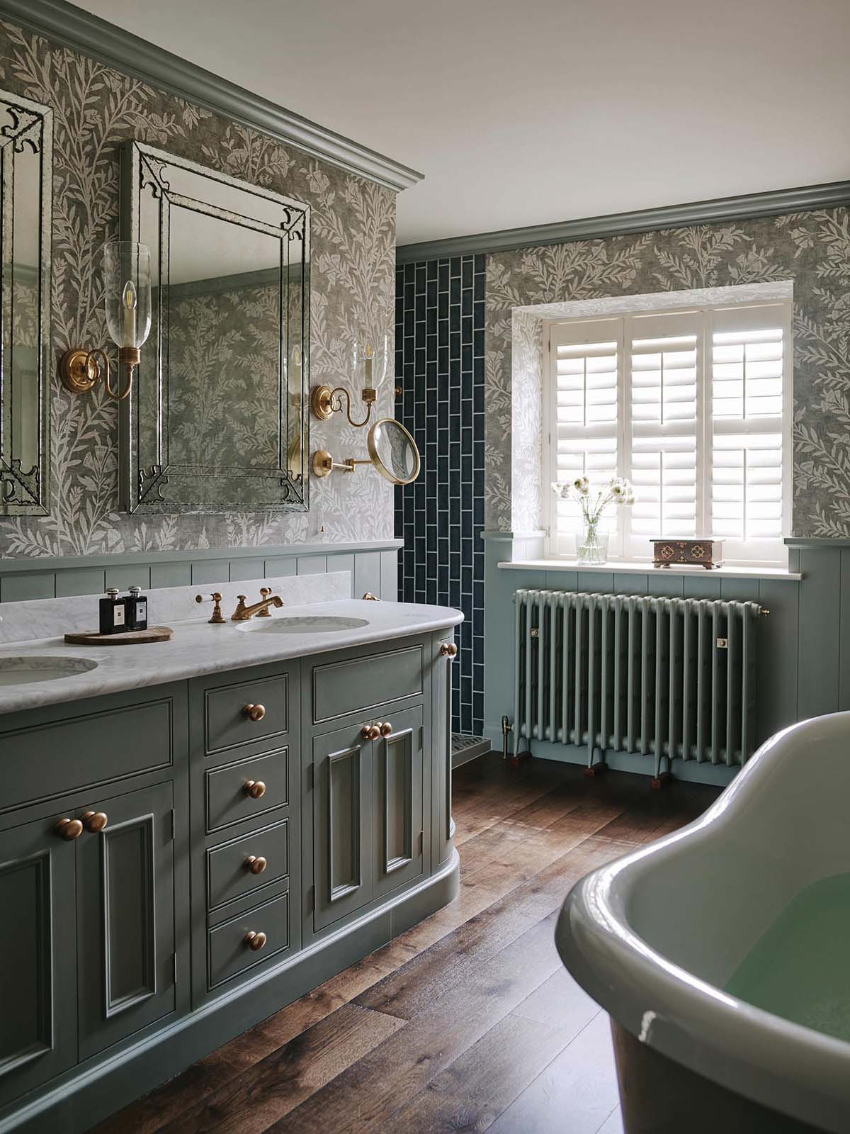
Dark subway tiles, painted woodwork and botanical wallpaper combine to make this a relaxing spot. “You always have to think if the wallpaper is suitable,” says the designer. “You can have moisture-resistant vinyl papers, but it has to be the right paper to get a nice finish. We just used a standard Lewis & Wood paper here. The shower is isolated and there are two windows, so it has plenty of ventilation.”
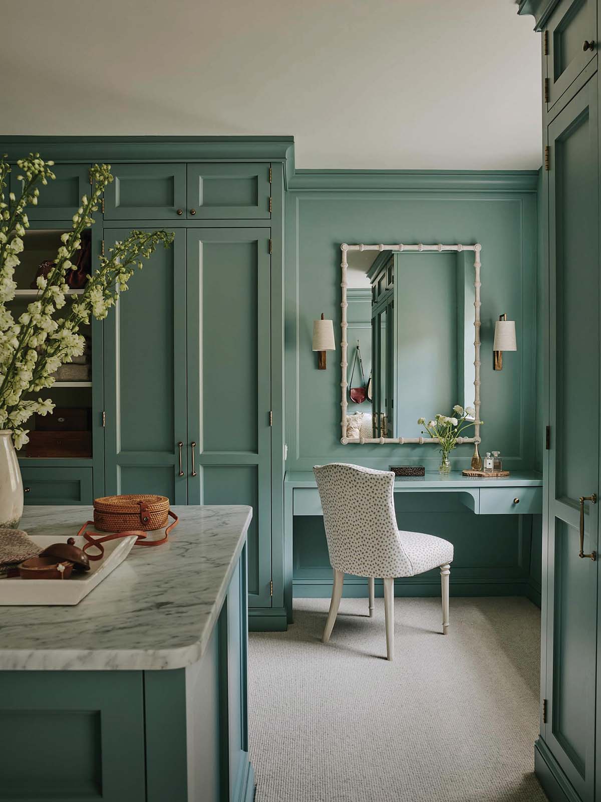
The dressing room’s storage was given a lot of thought. “We always start by asking how much storage a client currently has. It’s hard for people to envisage it all when it’s on plans or drawings, but if you can talk about it in the context of what they currently have (this will double what you have now, this is the same amount of storage, and so on), it really does help. In this case, they wanted simple systems that would last.”
A tall headboard creates a swish hotel-like feel in the bedroom. As well as the emperor-size bed, there’s space for a daybed. “This travelled over with them from Singapore. They wanted it in here because the kids often come and sit with them while they’re getting ready.”
The manor is now full of confident colour and texture; a liveable space that finally feels like the forever home the family craved. “I’m so glad we managed to incorporate their existing furniture into this project – they had some stunning pieces from all over,” says Becca.
“Their personal collection fits beautifully into their newly created home, like it was always meant to be.”
Interior designer Olivia Emery transforms Georgian country house


