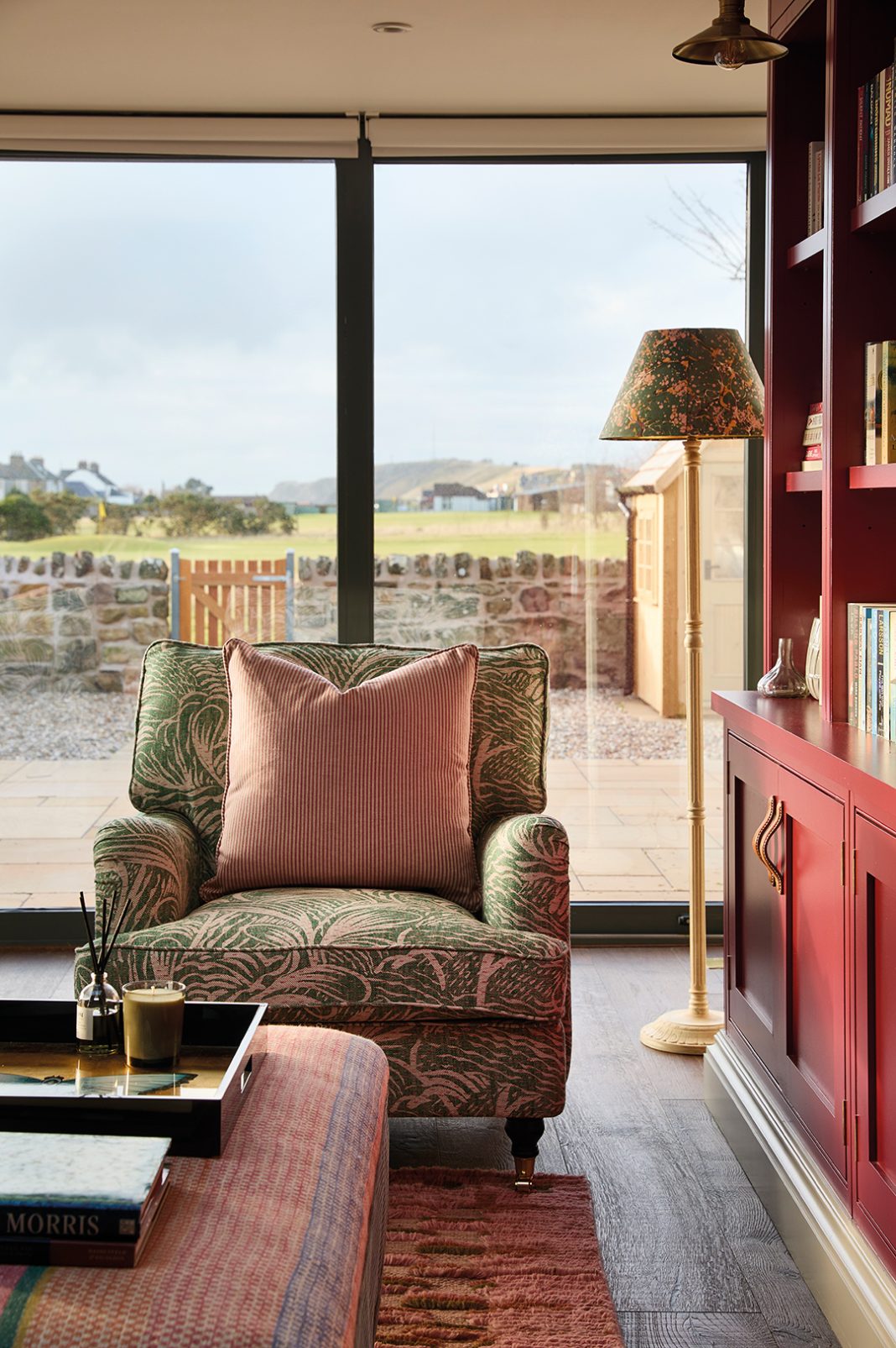
Photography Darren Chung Words Catherine Coyle
Finding new ways to update this period coastal property for a sociable family, Amber Yard’s Tess MacGeachy has created a vibrant space
What’s the best thing about summer? Getting together for barbecues? Taking in a pretty sunset? A stroll on the beach? For one fortunate family in Fife, there’s no need to wait for the Scottish weather to perk up before they can make most of their prime location. Their extended Georgian terraced property in the heart of the East Neuk is a buzzy, bustling home that welcomes visiting offspring, stages village sports get-togethers and hosts the best games nights. But, while the MacGeachy clan have a deserved reputation for entertaining, it’s their remodelled home that has allowed them to do it in such style.

Tess MacGeachy, daughter of the owners, was tasked with the job of overhauling the period property. Having trained at KLC in London and then cut her teeth as an interior designer at Zulufish, she set up her own practice, Amber Yard, in 2021 and embarked on an extensive redesign of this seaside property in Elie. “My parents saw the house advertised for sale and suggested it to friends of theirs,” she recalls. When nothing came of that, they made an offer themselves: “They knew the house and couldn’t resist it, so they decided to buy it and turn it into a ‘spill-over’.”

With their own home just around the corner, this would be the place where guests could stay comfortably, where the kids could kick back and relax and where the extended family could gather, without their main residence becoming overcrowded or unruly. For that to work, MacGeachy had to think about redrawing the space to accommodate larger groups. She did this by working with architect Fiona Merrylees to extend the rear of the building to make space for an open-plan kitchen-living-dining area that also has a utility-cum-butler’s pantry – all with enviable views towards the North Sea.
WELCOMING THE OUTSIDE IN
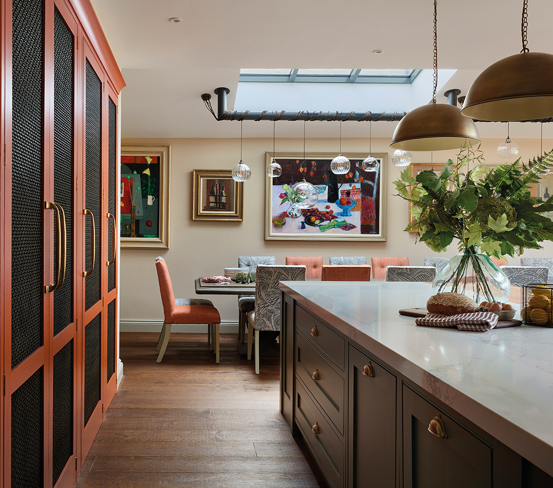
“We put in a large skylight above the dining table,” says the designer. “By inviting so much more natural light into this party zone, the atmosphere in here really changes depending on the time of day.”
Creating the ‘tapestry wall’, as MacGeachy terms it, was a smart bit of collaborative working. Getting Aberdeenshire’s Ballater Gallery involved allowed her to focus on the interior design, knowing that the gallery experts would pull together artwork to purchase that would work for this vast, empty space. “It’s a very eclectic mix,” she admits. “We spent a long time working out the positioning, spacing and lighting. Symmetry is very important but too much of it can limit what you can do with a room. Nothing in here matches, but it all works together.”
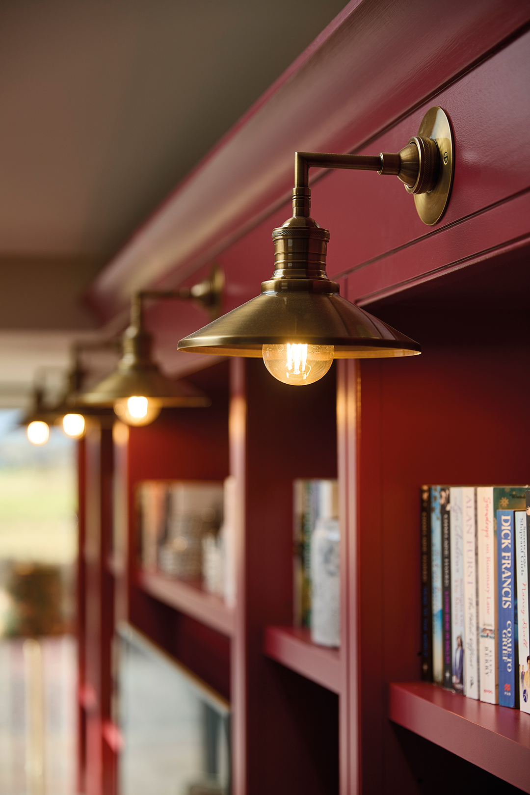
The designer had a head start with her client, of course: she was already very familiar with her mother’s tastes and was well aware of her penchant for layering colours and patterns and her love for both contemporary and antique pieces. That, though, meant MacGeachy had to work hard to create cohesion. “My parents, and my mum in particular, wanted a lived-in feel. They don’t like stuffy and want to feel relaxed, so I sourced vintage and antique pieces to give that ‘collected’ atmosphere, with lots of colour and pattern to add character.”

DESIGNS FOR LIFE
Looking to other designers for inspiration (she lists Kit Kemp, Studio Ashby, Rita Konig, Studio Duggan and Nicola Harding among those she admires), MacGeachy also draws threads from her travels, whether that’s trawling the souks of Marrakech or wandering the cobbled streets of London. Hotels have been instructive too; it’s a difficult task to make a home feel luxurious, special and highly functional at the same time, and some of her favourites (Soho House, most notably) provided a moodboard for exactly that. Bedrooms – often forgotten rooms with little oomph – received significant attention: “I wanted the guests to feel they were staying somewhere really plush, where they could cosy down and not want to leave.”

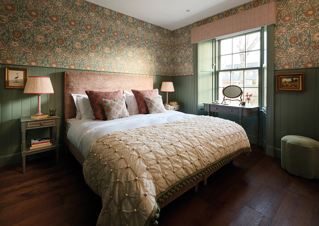
She has certainly achieved that. The master suite is a melange of clashing patterns, textures and colours, all connected by a palette of pretty, chalky hues. Upholstery has been integral to the scheme, with layers of sumptuous fabric, coupled with on-trend detailing (note the scallop-edge drawers, rustic light fitting and textured bedding), and expansive walls that can cope with the large motif in Lewis & Wood’s Pomegranate wallpaper. The overarching effect is classic but with a twist.
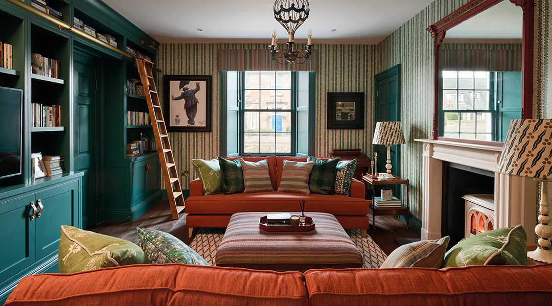
MacGeachy likes to start each design the traditional way, with a pencil, sketching out her concepts. But it’s when she makes CADs and rendered elevations that her clients can really visualise their rooms coming to life. Working up drawings of bedrooms, for example, and creating depth and texture, shows clients just how magical a room could look. By pairing this layered aesthetic with high-spec detailing, such as the leather handles and brass accents in the kitchen, revitalising the staircase with a Roger Oates runner, and using an eclectic array of contemporary paint colours to upcycle pieces like the linen tallboy on the upper landing and the inky teal bookcases in the snug, she has found a harmonious balance that makes for comfortable modern living.
LESSONS IN STYLE
Even in the utility room on the ground floor – the very definition of a functional space – there has been no compromise on style. Rather than allowing the focus to be on ugly appliances, she has filled the room with colour and drawn the eye to the impressive views outside. Quirky floor tiles by Bert & May inject a bit of fun, and a thick butcher’s-block countertop with bold tiling on the walls make it clear that no one here is precious about the interior. High quality doesn’t mean off-limits.

“I knew my parents really wanted people to come in and enjoy this house – to take their shoes off and feel at home,” she smiles. “We’ve really had fun with it and shown that you can change the atmosphere of a house by doing simple things like painting with confident colours or adding cushions and lamps to make it feel special.”


