Visionary design and next-level craftsmanship have
transformed this Govanhill tenement flat into a work of art
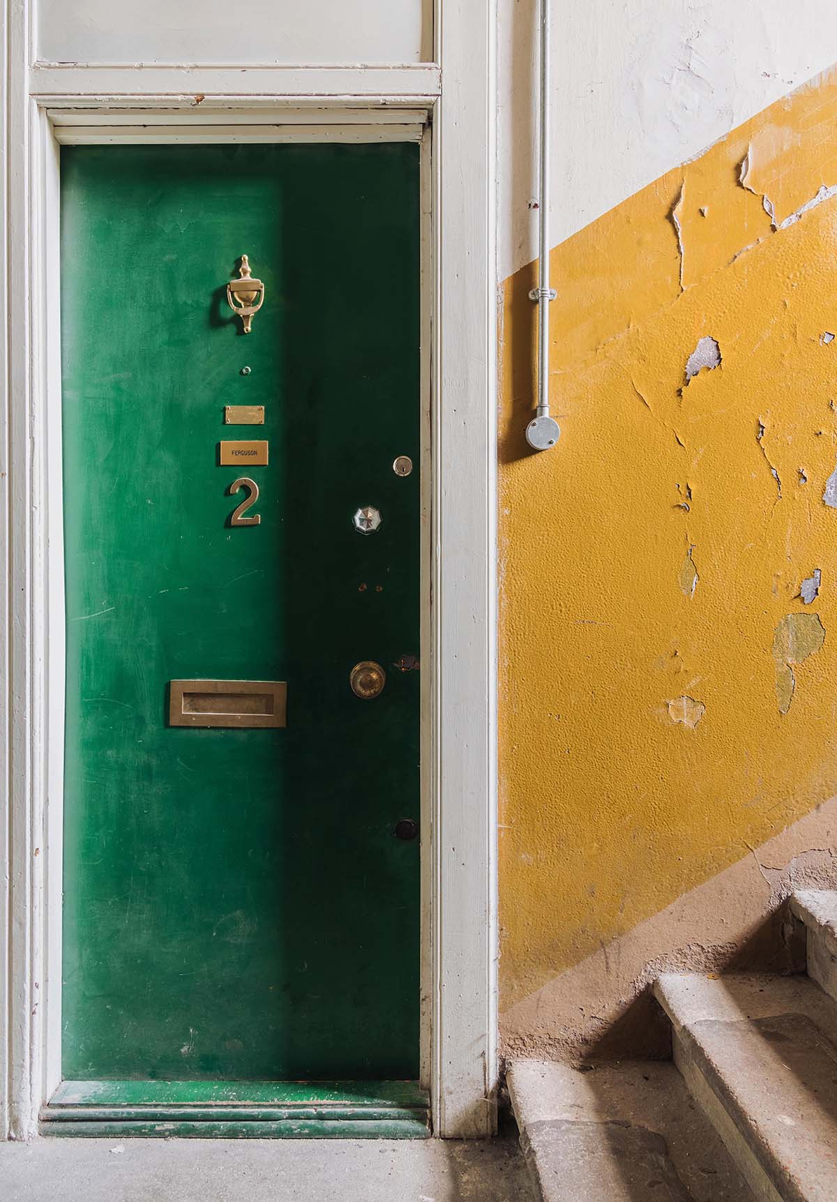
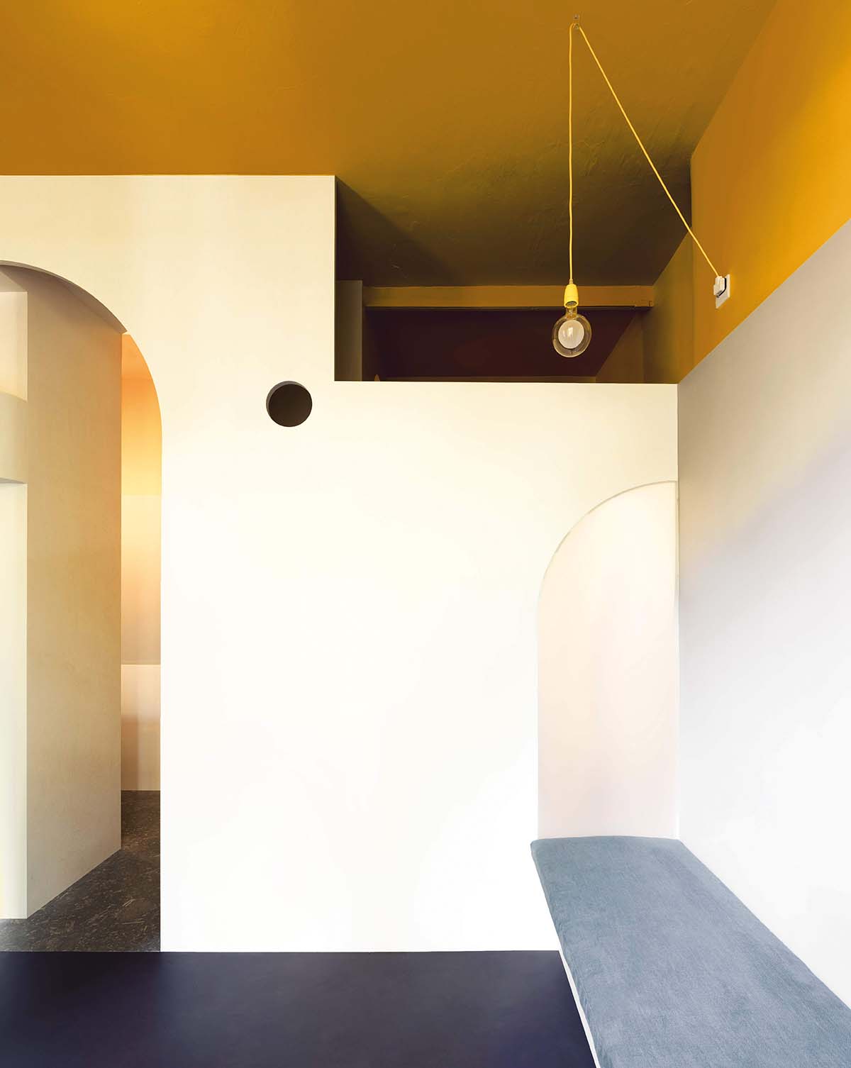
In an ordinary Victorian tenement on an ordinary street in Govanhill is a flat that is anything but ordinary. Walk through its bottle-green door and you’ll find yourself ensconced in 25 square metres of Mondrian-esque colour and confident form, where razor-sharp lines dissolve into curved openings and a compact floorspace is offset by soaring ceilings.
There’s nowhere else like it in Glasgow – perhaps not even in Scotland – so it has a natural home here in what is arguably the city’s liveliest creative hub.
Owned by experimental urbanist Duncan Blackmore, the tenement flat – named Ferguson after one of its previous occupants – serves as a base for him to stay, work and entertain while remaining connected to a community he regularly collaborates with.
Duncan has been involved in initiating two projects in Govanhill: Kiosk, an experimental ‘spare room’ on Prince Edward Street that is available for use by anyone who has an idea to work on, whether art or activism; and the renovation of the long-vacant building that now houses 20 Albert Road, an art space jointly programmed by a collective of artists, gallerists and curators where events, exhibitions and discussions are held.
“There’s so much going on here; a really interesting energy with lots of entrepreneurialism,
self-expression, freedom and tension,” says Duncan. “It’s invigorating to be around.”
That sense of invigoration is felt keenly in Ferguson, the micro-apartment Duncan conceptualised during lockdown alongside architect Lee Ivett, a collaborator on
Kiosk, and designer-maker Simon Harlow, who has lived and worked in Govanhill for 18 years.
THE ART OF CONVERSATION
For such a visually stimulating project, it comes as a surprise to learn it was
largely imagined through words. Only one axonometric drawing exists; the true reference was the constant stream of dialogue between the three over WhatsApp and Zoom.
“It’s really the built result of a relationship which unfolded over the course of the project,” says Duncan. “I didn’t have a distinct picture of it in my head in the beginning, although I was aware of what I was mashing together, aesthetically, by involving Lee and Simon.”
Though its appearance took shape over time, the owner had a clear idea of the property’s intended use from the outset. He knew he wanted it to be a place to stay rather than live – somewhere flexible and uncluttered that wasn’t “a world of sofas and TVs and dishwashers”.
Simon recalls Duncan saying he would like to be able to do a lap around the tenement flat without restriction. “So you would never reach a point where you stop and then have
to back out again,” explains the designer. In its original configuration, this wouldn’t have been possible.
SMALL SPACES TRANSFORMED
The flat, which had been vacant for some time, previously comprised a tiny shower room with a toilet, a cramped kitchen, and a sitting room containing a bed, all separated
by internal walls.
“It felt very small and really dark,” adds Simon, who worked with long-time artistic collaborator and friend Simon Richardson on the fabrication of the build.
“And it is really small – but we wanted to open it up into a big volume.”
Constrained by its existing footprint, they had to get creative. The shower room, which had been close to the front entrance, was shifted to the opposite side of the flat and became the only room closed off by a door.
The rest of the flat was transformed into a free-flowing space with no internal walls or doors.
From the entrance, you walk along a short passageway and round the corner through a tall arched opening into an “unprogrammed” room flooded with light from two south-facing windows.
There’s a built-in bench and shelving on one side and a micro kitchen on the other, separated only by an open-ended central partition so that you can move around
without interruption.
Unshackling the flat’s internal boundaries could have resulted in its 3.4-metre-high ceiling feeling disproportionately tall. It doesn’t, though, largely because of the introduction of a mezzanine level (housing a sleeping area) above the shower room, accessed by wooden stairs, as well as the insertion of geometric shapes and voids in the living area that scale down the perception of space while letting light circulate.
SALVAGING HISTORY
Not everything is a new intervention; portions of the flat’s original walls are locked inside sturdy timber cages. “We didn’t want to just make a whole new box inside an existing box. You want to celebrate the structure that’s already there, so we were constantly having conversations about that,” says Simon.
“It was a really complex build because the floors weren’t level and the walls weren’t
plumb. Once I was on site, it became a more interpretive process that had to be dealt with sensitively. I was determined that all of the lines would fall correctly and we
wouldn’t lose the vibrancy of the design.”
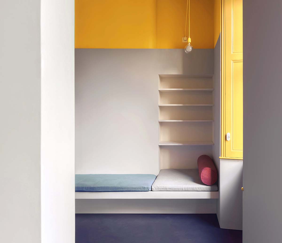
Its vibrant energy comes as much from clever configuration and exquisite craftsmanship as it does from a palette of bold primary colours, which serve the dual purpose of adding playfulness and denoting function.
A datum line continues from the mezzanine level and wraps around the walls: everything above the line, including the ceiling, is painted in Dulux’s Sundrenched Saffron, a jaunty yellow that marks out the upper realm of the lat.
“Everything below it is grey to knock it back a bit, and then anything we physically built from wood is white,” says Simon.
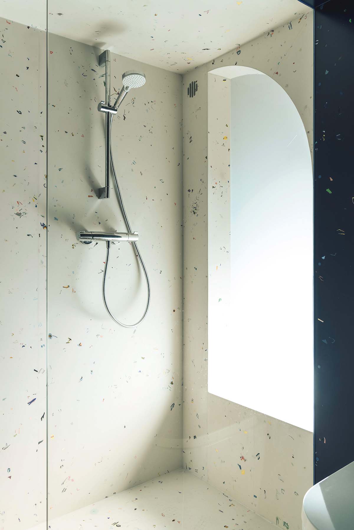
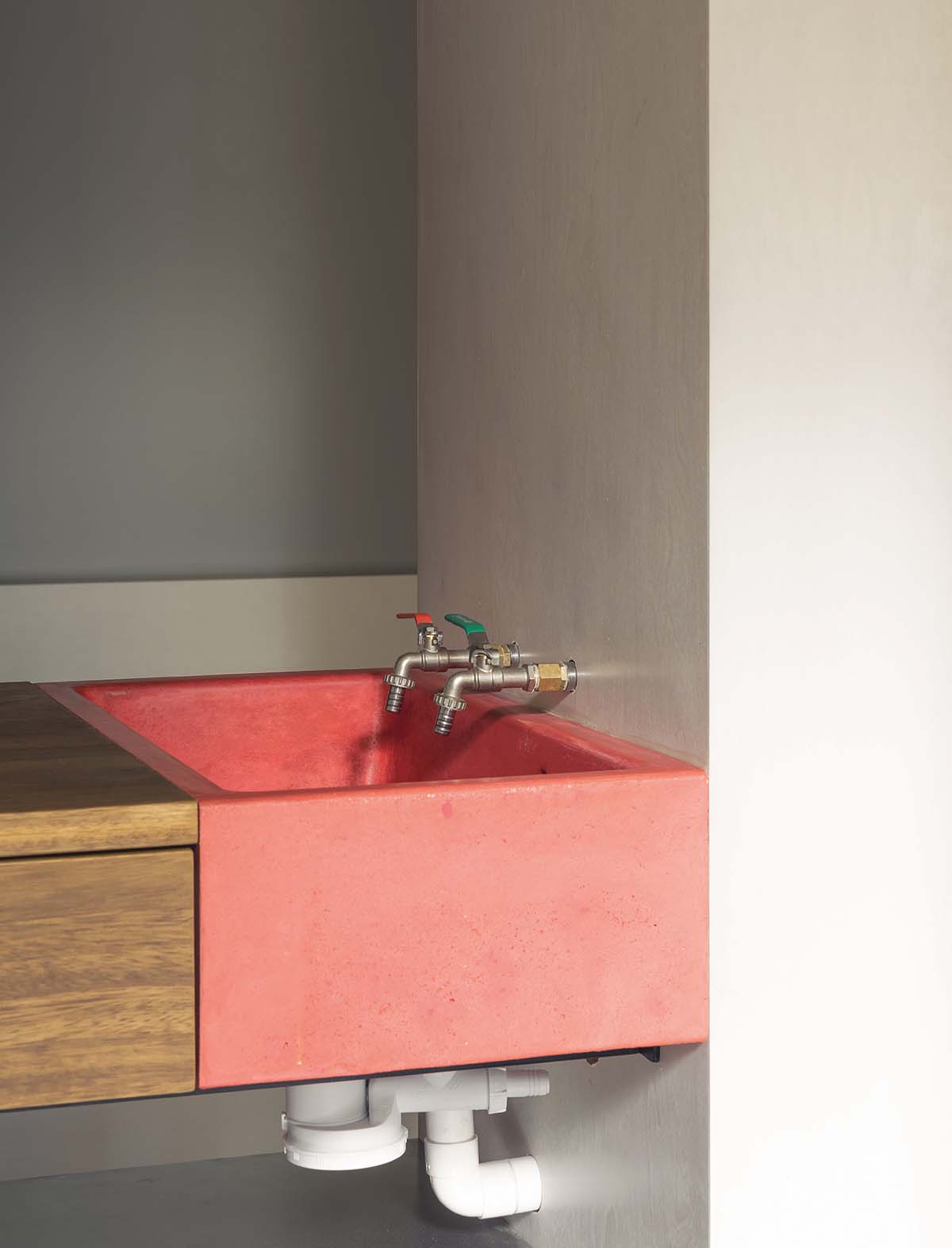
The kitchen’s signifying feature is a pillarbox red cast-concrete sink. The shower room is swathed from top to bottom in blue and white Mirrl, a Japanese-inspired flecked polyester resin co-created by Simon and produced in Glasgow.
A bright yellow Mirrl-framed mirror, made in collaboration with the irreverent artist Adam Nathaniel Furman, hangs above the loo.
Rather unusually, Simon can count on one hand the number of items that were bought, ready-made, for Ferguson. The taps, the lightbulbs, the cooker. Practically everything else was created from scratch, from a cut-and-bonded fibreglass sink to the sliding lock concealed inside the shower room’s door. “Duncan was always interested in exploring these ideas, always happy to discuss them,” says Simon. “That’s rare.”
This commitment to uncompromising quality came at a cost – the flat is worth less, in pure monetary terms, than what was spent on it. It was never Duncan’s intention to ‘indulge’ himself in such a way, but he has made peace with it.
He now has a place to stay, think and dream; somewhere calm yet energising that bears the fruit of a level of skill and attention to detail worth investing in.
“Once it’s in that realm of ‘indulgence’ it almost becomes a kind of artwork, like a sculpture,” he reflects. And who can really place a value on that?


