Bold, brave choices paid off handsomely when the owners of this Edinburgh flat decided to put their stamp on the place
As they gazed down at their neighbour’s lovely west-facing back garden, Tom and Susie Crowe were making plans. The property had just gone up for sale and the couple had their hearts set on it.
They already loved living in this street – a quiet corner between Edinburgh’s west end and Stockbridge – and they felt that with some upgrading, a few tweaks to the layout and, crucially, the addition of a glassbox extension at the back, the flat two doors down could be their dream home.
Just a few months later it was theirs, and within a fortnight of moving in they’d invited an architect round for a chat. It was all going so well…
Today, two and a half years on, there’s no sign of any extension and the floorplan has been radically redrawn. Yet there’s no doubting that this really has become their dream home – just not the way they imagined it.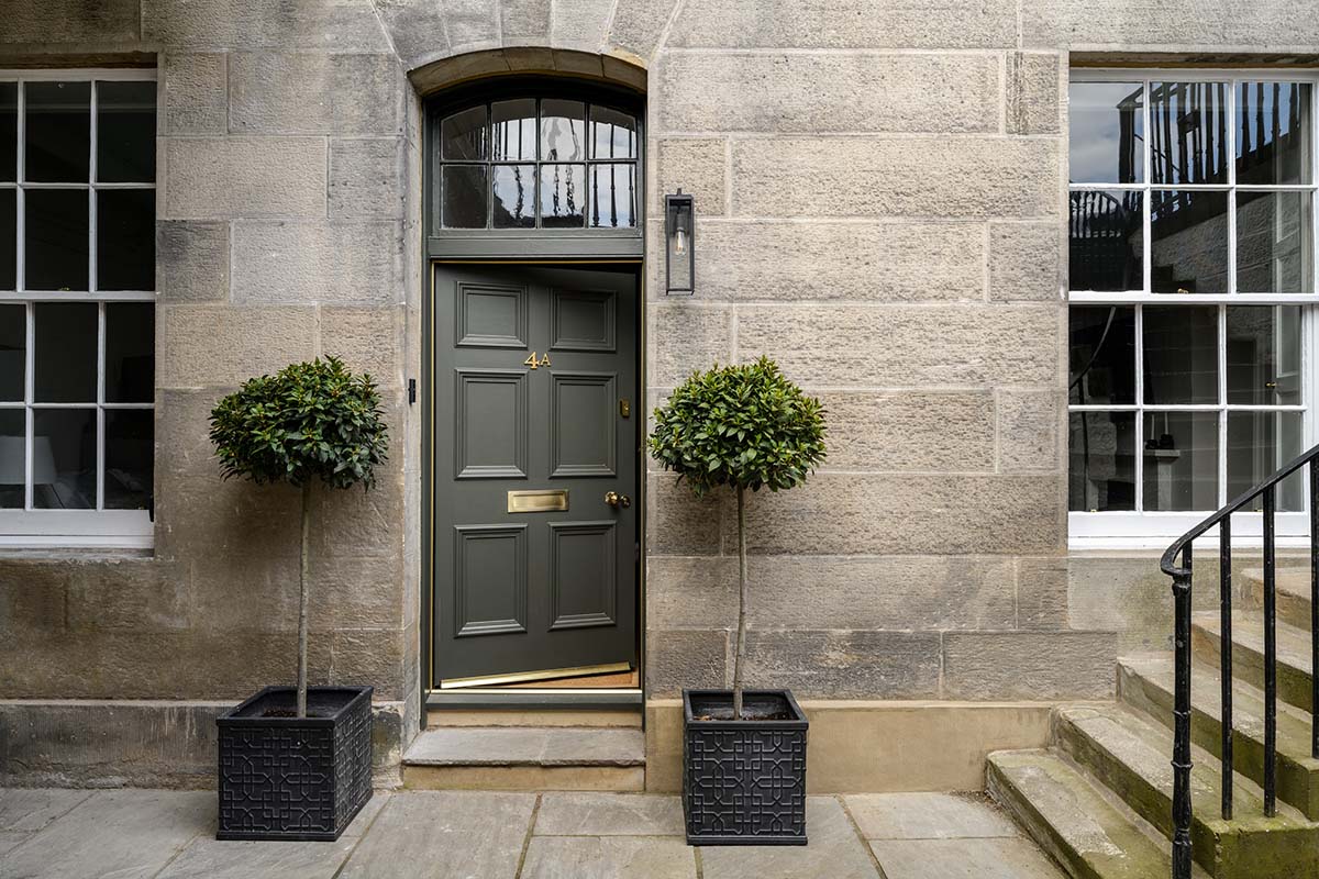
“We were really upset when we realised our plans weren’t going to work out,” Tom admits. “But, actually, it was a blessing in disguise. What we’ve ended up with is far superior. We had to spend time in the house, seeing how the light comes in, getting to know how each space feels, before we could work out how we wanted to live here and what had to change to make that happen.”
The property – the garden level and ground floor of a converted townhouse that’s part of a grand terrace dating from the 1850s – had potential, but problems too.
The layout, Tom says, was “weird”, with bathrooms in peculiar places and a lot of odd-shaped rooms. The kitchen was upstairs among the bedrooms. The front portion had been split off into a granny flat. It felt dark and gloomy and there was no connection to the private garden.
“We brought in David Blaikie right at the start – he’s local and his practice has so much experience in doing listed townhouses. We had faith he’d get it right,” says Tom. “He went through our ideas, trying to work out how we could get everything we wanted.”
It quickly became apparent that an extension would eat up a huge chunk of the budget, restricting what else could be changed. A complete rethink was required. Once they got over the disappointment, Tom and Susie were pragmatic, and as the months went by and they got to know the house better, they realised there were other ways to fix its problems.
Discussions continued with the architects, who showed the couple that they actually already had all the space they needed. Plans were drawn and rejigged, and eventually a solution was found.
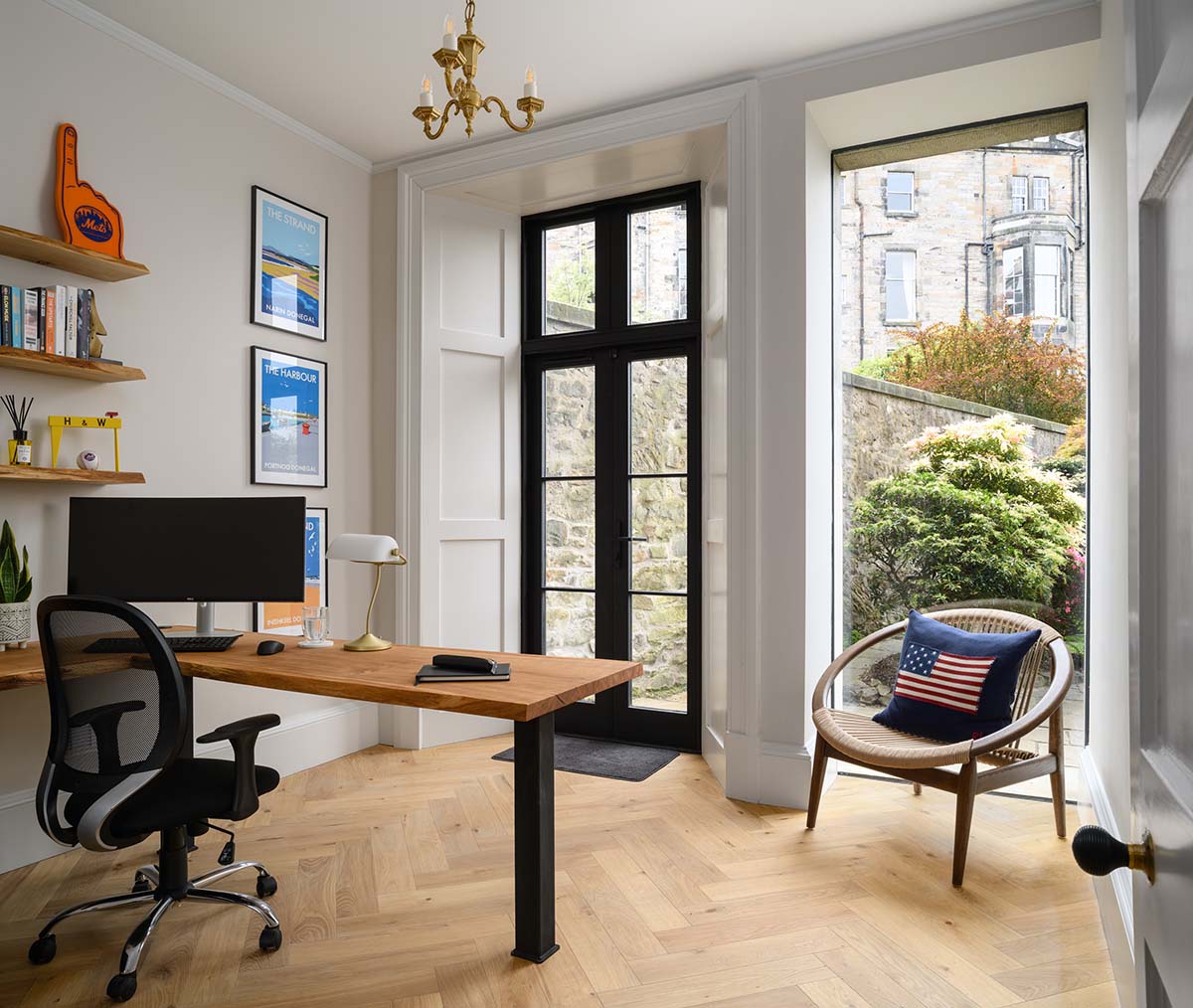
The garden level now comprises an open-plan kitchen, dining and living room, plus a guest bedroom and office, with two more bedrooms and a sitting room upstairs.
This gave them the easy, open-plan living they craved, access to the garden, flexibility to go from three bedrooms to five if required, and crucially, light in all the places that needed it.
As the layout took shape on the drawing board, Tom and Susie devoted ever more time to thinking about what they wanted their home to look and feel like, gathering inspiration and figuring out a scheme that would give the interiors that elusive blend of traditional and modern style it needed.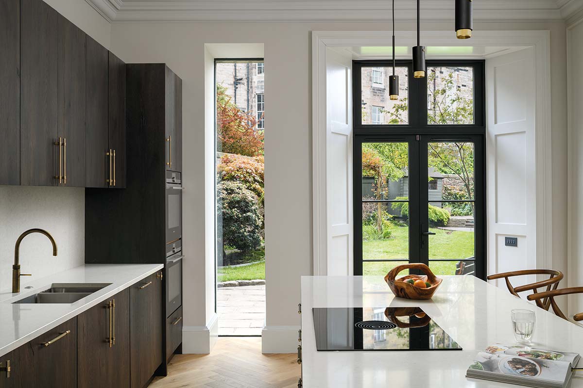
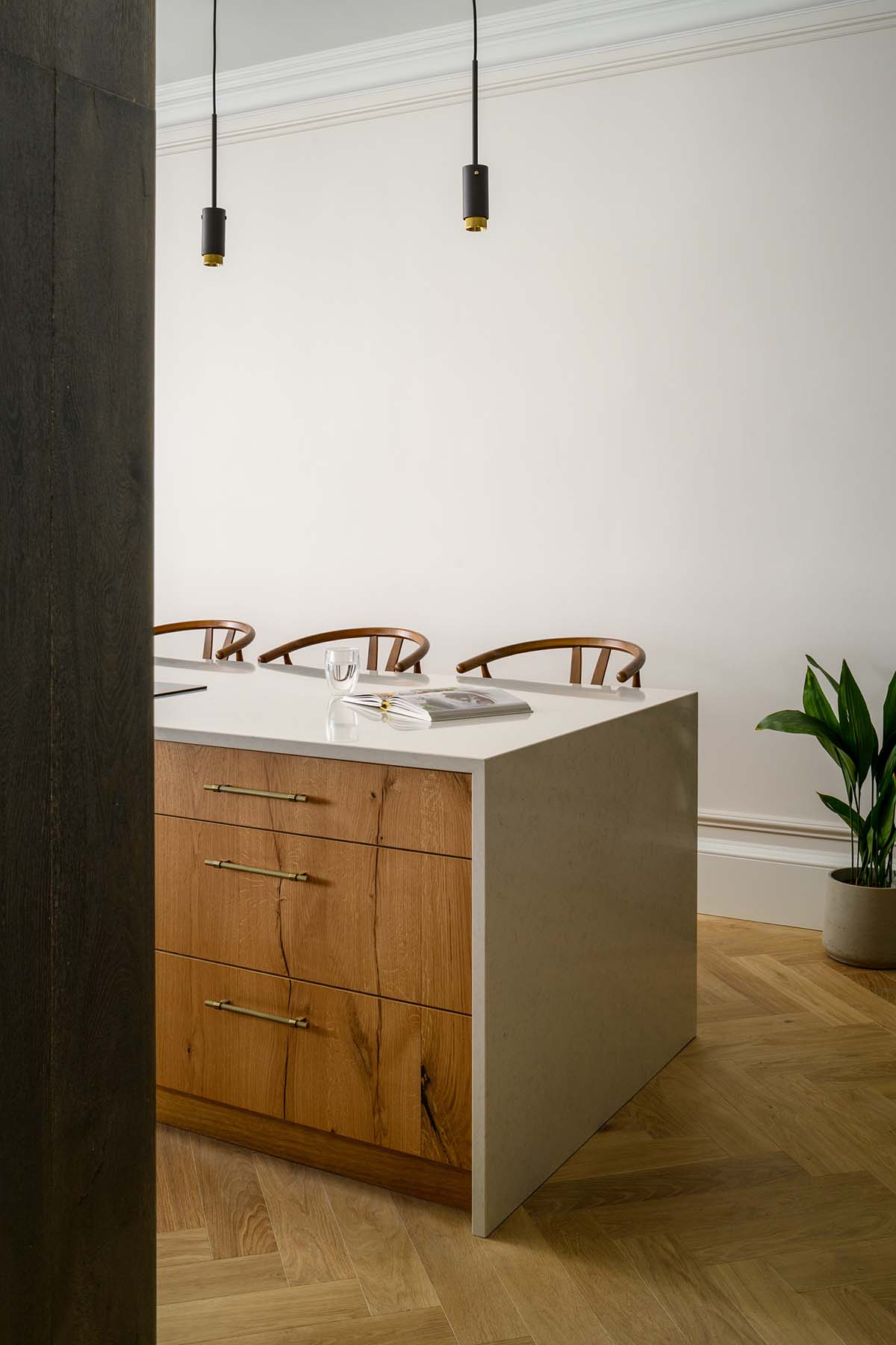
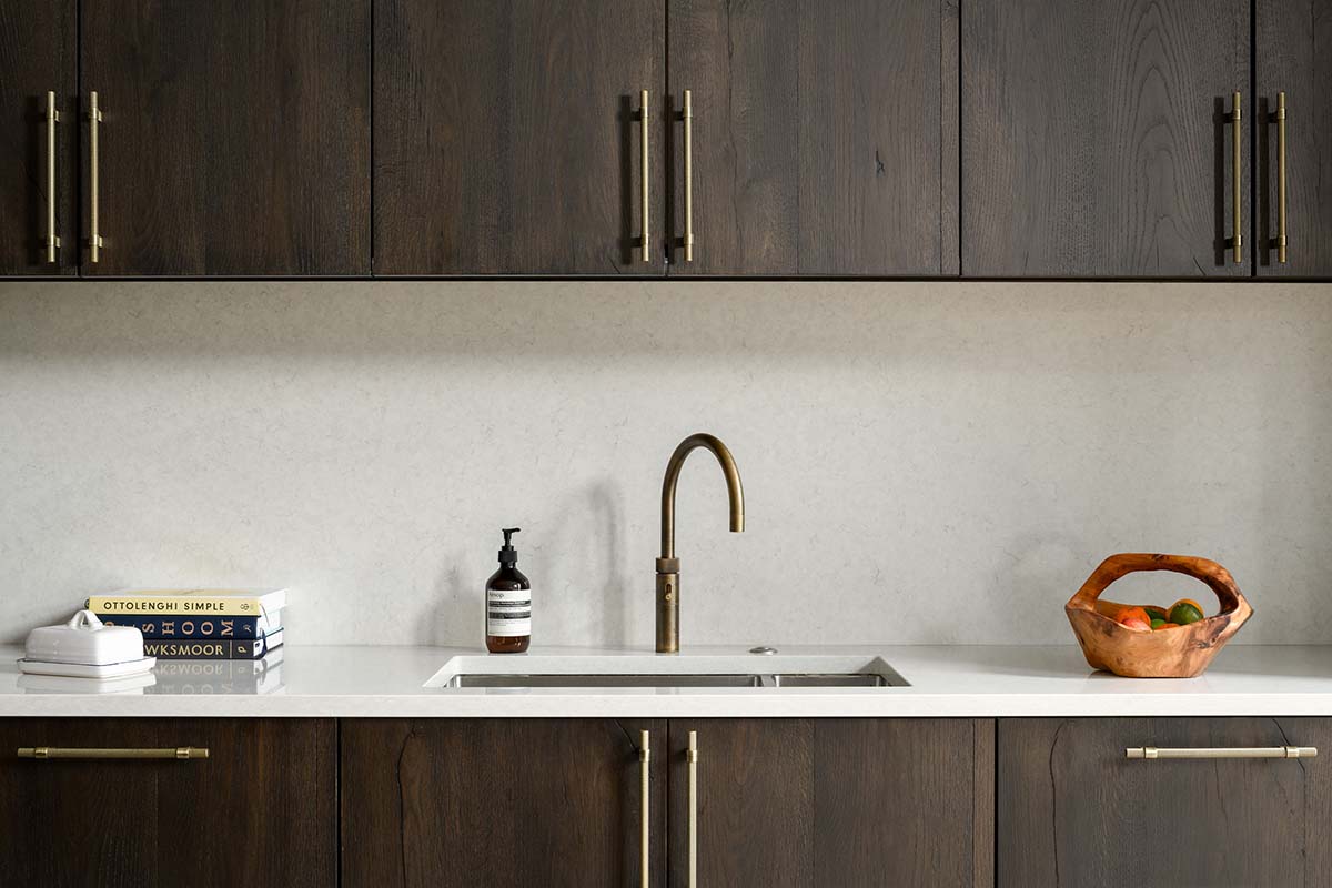
But when, 14 months after buying the property, the pair moved out and the builders started work, all these ideas were still just moodboards.
“Interior designers have so much experience – they know what works and what doesn’t,” says Susie. “When you’re doing it for the first time, you’re just hoping for the best. In your head you know how you want it to look, but you have no idea if it’s going to turn out as expected. There were moments when we were terrified it wasn’t going work.”
Their contractor, Bann, stripped the house back to the bones. Everything had to be renewed, including the plumbing and the wiring. Cornicing was repaired or reinstated. Tiny rear windows were replaced with floor-to-ceiling glazing.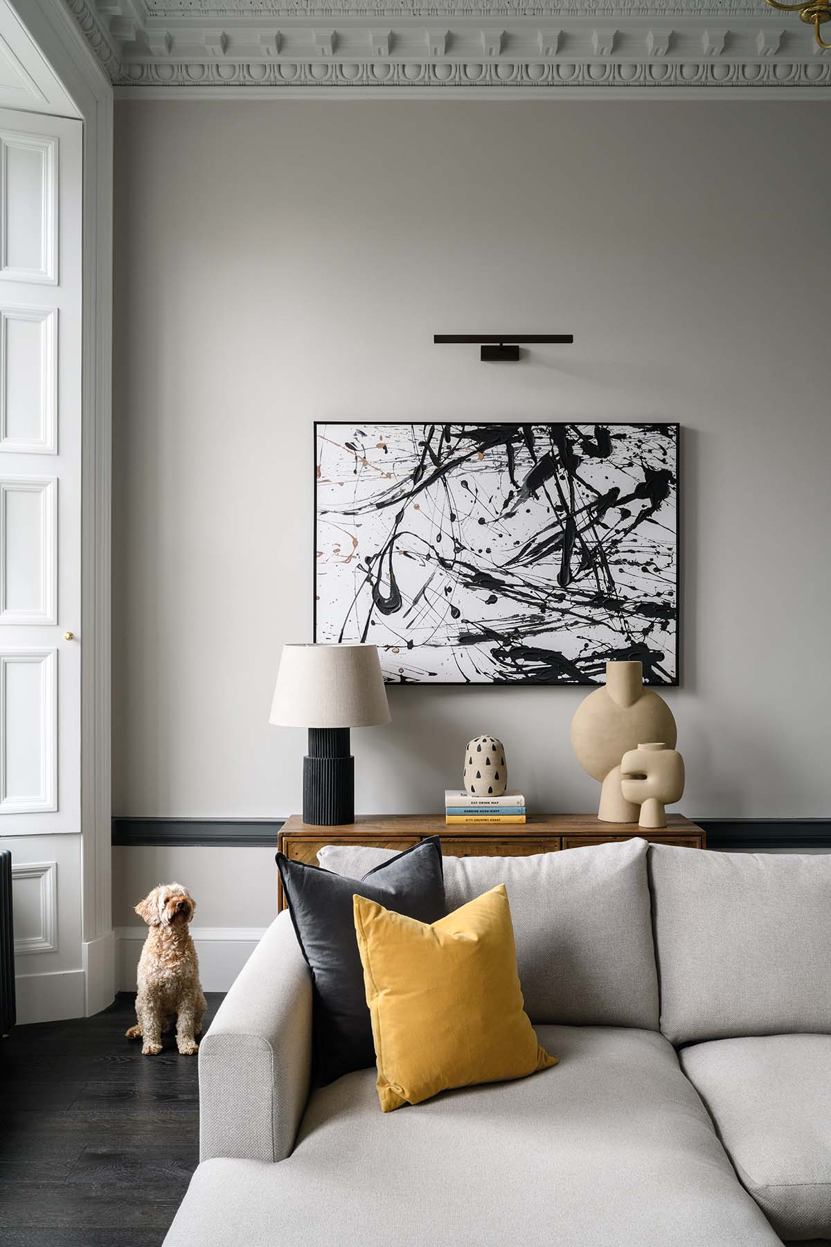
Walls were taken down and daylight was allowed to flow through the rooms. They’d seen Bann tackling similar projects around town and had heard good things about the quality of their workmanship – something that really appealed to this self-confessed “picky” pair.
“Bann were absolutely brilliant,” says Susie. “We couldn’t recommend them more highly. They were a pleasure to work with.”
“James McAuley, the owner, treats your renovation like it’s his,” adds Tom. “The whole team went above and beyond. The tiny details really matter to them. That was ideal for us – we’re sticklers for the details too.
When we were sourcing the fixtures and furnishings, we spent hours and hours contemplating small things that no one but us will ever notice. But we wanted to get it right.”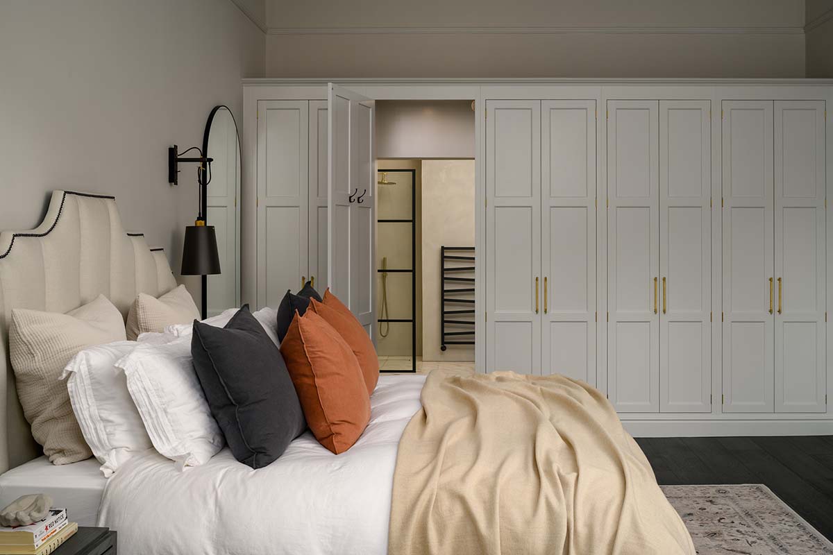
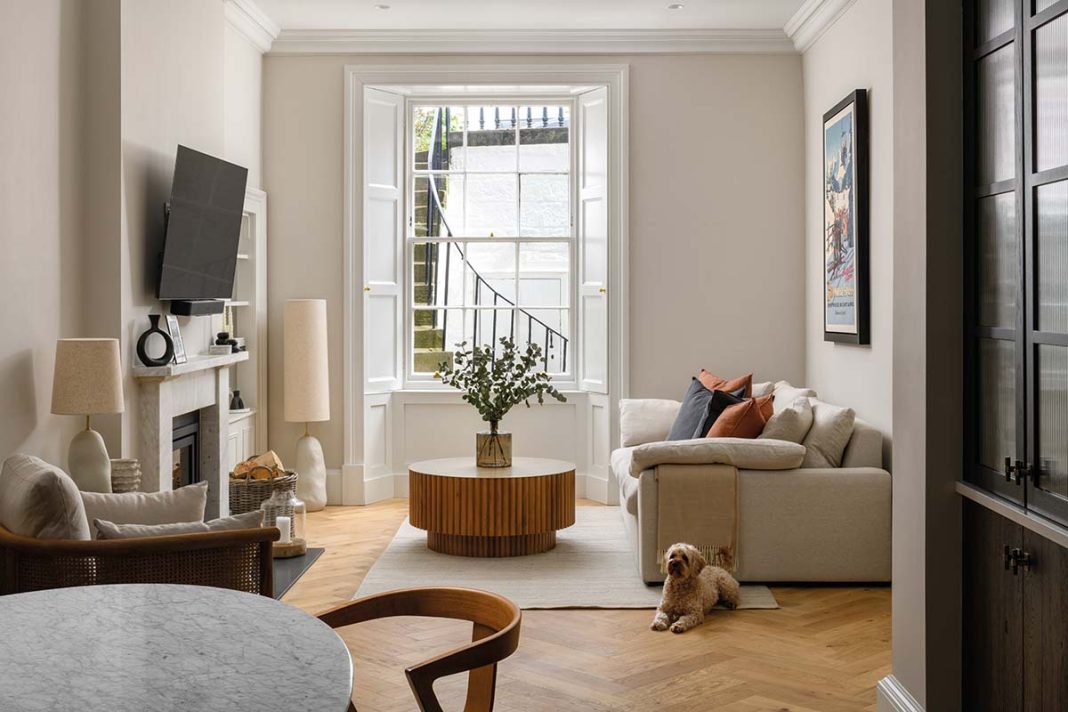
As the building work progressed, the couple saw their décor begin to take shape. Pale herringbone timber flooring was laid across the garden level, bouncing the morning sunlight from the front of the house through the newly open-plan space to the kitchen at the back.
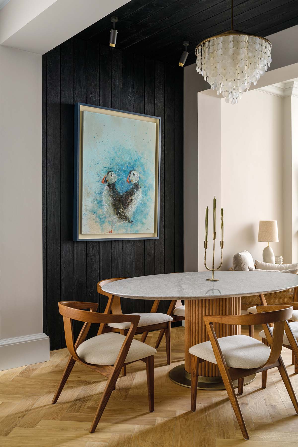
Between these is the dining area and one of the couple’s bold design ideas: walls and ceiling clad with dark, smoky charred wood.
They’d hoped to use this material on the exterior of the ill-fated extension – and when that didn’t happen, they felt it was too good an idea to waste. Waiting for it to be installed was nerve-racking.
Would it suck out all the light? Would it look “ridiculous”, as Tom feared?
On the contrary: it’s a brilliant way to define the space, creating a real sense of enclosure and cosiness when candles are lit on the dining table. The couple could have simply used a dark paint here, but it wouldn’t have achieved the lovely texture and warmth the wood has given them. There are subtle layers of texture everywhere, through the use of fluted glass, ribbed wood and tactile upholstery. 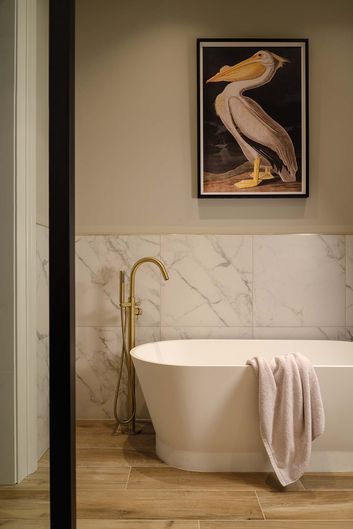
“We wanted it to feel a little bit Scandinavian but with a more homely feel than the usual Scandi style,” Susie explains. “We were aiming for timelessness. We wanted it to feel classical yet modern.”
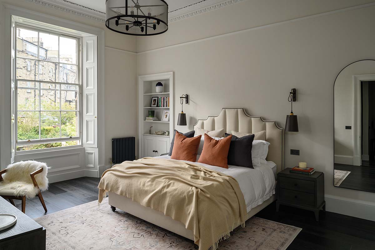
They’ve gone dark in the main bedroom upstairs too – a vast room that used to be the kitchen. Extra-wide black floorboards suit the lofty proportions and, together with dark furnishings, help to anchor the room and make it feel cosy.
The fitted wardrobes, designed and made by Peden & Pringle (also responsible for the kitchen), contain a secret door leading to the en-suite. The couple moved back in at Christmas and have welcomed a steady stream of visitors in the months since, and they couldn’t be happier. They wanted the space to work for a crowd as well as for just the two of them.
“We have no regrets about the extension,” says Susie. “Look at all that space we’ve saved in the garden.”
And they have no regrets about their high-risk décor strategy. “We just had confidence in our ability to choose the style we wanted,” concludes Tom.
“It was worth it because it’s really ours. It’s our blood, sweat and tears in this building. We put everything into it. It’s so rewarding to sit back and think, ‘We did this.’”
“We wanted to put our stamp on it and we did.”


