Emily Smoor’s flair for the dramatic and ability to conjure up a sense of authenticity can be seen to full effect in this holiday home
Emily Smoor is a master of the art of deception. The interior designer and director of Edinburgh’s Fantoush has a knack for transforming the ordinary into something rather spectacular. Her skill lies in her ability to fuse styles confidently; for the most part she works intuitively, and likes to create schemes
that she’d happily adopt in her own home.
She’s laughing as she describes the job she was tasked with just 18 months ago, to overhaul an old rectory house and its neighbour, the Kirkstyle Inn, a pub with rooms, in a bucolic corner of Northumberland.
“When we finished, one well-known food critic came to review the pub and wrote about the original flagstone floors,” smiles the designer. “But there was next to nothing original left at the rectory or the inn apart from a couple of gable ends!”
Therein lies Emily’s craft: she is able to make something out of nothing.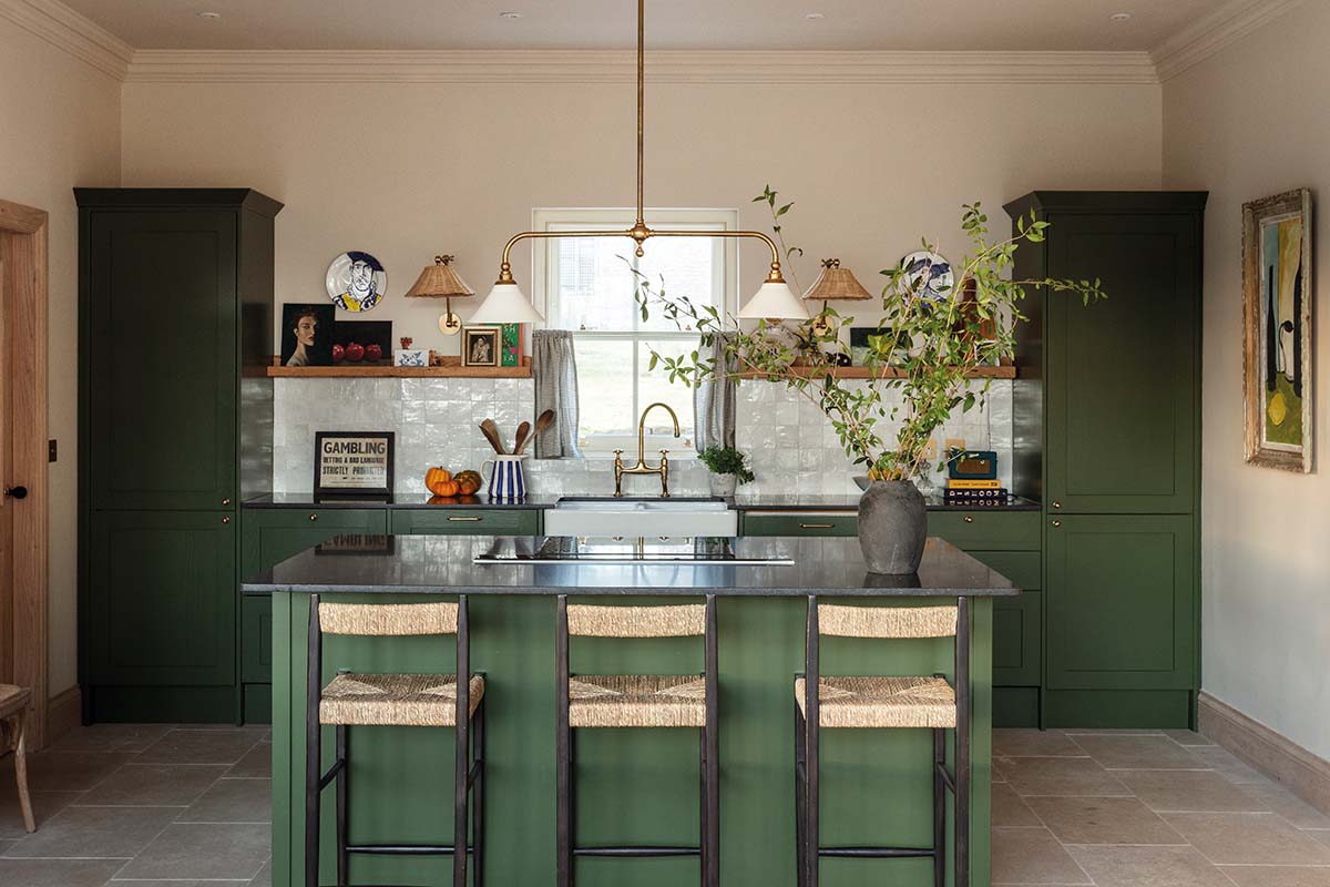
And, offered a whole new façade that possesses such gentle assurance, visitors are convinced this is how it has always been. They are presented with the kind of convivial but demurely elegant ambience that makes them want to stay – and gives them ideas of things they’d like to try in their own homes.
The designer met clients Roz and Nick Parkinson through mutual friends. The couple had run very successful pubs further south, and when this project came up, they knew Emily would be able to handle both the scale of the job and its quick turnaround.
They also gave her carte blanche when it came to the concept behind the interiors. “Roz and Nick were very generous with their trust,” confirms the designer.
That lack of a strict brief might prove daunting for some, but it’s actually how Emily prefers to work. It was an extensive project; as well as tackling the pub’s four bedrooms, the six-bed house had to be revived to appeal to holidaymakers.
“The rectory was very 1980s, nouveaux, tired,” recalls Emily, flicking through some before snaps on her phone that show its dark corners and heavy patterns in unflattering colours.
“The soul of the building had gone, so I, along with architect Dave Burgeon of Richard Amos Ltd, had to think about how to restore its architectural integrity and how to find elements that would appeal to all guests.”
Her plan was to keep it sympathetically tied to the period it was built, but with enough updates to make it feel timeless – all while avoiding country-house pastiche.
“We brought in Emily in the late summer of 2021,” says Roz, “and by January 2022 she was giving us her first concept presentation for the place.”
By spring, the job was underway. “When you look at the surroundings, it would be crazy not to use the outdoors,” says Emily, motioning to the verdant views beyond the windows. “For me, it’s about not making it too much of any one particular thing. It’s an eclectic curation.”
On the ground floor are spaces where people can come together but also have the option of retreating.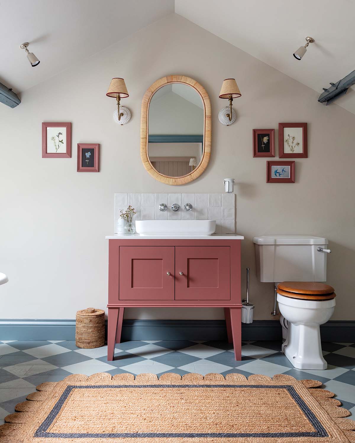
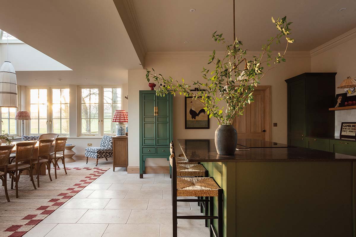
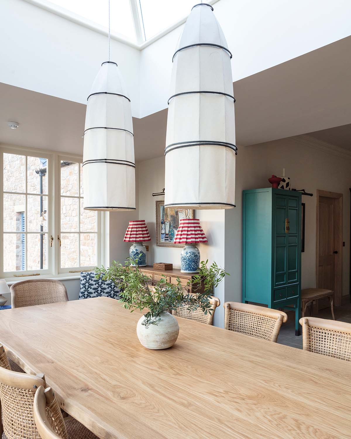
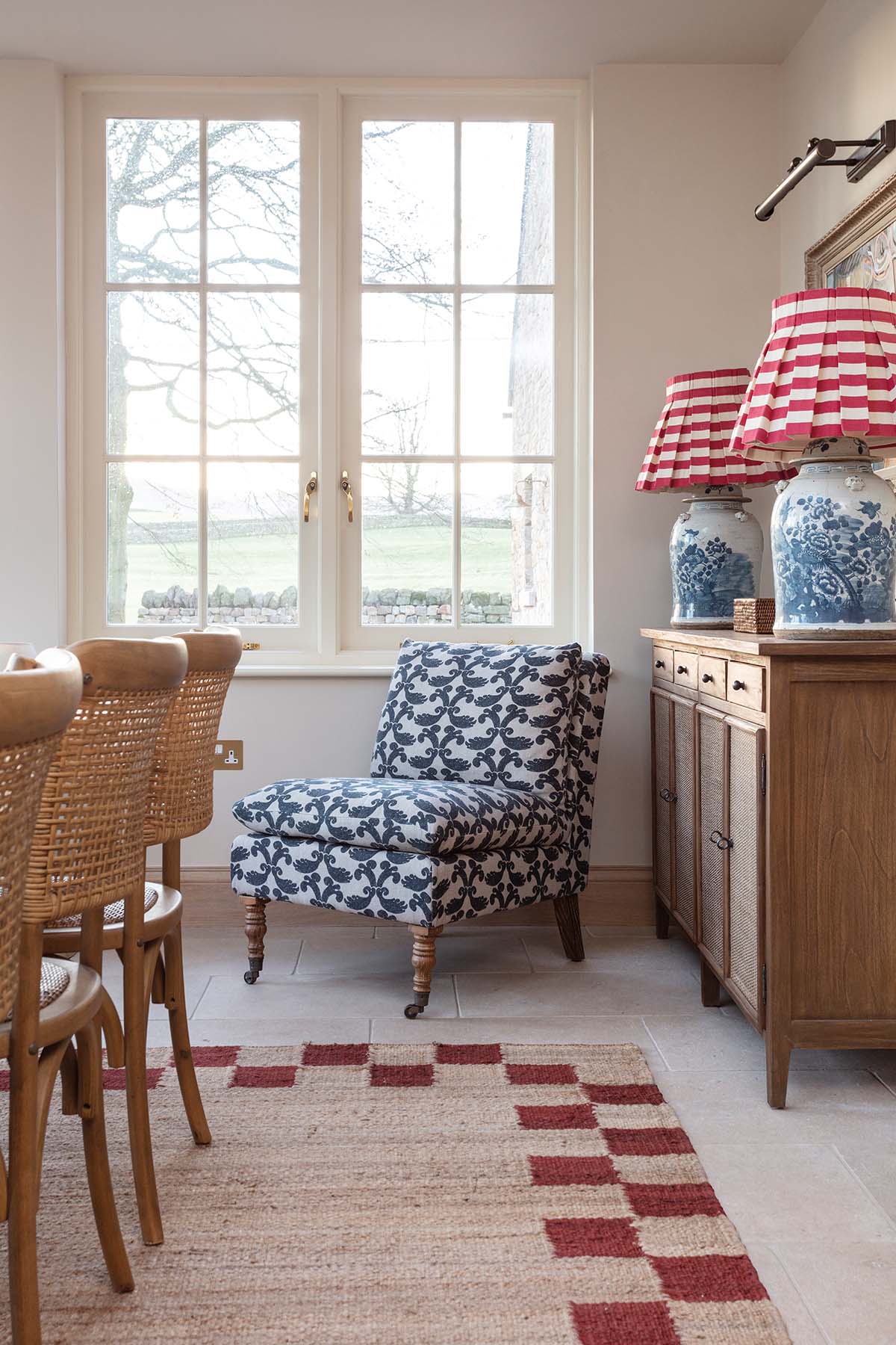
To that effect, the kitchen and dining area is open, with plenty of glass to blur the boundary between indoors and the garden. A rooflight above the dining table pulls daylight into the space, illuminating the beautifully crafted pendants and furniture.
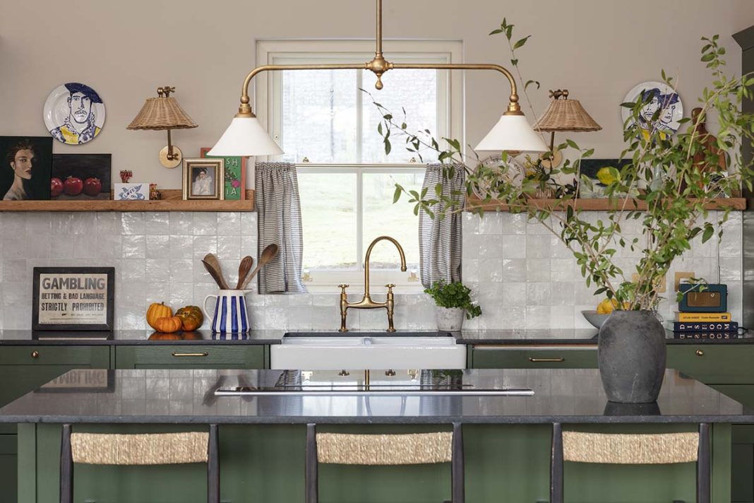
An equilibrium was found in the kitchen; the bones of the room are from Howdens, while more of the budget was apportioned to luxurious finishing touches like the DeVol taps and lighting. Likewise, Zara Home barstools complement the island’s dark Silestone work surface to conjure that sense of quiet curation.
The lounge lends itself to zoned entertaining too; two rooms have been knocked into one, complete with an on-trend archway with dividing curtain.
“It works well if the grown-ups are watching a movie or playing a board game, as there’s space for the kids to still be there but doing something else.”
Alternative Flooring. Emily has dressed the room using IB Laursen bedding and throws, William Yeoward curtains and Chelsea Textiles bedside chest
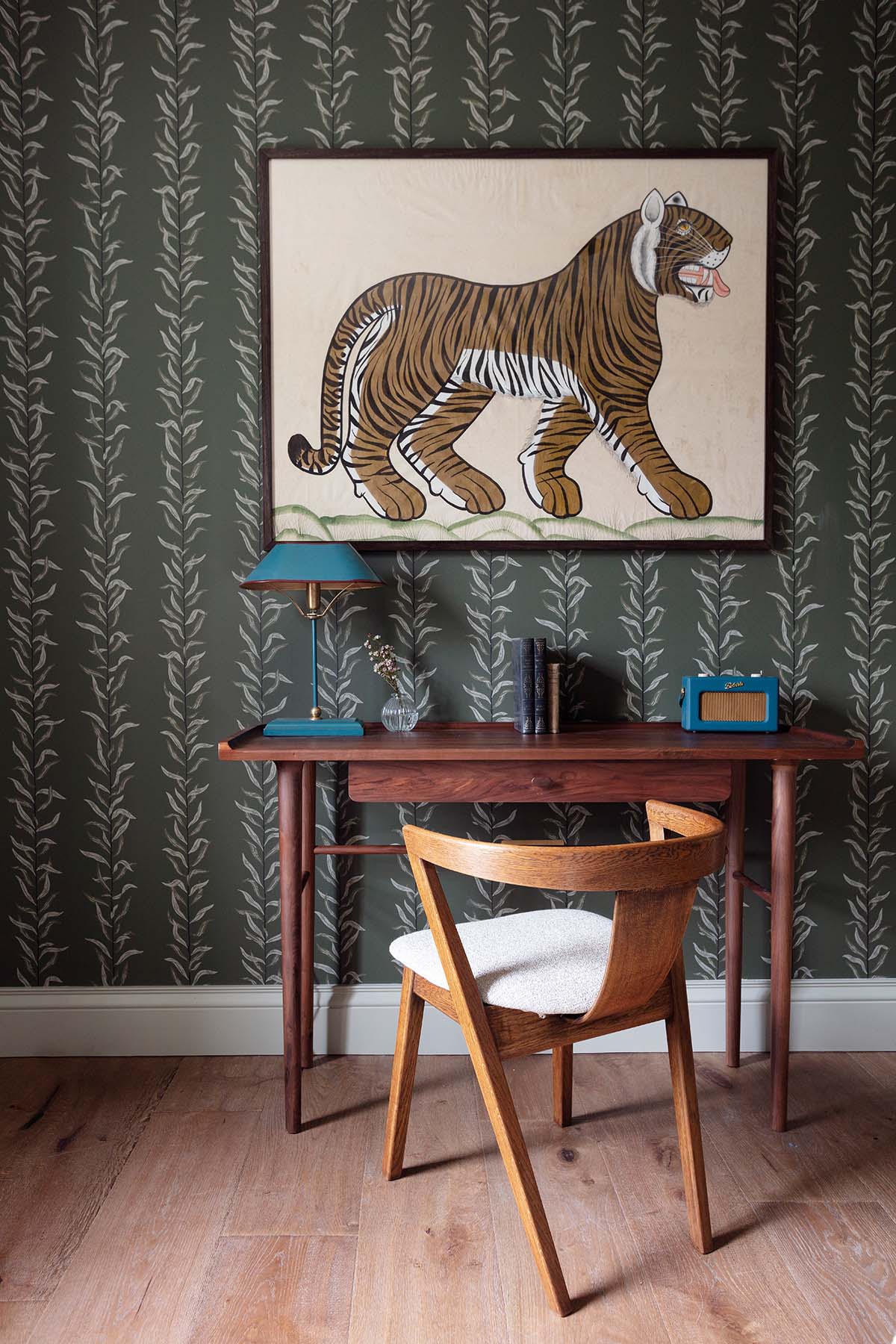
There’s a change in mood in here, too. The palette is darker and moodier, evocative of expensive hotel lobbies or members’ clubs where lighting is low and furnishings are plush.
“I’ve used a lot of grasscloth on the walls,” remarks Emily. “Biophilic design is something that I’m drawn to and these natural and calming textures reflect what’s happening outdoors.”
Each of the six bedrooms has a different character, giving the property the air of a boutique hotel. Colour has been key in these rooms; rich but subdued tones serve as a useful backdrop that feels confident but doesn’t overpower.
“I’ve used warm colours on this side of the building,” she explains. “This is the darker, colder side of the house, so the colour palette was a way to warm it up.”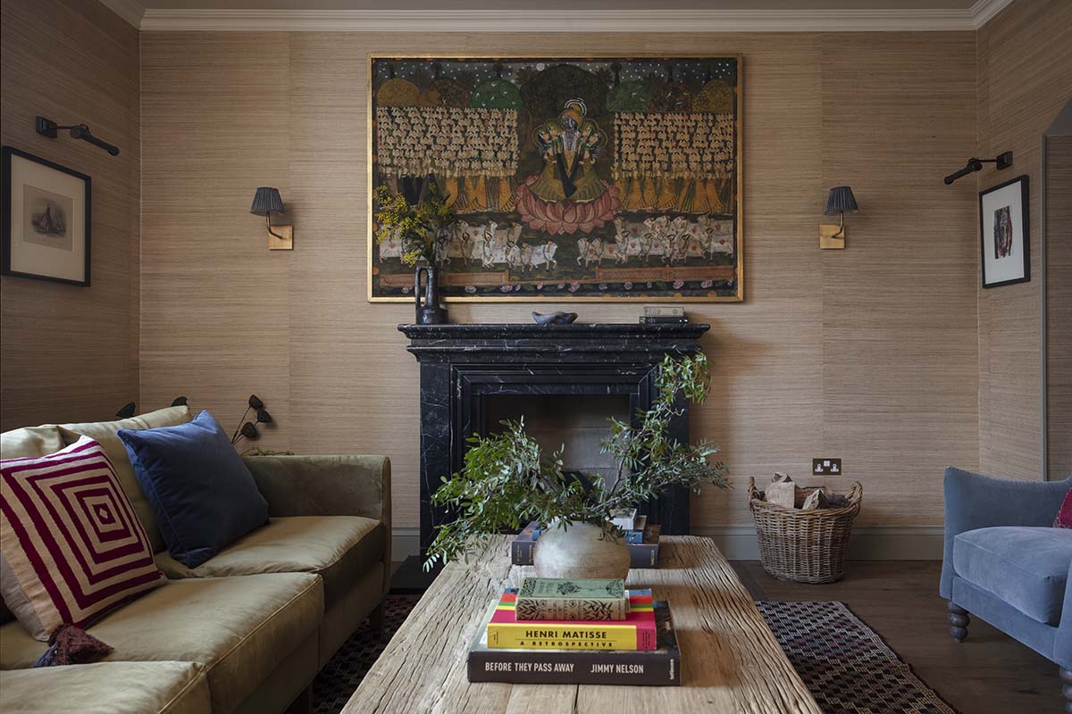
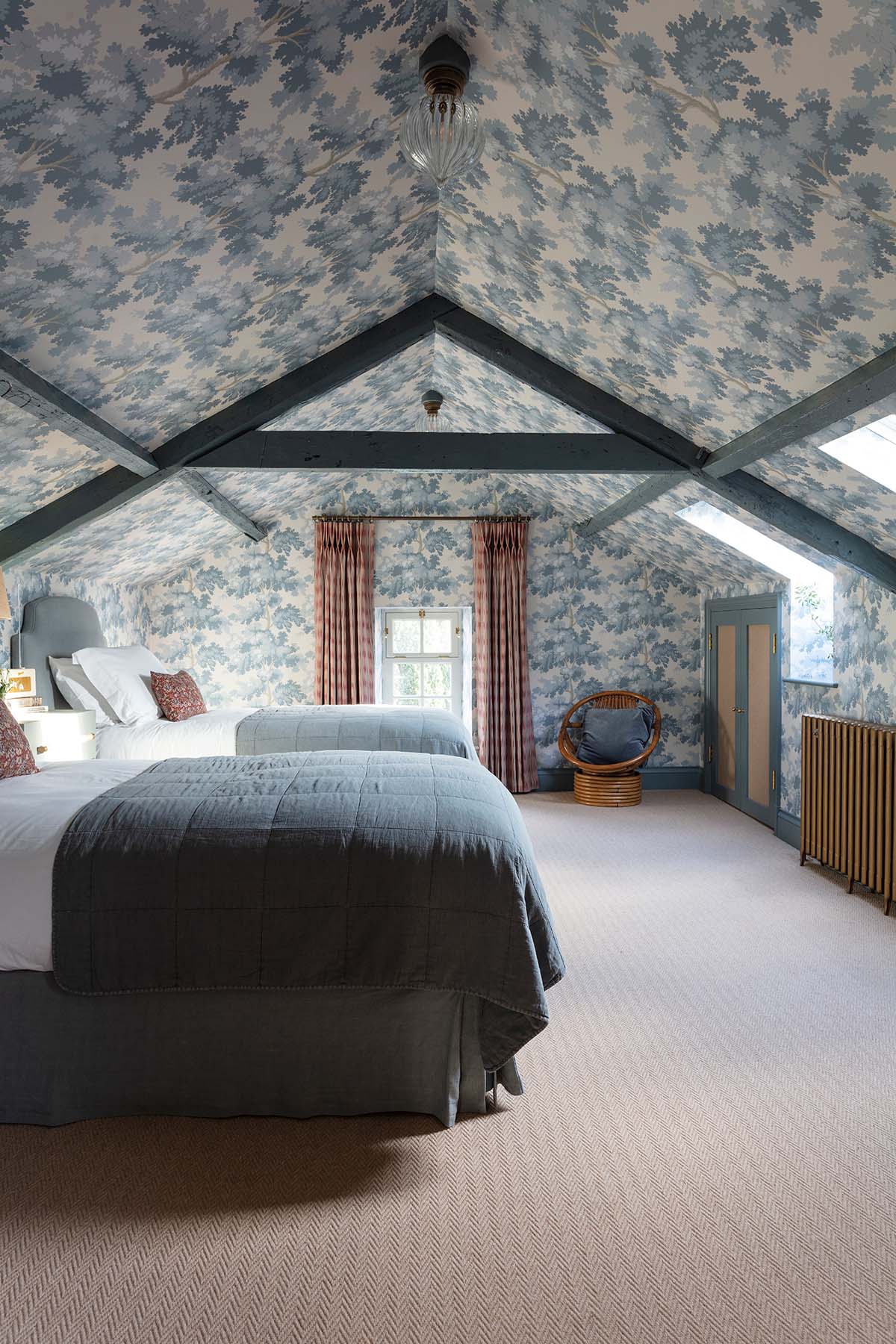
Wasted storage space in the roof has been converted into the kind of attic bedroom that children (and adults alike) dream of. Emily’s starting point here was to “make it feel like you’re sleeping under a canopy of trees”.
Using archival Sandberg wallpaper and exposing the roof beams, it’s a smart design trick to exploit the lack of head space, and has produced a fairytale hideaway.
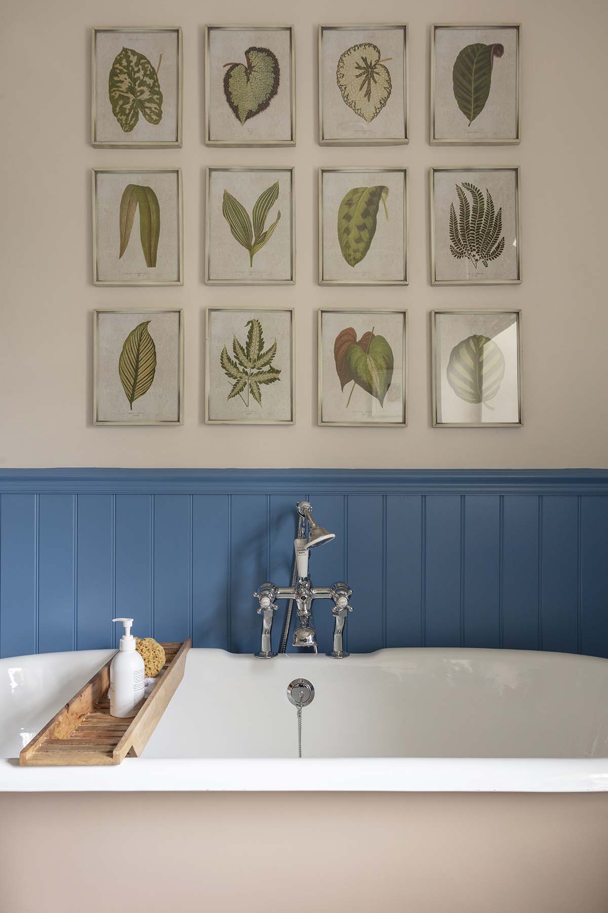
The en-suite bathrooms are just as welcoming, thanks to antique artworks and gentle colours. “I used leftover paint to create a chequered pattern directly onto the floorboards,” smiles Emily.
“The tradesmen looked at me as if I was mad but I think it has worked really well within the scheme of the whole house. “You have to think about what will wear in, not out.”


