


Bold, beautiful and completely unique, this Edinburgh flat’s décor is a homage to the transformative power of paint
Photography Alix McIntosh
Words Catherine Coyle
What A Victorian Flat
Where Merchiston Crescent, Edinburgh
Design Mr Buckley Interiors
Sam Buckley is an artist. Not your regular painter-at-an-easel type of artist, though; he doesn’t do pencil studies or landscapes or self-portraits.
Instead, he uses buildings as his canvas, emblazoning walls and huge spaces with graphics and using colour for maximum impact.
He’s a master at taking a decorative art and showing that it can be all about function, too. He blends design with art to create dramatic interior spaces, and nowhere is that more obvious than in his latest residential project, in Edinburgh’s Merchiston.
His client, Brenda Carey, a senior computer games designer at Rockstar Games, had seen what Buckley had done with his own home and was keen for him to look at ways to inject something special into her traditional Victorian flat.
“The place had good bones – a previous owner had rewired it and the floors had been redone – but it needed to be freshened up and made more exciting,” recalls Buckley.
“Brenda wanted a home that would make people say ‘wow!’ when they saw it.”
The pair began discussing Supergraphics, a favourite book of Buckley’s and one that has helped shape his design ethos. “It was published just after I returned from Milan, where I was doing my masters,” he recalls.
“It’s about graphic design for walls, buildings and spaces and celebrates bold design on an outrageous scale.”
It confirmed Buckley’s belief that decorating spaces – both inside and out – can have a transformative effect on how we live and work. Factor in colour, and the impact can be so much more than simply cosmetic – an idea that increasing numbers of us have embraced as the pandemic unfolded.
“I don’t shy away from colour – it is to be explored and experimented with,” agrees the designer. “Different colours can mean differ-ent things to different people, of course, but my studies in colour theory in Milan have definitely encouraged me to use it the way I do.”

For the Merchiston flat, Buckley was inspired by a fabric sample he’d come across (a striped velvet by French textile house Lelièvre) that in turn informed the colour story he wanted to create.
At the same time as he was working on this project, he was also developing his own rug designs as part of a long-standing partnership with Italian rug company cc-tapis.
Here, he had been playing around with geometric forms, circles and semi-circles, in particular, and working on patterns for his own portfolio. “Edinburgh’s Victorian flats can be big and it is often difficult to find a rug that fits.
I suggested making something bespoke for the main living space. With three different pile heights and lots of textures, it’s very special. It also grounded the design scheme of the whole apartment.”
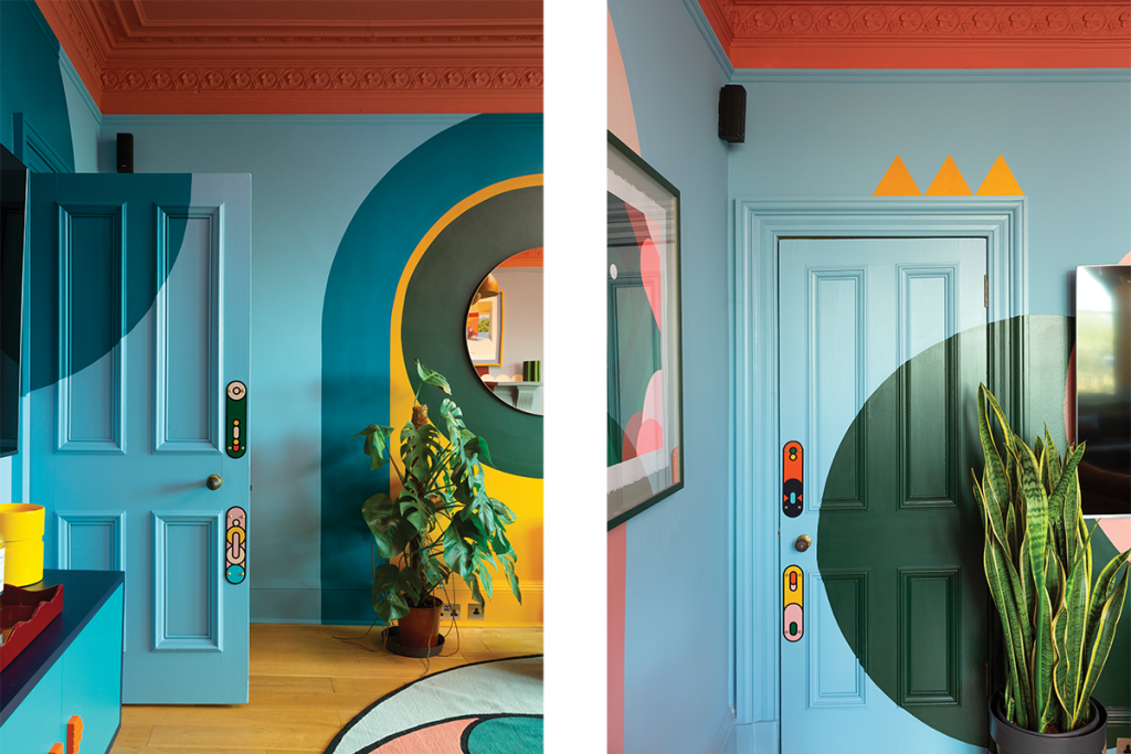
The walls are Buckley’s canvases. Far from being random shapes daubed onto the plaster, these graphics are carefully considered and deftly plotted designs that seek to give the period property a new, more contemporary feel.
“I work in 3-D and create renderings of the designs I want to make. These were all done on screen first, where I mapped them all out.
Then, using a pencil, string and a good old compass, I drew the shapes directly onto the walls myself. That took the pressure off the decorators, and allowed them to concentrate on filling out the designs.”
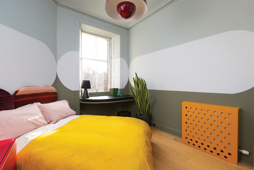
Where many interior designers would have brought the period features to the fore, Buckley’s scheme does the opposite, allowing his ideas to take centre stage instead.
“There was a certain amount of wanting to ignore the architectural details and just get the big graphics working to balance the colour and shapes,” he explains.
“In that way, it created a thoroughly modern space where classical detailing now takes a back seat.”
Buckley’s motifs are not unique but the way he manipulates them is, producing something wholly distinctive whether in form or colour, or both.
Devising that extra layer of originality is what he does best. When he saw that a replacement ceiling rose was yet to be installed following a leak, for example, he viewed this as an opportunity to come up with a bespoke piece that would add depth to the room’s scheme while playing up the geometric styling.
In collaboration with Chalk Plaster Design, he devised an alternative ceiling rose that has been painted in a pale pink to stop it getting lost in the space.
Likewise, handmade enamel push-plates on the doors mimic the geometry in the bespoke rug, pulling out the modernist motifs and the cool colour palette that gives the space cohesion.
“We had around nine different colours in the end – a mix of complementary tones and contrasting colours, as well as groupings within colour spectrums,” recalls the designer.
“It was just regular house paint that was used, each colour mixed to my specification by Johnstone’s Paint. It’s certainly instinctual, like the way an artist knows when it’s time to stop and that a piece is finished.”


