Designer Beata Heuman has transformed this Victorian terrace in London into a distinctive family home bursting with charm and colour
Photography Simon Brown
Words Natasha Radmehr
What Victorian terraced house
Where Shepherd’s Bush
Architect Studio McLeod
Interior designer Beata Heuman
Being commissioned to renovate the home of an esteemed industry peer is possibly the highest praise an interior designer can get. Beata Heuman was certainly flattered when the owner of this London terraced house, an expert in the world of home interiors, invited her to do just that. “It was such a compliment,” smiles Heuman, designer and author of Every Room Should Sing. The owner and his wife wanted their home to have a blend of personality and practicality, so there’s little wonder the Swedish-born, UK-based designer was top of their list for the job. Heuman’s playful, imaginative style – honed during her early career working for the eccentric interiors powerhouse Nicky Haslam – has made her one of the country’s leading tastemakers and most sought-after designers, with a Rolodex of A-list clients that includes the eminently stylish supermodel Adwoa Aboah. The designer’s knack for pairing theatrical, colourful flourishes with pragmatism makes her spaces as liveable as they are photogenic. Who wouldn’t want their home to be energised by the Heuman touch?
The designer derives as much pleasure from the creative process as her clients do from admiring her work, and she was especially excited to get stuck into this project. “I really like the architect involved, Duncan McLeod from [Londonbased practice] Studio McLeod. He’s great with light, creates interesting sight-lines and is very modern, which is a style of architecture I wouldn’t normally gravitate towards,” she says. “But that’s exactly why it worked. The client wanted me to pull in the other direction and humanise the spaces. The combination of our two different approaches is what makes this home so successful.”
From the outside, the four-storey house is typical of the tall, gangly Victorian buildings stitched like sardines along the streets of Shepherd’s Bush. “It’s nice, but it’s not the kind of house you stop and notice when you walk by,” says Heuman. But don’t be fooled. This home is what some might refer to as an architectural mullet: longer at the back than would first appear. “When you walk inside, it looks very different to how you’d imagine – it’s a lot bigger. Right away you see an extension at the back with a large, open space where the kitchen and living area is. I love that element of surprise.”
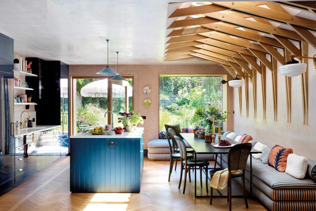
The clients wanted this heart-of-home space to be equipped to handle the daily demands of a busy family life; a place for cooking and entertaining friends and family, where the little
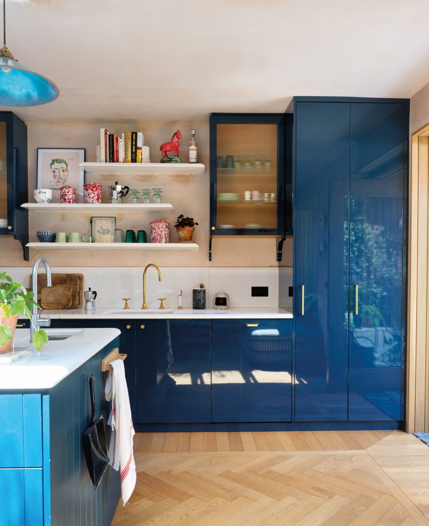
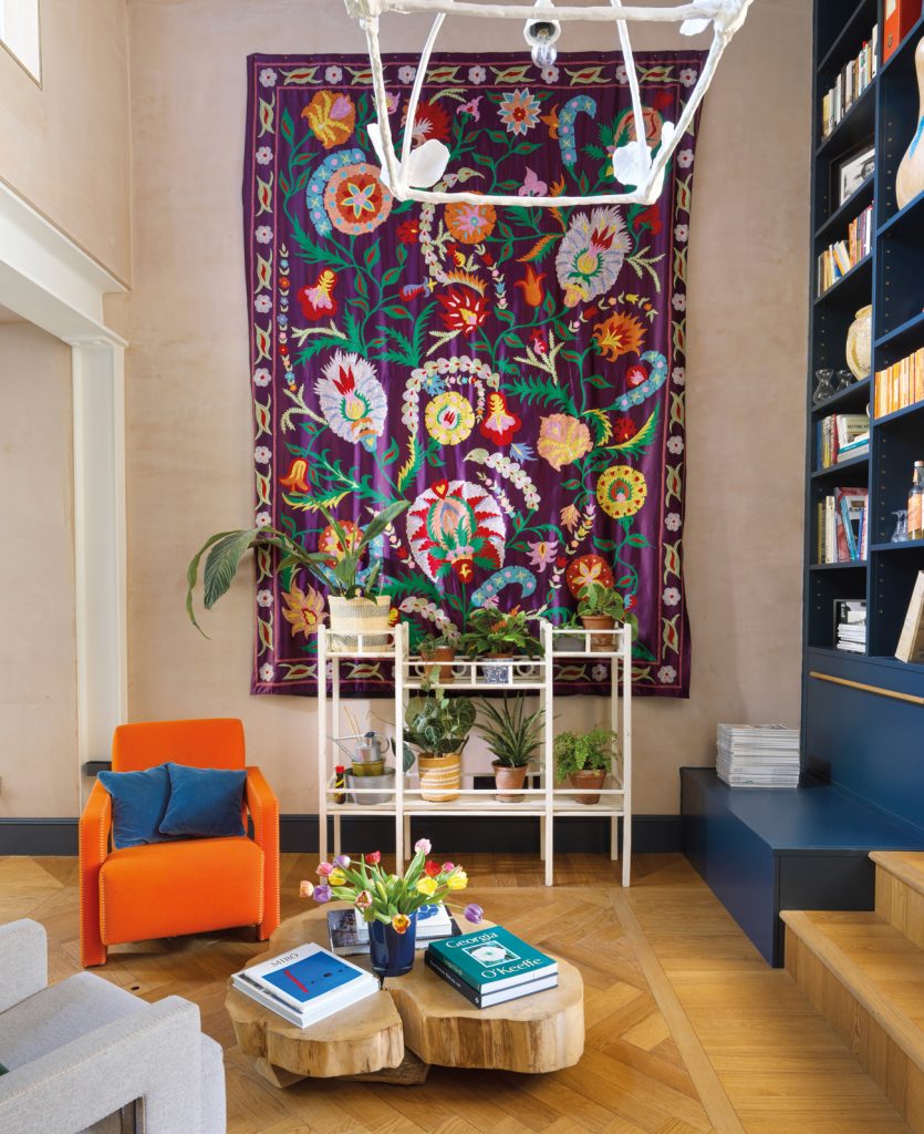
ones could run around with ease. The generously proportioned kitchen, dining and living area flows out to the back garden and has a relaxed, organic feel. A burst of greenery is visible through the windows, and oak has been used judiciously in the parquet flooring and lattice skylight structure, softening the boldness of the glossy teal cabinetry. You won’t find the pale, weathered salmon wall colour on any paint charts, because it is raw plaster which has been sealed.
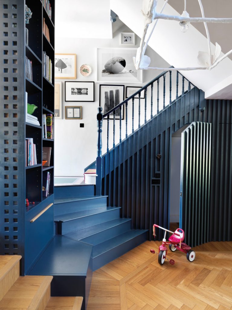
Heuman isn’t afraid of contrasts. She embraced the incongruity of the old and contemporary architectural styles that meet in this home (“I love how the traditional Victorian balustrade on the stairs merges with the more modern, straight spindles below,” she says).
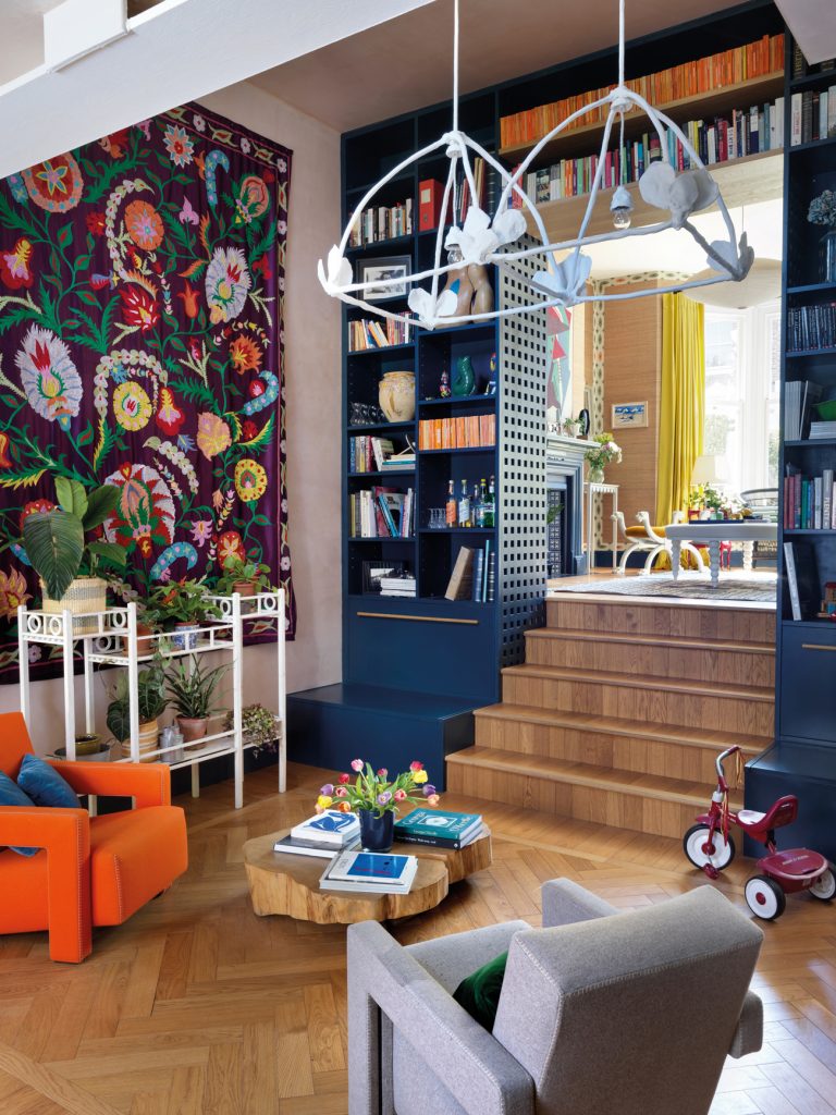
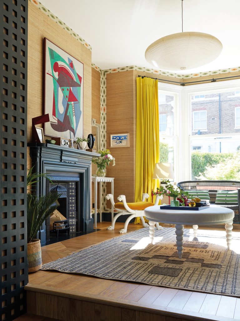
The ground floor is split over two levels, with steps leading from the open living space to a more formal reception room, so the interior designer seized the opportunity to give this space a different feel. “It’s more elegant and grown-up, with canary-yellow silk curtains that make it feel quite precious,” she explains. But there’s still a spirited sense of fun. The woven, straw-coloured seagrass wallcovering is vivified by a kitsch patterned border that traces the skirtings and wall edges, while a pillarbox-red floor lamp stands cheerfully behind the sea-green sofa.
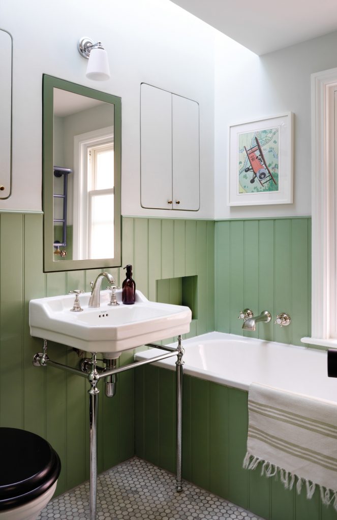
Throughout, neutrals provide a soothing anchor for saturated colour pops. “I work a lot with blues and greens, because they’re vibrant and uplifting but ultimately restful,” says Heuman. “These colours create a sense of calm, which is something the clients wanted for their home.”
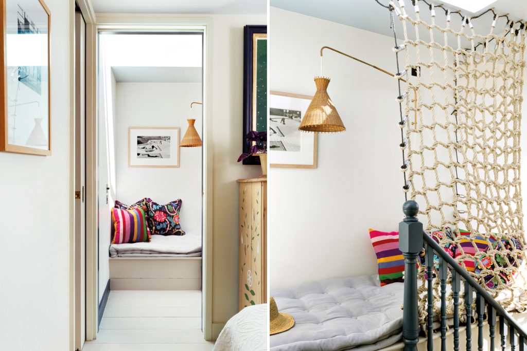
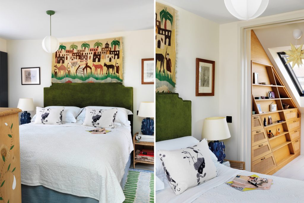
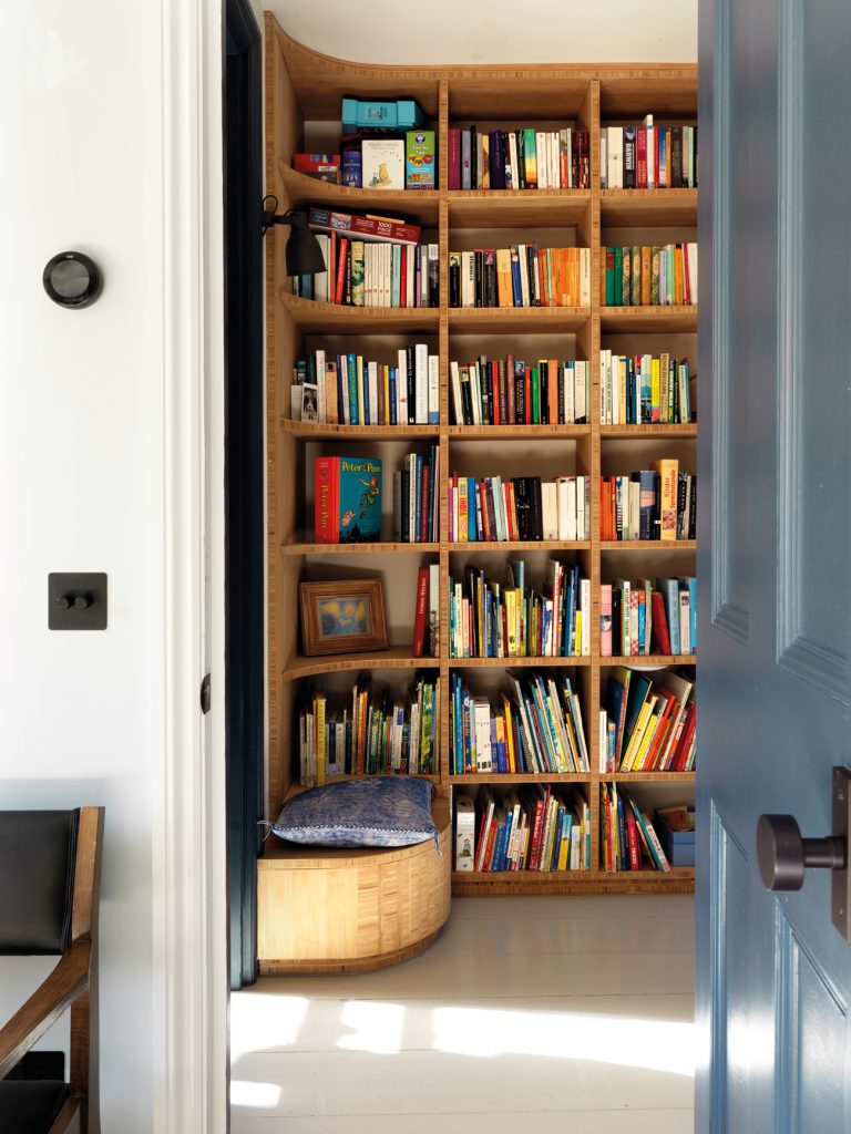
For many of us, serenity comes from an uncluttered environment. And though Heuman’s mix-and-match aesthetic somewhat belies her Scandinavian roots, her ability to make any room feel streamlined and organised does not. She thinks constantly about where things are stored, making design decisions based on how her clients actually live. This home has been arranged thoughtfully for busy working parents. There’s hidden storage in the entrance corridor for outdoor paraphernalia; the seats at the base of the sitting room’s bookshelves double as a place to stuff toys and shoes; the angled chimney stack adjoining the master bedroom has been fitted with nifty oak shelves bearing radio-weave drawer fronts. It’s the kind of place that would inspire even the untidiest of us to give the KonMari Method a go.
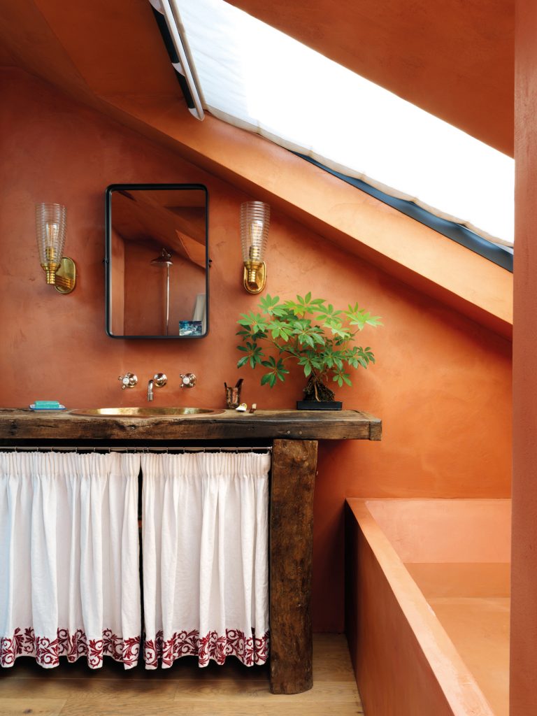
As much as she has a signature style, Heuman is always experimenting with new techniques. She finds that risks invariably pay off. The master bathroom in this case, for example, was different to any she’d designed before. Rather than swathing the room in high-shine tiles and clinical sanitaryware, she covered the walls and bath in terracotta-tinted Béton ciré, a waterproof micro-concrete paste. The result is an earthy sanctuary that transports its inhabitants to the warmth of a rustic Mediterranean villa.
Heuman is as likely to scroll through Instagram for inspiration and ideas as she is to delve into the archives of design legends such as Jean-Michel Frank, Steven Gambrel and Madeleine Castaing. She’s not that fussed about following trends, but concedes it’s difficult to ignore them entirely. “I always want to do original work, obviously, but nothing is really that original. We’re all reacting to what we see around us; nobody is walking around with blinkers on, and most ideas are reiterations of something that has come before,” she reflects.
“It’s a bit disappointing, sometimes, to get excited by an idea that feels really new only to discover that it’s a bit of a trend. Sometimes there’s just something in the water, and people are turning in the same direction at the same time. But it’s good to constantly be pushing to evolve these ideas. And hopefully we’re ahead of the curve sometimes.”


