Still working from home? We’ve got some inspiration for your space
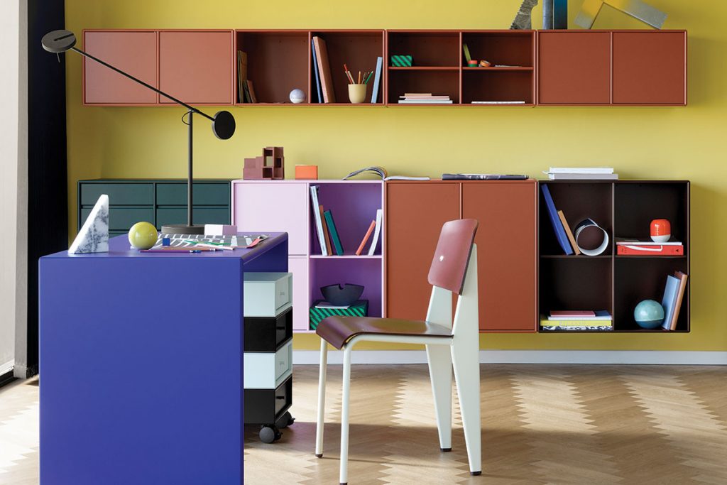
Home offices have often been considered a fairly luxe addition given the out-dated concept of what an office looks like. If you’re picturing an overbearing mahogany desk and rows of dusty books in the background, then you might be right in thinking you don’t have the space for one. However, with a bit of imagination, a small nook can become a comfortable place in which to work.
Being keenly aware of how important that is right now, more than ever, it’s worth taking the time to figure out precisely how you’d like to use your space. If convenient, set up the kitchen counter with your laptop, but if you know you’re a serial spreader (aka papers everywhere by 10am) then be realistic. It could be as simple as putting up shelves to tidy away file holders and slot your laptop out of sight; or take a cue from some of the designers featured in this post and create a designated area for working.
If you have a creative job, you’ll want a space that echoes the sentiment. A good option is a colourful setup with a mix of open and closed modular storage to display and hide away in equal measure. Colour blocking is especially effective, allowing the room to feel inspiring but still professional. Though you’re there primarily to work, your office should bring joy, make you smile and motivate you. Playing with colour and texture is actively encouraged.
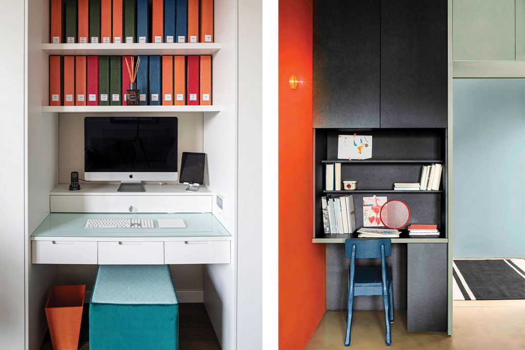
We’ve all been told ‘any cupboard can be a home office’, but how do you actually make that a reality and not make it feel a bit claustrophobic? The answer is careful planning that incorporates heaps of light where possible. Kelling Designs (above left) shows how to design a little nook that’s cheery and functional. The clever colour combination is echoed in the small bin and padded cube stool, both of which are easily tucked under the desk and out of sight. The built-in shelves make use of the width and the computer monitor is raised to minimise back and neck pain in the long run. This raised platform doesn’t go to waste, it hides a deep drawer. Similarly, the desk itself has three generous drawers for overspill. The finished result is a clutter-free area which feels much larger than it is.
Don’t just rely on white, though, as Dulux (above right) proves that a darker workspace can be just as rewarding. The deep hue might seem daunting, but it clearly marks this area is as its own zone within a larger room. The space is stylish enough to leave on display, so no need to worry about custom cupboard doors.
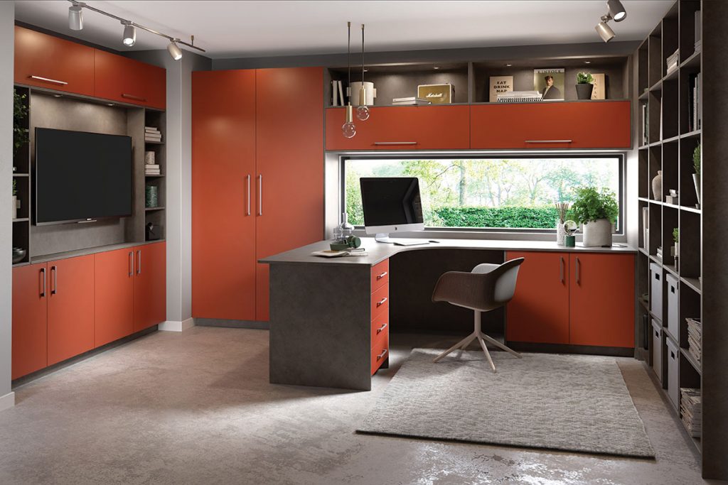
If you’re a multi-tasker (needing to keep an eye on the sprogs while you work) consider an integrated work/living space. This smart red arrangement from Ashley Ann (above) fits seamlessly into a kitchen by extending worktops and allowing an additional overhead cupboard or two to stash work accoutrement. Tuck the chair in at meal times and you’ve also got an extra bit of workspace to prep dinner on.
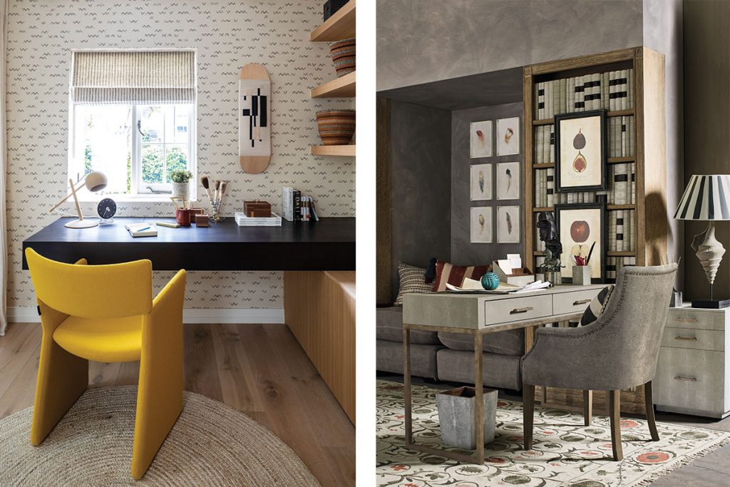
Or, use a desk as a room divider. There’s no rule that says furniture has to be squashed up against the walls; in fact, make a space look more sophisticated by experimenting with the floorplan. OKA (above right) pivots the desk so it faces the main living area, with a small cabinet for paper on the right, and generous drawers in the desk itself. By tying the grey hue of the desk and chair in with the wall colour and larger sofa, the small office doesn’t look out of place.
One big benefit of a home work space that should not be ignored (aside from the short commute), is the ability it allows to inject personality. Whereas in the office you may be constricted by health and safety rules, or a need for cohesion, at home you can go wild. If colour is your thing, paint away. If you’re a caffeine fiend, set up an elaborate coffee station in the corner. Even if you like the most minimal of aesthetics or are severely lacking in space, it’s still your choice what art goes on the wall, or what kind of desk chair you settle into. Make it your own, and make it a place you love to be


