A tiny budget and a tight schedule left no room for error in this vibrant, clever makeover
DETAILS
What A second-floor tenement flat built in the late 1800s
Where West end of Glasgow
Interior designer Catherine Henderson Design
Photography Neale Smith
Words and art direction Gillian Welsh
Steal this project’s style here
Buying a house and getting married are supposed to be two of the most stressful things we can do in life (as well as two of the nicest, of course), so you’d think no one would attempt to do both at once. But Kevin and Sarah Martin were in love – with each other and with a property that had come up for sale in the west end of Glasgow – and it just so happened that the stars aligned, the two events coincided, and they went for it.
The flat was a knockout: a south-facing red-sandstone tenement, two bedrooms, with high ceilings and glorious original features. The couple already knew it pretty well, since it had previously been owned by friends. Both had grown up in period properties and had developed a love of and respect for the craftsmanship that goes into cornicing, ceiling roses and well-proportioned rooms.
As well as its high-grade architecture, the flat also had an unbeatable location in one of the city’s most revered postcodes. The quiet, leafy street has the best of the west end on the doorstep – the vibrant Byres Road is half a minute’s walk away, with Hillhead subway station just a few yards beyond that. Two famous parks – wide open spaces for little Bowie, the couple’s beloved Maltese terrier, to play in – are within strolling distance.
The interior was in good condition, with a freshly renovated bathroom and recently laid American black walnut flooring in the hall and living room, but the newlyweds were keen to put their own stamp on what was, after all, their first marital home. They invited interior designer Catherine Henderson to come along and take a look at it.
She, like Sarah, had been brought up in a tenement flat, and as the three discussed possible ways to overhaul the living spaces and update the decoration, sparking ideas off one another, there was great chemistry between them. Henderson could see the potential that could be unleashed here, but there were two big constraints that she would have to work within: timescale and budget.
The brief was straightforward: it had to be as beautiful as possible for the least amount of money. There could be no unnecessary splurging, and some serious lateral thinking would be required by the designer to keep costs down. As for timescale, the couple had arranged short-term rented accommodation for themselves so the work could be completed unhindered. But they couldn’t afford to stay away for long. The race was on.
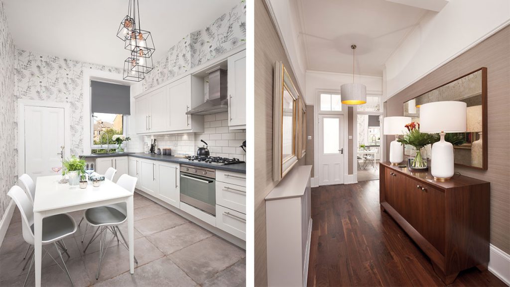
Henderson quickly figured out what could stay, what had to go and what needed to be added. The kitchen, for instance, looks completely rejuvenated, with an impact far beyond the money that has been spent on it. Rather than forking out on new units, it was decided simply to paint the existing cabinetry.
Dark cherrywood fronts are now hidden below a fresh coat of paint (Farrow & Ball’s Ammonite), giving them an instant update. The walls have been papered in Designers Guild’s lively Acanthus Graphite, its hints of green complementing the fashionable Dar pendant light and BoConcept table.
It’s not just surface improvements that have been made here, however. The room had an alcove that was really an area of dead space serving no particular purpose. Henderson had the ingenious idea of walling it up and adding a doorframe to disguise it, creating a pantry-cum-storage cupboard.
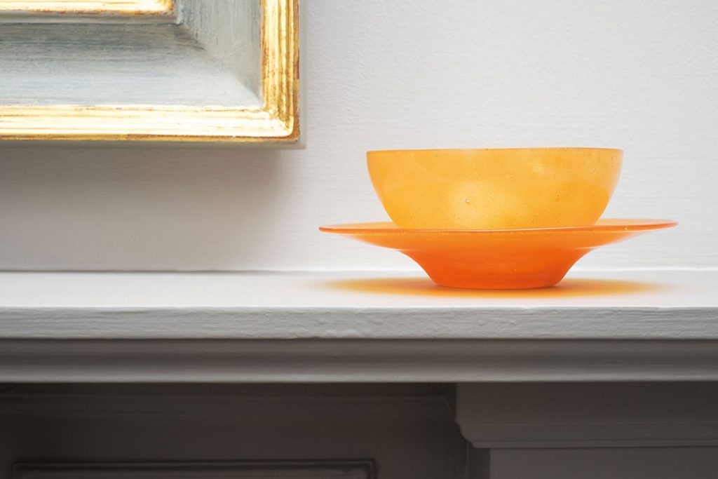
Lighting, shelves, a wine-rack and a pulley were then installed. It’s a practical and elegant solution that has immeasurably improved the kitchen. Not only has it cut down on clutter (the hoover and washing basket now have a dedicated home, and there is ample room for storing food and small appliances), but it makes the room feel much more balanced and complete.
This was the first room to be tackled and its success spurred owners and designer on. Next up: the floors. The black walnut was durable and good quality, but being in high-traffic areas such as the hall meant it had seen better days. Aable Wooden Floors was instructed to bring it back to life through meticulous sanding and varnishing. “I have to confess I wasn’t keen on it at all at first, but it looks absolutely wonderful now,” admits Henderson.
Similarly, reusing the curtains that had been left behind as part of the sale was, she says, one of the biggest bargains. “I wanted to keep as much of the budget as possible for new additions, such as rugs and lighting. The curtains in the sitting room and the master bedroom were neutral, so were ideal to keep.”
The short and snappy overhaul continued apace, with traditional features being enhanced by the addition of elegant, modern touches. “The flat was completely liveable at the start – it was just a bit underwhelming,” recalls the designer, who also took on the role of project manager. “Kevin and Sarah are very stylish people, and I wanted that to be echoed in the décor.”
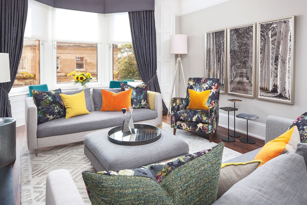
The bright living area, with its mix of chic seating and tables and interesting groupings of books and objects, is a good example of this. This is a polished space but it’s not some lifeless showhome; it’s lived-in and comfortable and mirrors the couple who live there. Understated white Lotus lamps go with the ornamental pears on the mantelpiece and the cooler, silvery tones of the Designers Guild rug.
A place to sit and relax while taking in the buzz of Byres Road has been created at the bay window: a pair of smart Julian Chichester chairs, upholstered in Designers Guild’s luscious Varese Viridian velvet, flank a table on which to rest coffee or aperitifs. “It’s a lovely room. The floor has been transformed, but the furniture really helps too,” says the designer. “The TV unit with top shelving custom-made by Sam Paton looks especially good.”
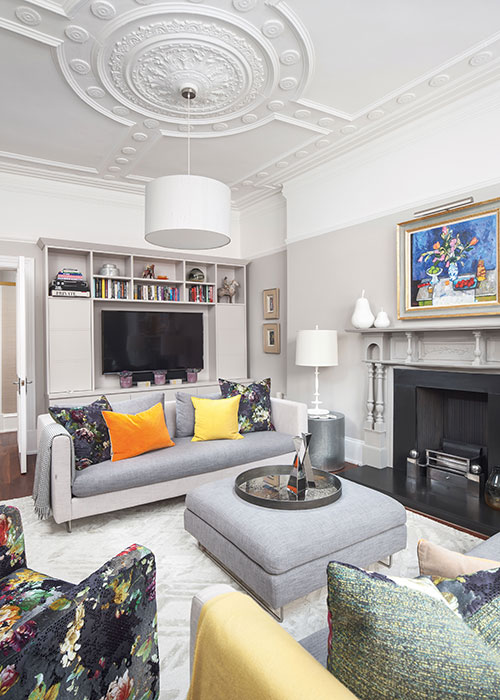
The fireplace, meanwhile, was dated and didn’t work; Gibson & Goold had installed cast-iron reeded panels and a fire basket in Henderson’s own home, and when she showed it to her clients, they wanted the same look. “It was a messy job, tearing out the hearth and its surround, opening up the whole void and replacing the old tiles with new slate,” recalls the designer. “But look at it now: Euan Goold has transformed it into a sleek, timeless focal point that is worthy of this beautiful room.”
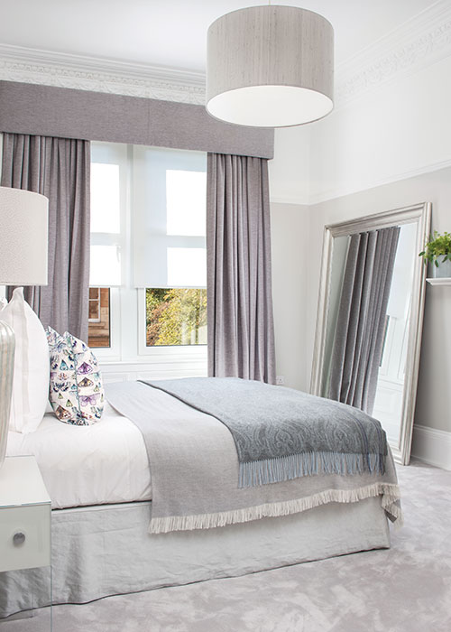
There was no time to stop and admire the progress so far, as the bedrooms were next up. (“This whole job was one of the quickest turnarounds I’ve ever been involved in – just six weeks from the first consultation to completion!”) The smaller of the two bedrooms has been refashioned into a dressing room, and is now a tranquil, clean space that is free of clutter, thanks to full-height wardrobes on one side of the room, built bespoke and installed by Sam Paton Furniture. Fitted drawers, shoe racks and overhead storage conceal Kevin’s colourful cravat habit and Sarah’s shoe and bag collection.
Building on the sense of calm, a Zoffany paper, Half Silver, was chosen for the walls, with a luxurious carpet by Catherine Henderson Design underfoot. This palette brings composure into the overall scheme, so there was scope to insert pops of bright, bold colour – orange, teal and yellow – to reflect Kevin and Sarah’s vibrant and design-conscious personalities. A Joseph daybed upholstered in Designers Guild’s heavyweight Pavia velvet in Delft blue, along with brushed-cotton cushions (Savory Canard by Manuel Canovas) and subtle herringbone curtains in Bangor from Osborne & Little’s Pembroke range, all contribute to this harmonious blend.
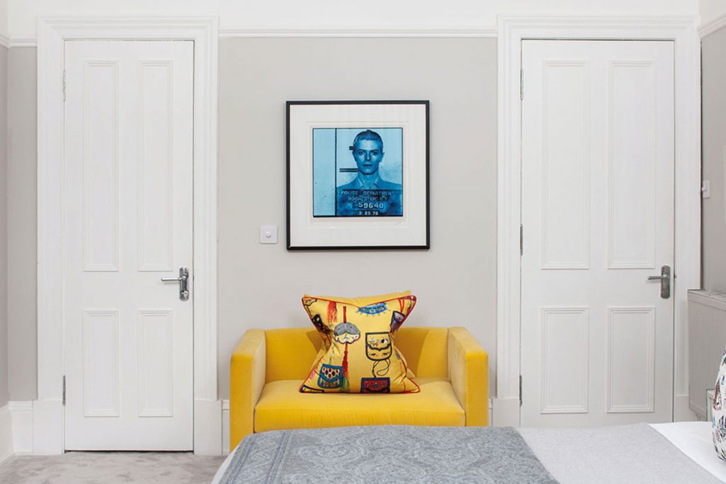
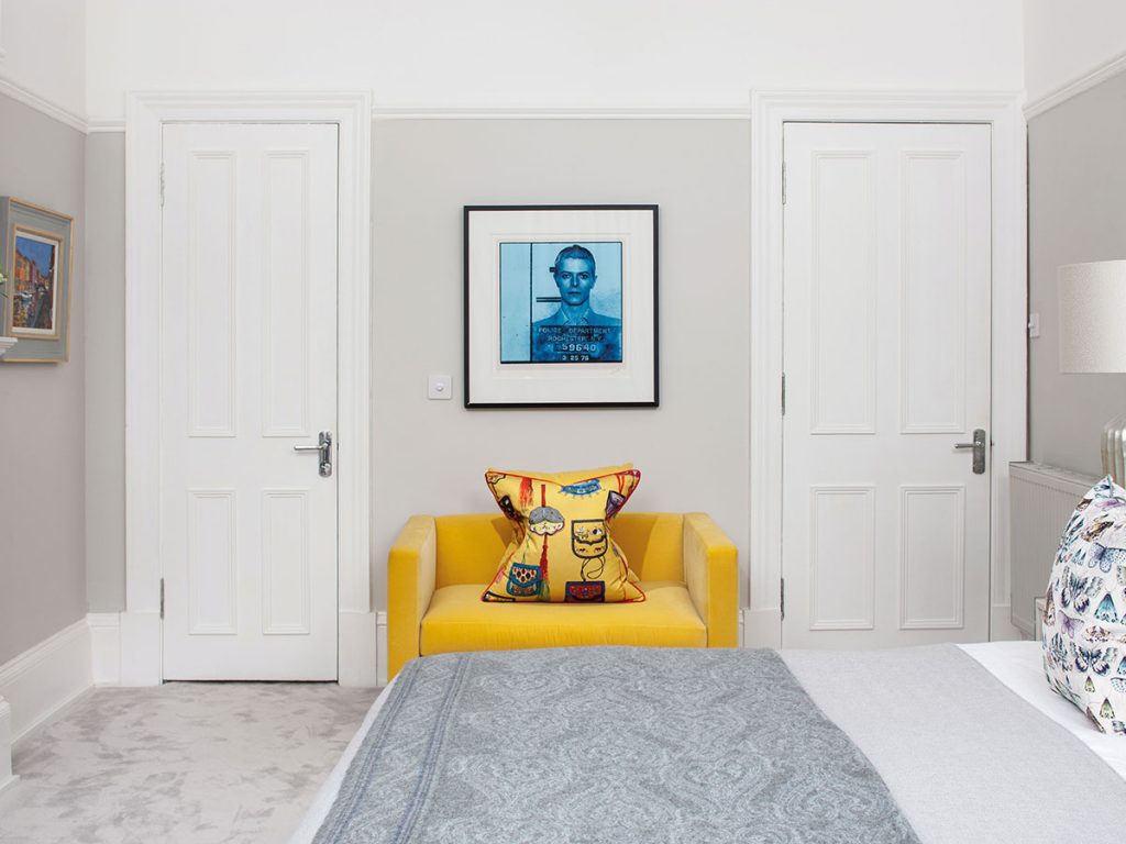
More colour was added throughout the apartment in the form of the owners’ diverse collection of art. Original paintings by Archie Forrest and Kirsty Wither hang alongside a cool selection of prints and drawings. In the predominantly pale bedroom, there’s an unexpected dash of Klein blue from the David Bowie limited-edition signed print, along with a burst of sunshine radiating from the slim Quadro chair and Manuel Canovas cushion.
The fireplaces in both the bedroom and the sitting room sit on angled walls, which were very obvious when the rooms were unfurnished. Henderson came up with two different ways to disguise this: a very symmetrical arrangement of furniture in the sitting room draws the gaze away from the angle, while painting the bedroom fireplace the same colour as the walls (and making a feature of the headboard and bed) achieves the same goal.
The budget and time restrictions turned out to have an unexpectedly positive impact, in that both designer and owners were obliged to work with what was already there. “Everything we’ve done enhances the flat, bringing out the best of the original features,” agrees Henderson. Collaborating with skilled trades and harnessing the imagination of a genuinely creative interior designer has been essential to the success of the project – truly a match made in heaven.


