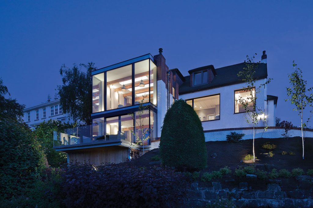
Glazing the back of this house remodelled and extended this family home in East Renfrewshire
DETAILS
What A remodelled and extended family home
Where East Renfrewshire
Architect David Blaikie Architects
Contractor Queens Park Builders
Structural engineer David Narro Associates
Photography David Barbour
Words Catherine Coyle
Social media: friend or foe? For interior design devotee Arantza Elosua, it proved to be the making of her very special house on the outskirts of Glasgow. It’s how she found a suitable architect, the way she communicated during the build process, and it now provides a record of the work and dedication that has been poured into her family home – the results of which have seen her shortlisted for a prestigious interior design blog award.
A modern-day interpretation of before-and-after pics, Elosua’s Instagram page (@homefunkyhome) is a frank testament to the hard graft, stress and ultimate reward of creating a truly unique place to live.
Elosua, a linguist and translator originally from Barcelona, had been neighbours and social media ‘friends’ with Edinburgh architect David Blaikie before work commitments meant she and her family had to swap the capital’s Stockbridge for East Renfrewshire.
The self-confessed urbanite was initially wary of moving to the suburbs, but the quality of the house she found in Whitecraigs, the abundance of green space that surrounds it and the friendliness of the locals made it an easier transition than she’d anticipated.
“We thought at first about buying in Bearsden or Glasgow’s west end, but then we looked here in Whitecraigs,” she recalls. “Once we’d made that decision, our search narrowed to just three properties and we eventually settled on this one.”
The inter-war villa was in a good state of repair – its render walls and red-brick detailing had been beautifully preserved. But the interior, with its heavy panelling, lack of light and timeworn conservatory, was out of kilter with the way this family lived, and it needed attention.
The pragmatic Elosua knew she could save money by demolishing the house and starting from scratch, but a long-held hankering for a period property led her to find another way, and that’s where David Blaikie came in. “I’d loved David’s work for a long time and was aware that he did a lot of conservation work,” she recalls. “We got the keys on 4 August 2016, and the architects were here the following day!”
Initially, the four bedrooms and three bathrooms were remodelled before any work to the extension began; this allowed the family a comfortable on-site living space while the bigger works were taking place. The Arts and Crafts-style villa is not listed but it is in a conservation area, so when they were making design decisions, Blaikie and project architect Michael Nelson put a lot of emphasis on updating the house without erasing the past.

“Our brief was to remodel the ground floor to create a suite of living spaces that flowed well but which could be closed down if necessary,” recalls Blaikie. “We were to design these rooms to take advantage of the extraordinary, far-reaching views over Greater Glasgow, improve the entrance hall to make it feel brighter and more open, update the kitchen, and modernise the electrics, lighting, heating and decoration.
“We also were tasked with finding a way to link the house to the back garden, which sits a full storey lower thanks to the steeply sloping site. The family required a working transition from house to garden that would let the children move easily between the two.”
Substantial alterations to the ground floor have dramatically improved the internal layout. A disused chimney breast was removed from the reception hallway and a skylight was inserted, utilising a void to great effect and in the process creating a warm and welcoming entrance.
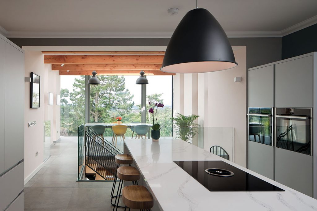
Beyond the hallway, the kitchen now opens to the extended part of the house overlooking the back garden. The old Victorian-style conservatory (which sat on stilts) has gone, and in its place is a dining room whose frameless glazing makes it difficult to see where the indoors ends and the outdoors begins, just as an infinity pool does.
Underneath this dining area, in the previously dead space that had been left below the overhanging conservatory, is a new garden room. It is accessed via an open steel staircase with a glass balustrade that capitalises on the new light from above, and the connection to both the main body of the house and the outdoors is much more successful.
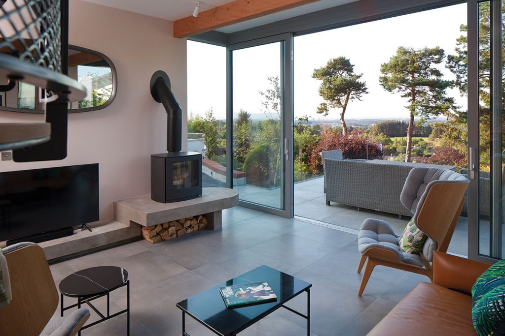
“The entire north elevation of the extension is a floor-to-ceiling frameless triple-glazed bay window that serves the upper and lower levels so the extensive view can be appreciated to the maximum,” explains Blaikie. “We wanted to create bright and airy spaces that would be habitable and comfortable throughout the year, so we had to get the balance exactly right between the glazing and the rest of the interior. The highly insulated roof helps with this.”
The architect suggested inserting exposed timber beams in the dining room to provide warmth and give a perspective on the scale of the windows, and to connect with the colour palette that Elosua was developing for the rest of the house. “I really like raw materials such as concrete, as well as curved edges and pops of colour,” notes the novice designer, “but I also love that the extension looks like it belongs to the building.”
Blaikie and Nelson spent a long time examining the way natural light enters the house, harnessing it to enhance their design. Three linear cupolas, for example, collect sunlight over the roof of the house; these are integrated between the roof structure and incorporated into the vertical support elements on the east and west façades of the extension.
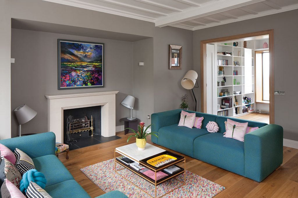
Likewise, by opening up the wall between the original formal dining room and the drawing room, they created a library nook that is centred around a deep-framed window seat and bespoke shelving; opposite the window are new concealed doors that give versatility between the library and the front living room.
Getting stuck into the decoration, Elosua admits that living amid renovation works for three years (and acting as project manager) was intense, but that the interior design part of this project made it all worthwhile. “I sourced everything myself and filled the house with happy colours that reflect my family’s personality, as well as having a bit of fun with the furnishings,” she says. “Art is very important to me and I’ve tried to go for colours that work with the paintings I own.
“Really, after all of the hard work and living on site for so long, it’s the simple things that bring me joy – like being able to walk barefoot because we finally have carpets!


