Photography Ian Arthur
Words Miriam Methuen-Jones
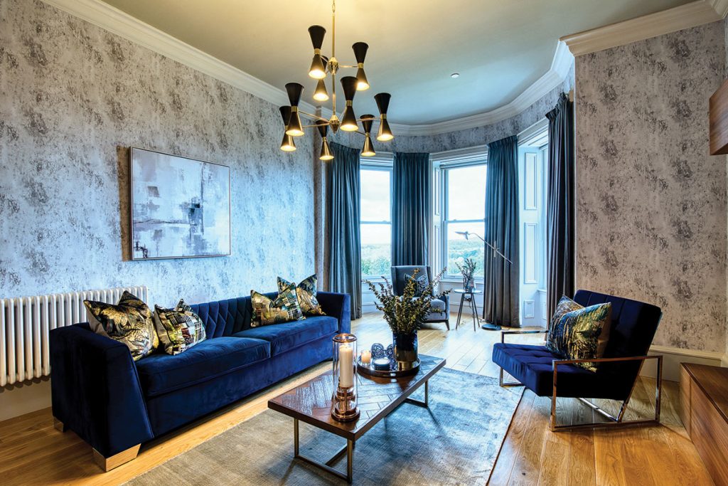
BRIEF To create a cool, relaxed, everyday living space incorporating the client’s love of blue.
HOW THE SPACE IS USED The client lives in England and this apartment is designed to be a home away from home when he stays in Glasgow. The aim was a luxurious feel, without any sense of fussiness or overstyling.
BIGGEST CHALLENGE Bringing in a feeling of warmth and cosiness.
DESIGNER Emily Fotheringham, fotheringhaminteriors.co.uk
Luxury and minimalism don’t often go hand in hand, but Emily Fotheringham was tasked with creating this very fusion for an apartment in Glasgow.
Her client wanted a clean, crisp, cool interior for his home away from home, without sacrificing luxuriousness. To satisfy these two seemingly conflicting demands, Fotheringham took a rather unusual approach: she decided to design an interior that would make you feel you were living in a piece of art.
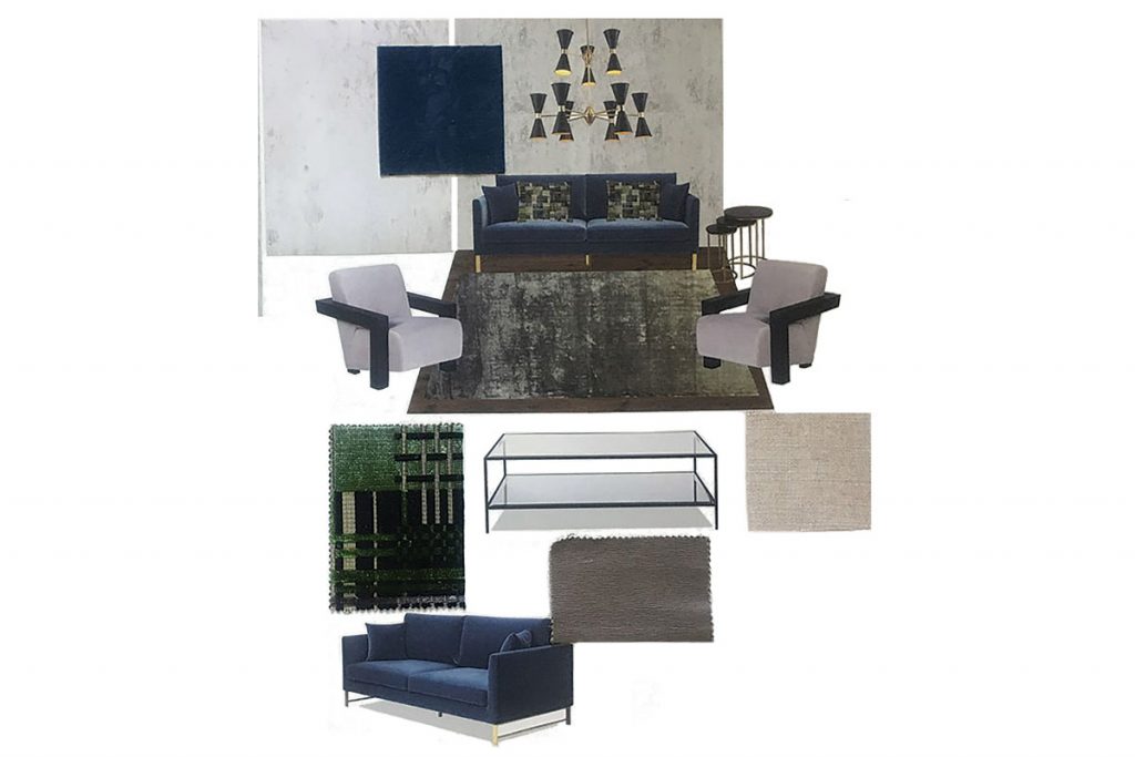
Her client loved stylish furniture, citing Ligne Roset and Heal’s as two of his favourite brands; taking this as a reference point, she designed a smart space and then carefully added colour, taking care to ensure it didn’t feel overstyled or heavy.
A big part of her vision was the integration of different textiles. The space needed to feel like home, despite not being used full-time, so Fotheringham brought in comfort by mixing textures: “I achieved a sense of cosiness by layering and adding linking elements through pattern, fabrics and accessories. The material compositions made a big impact,” she says.

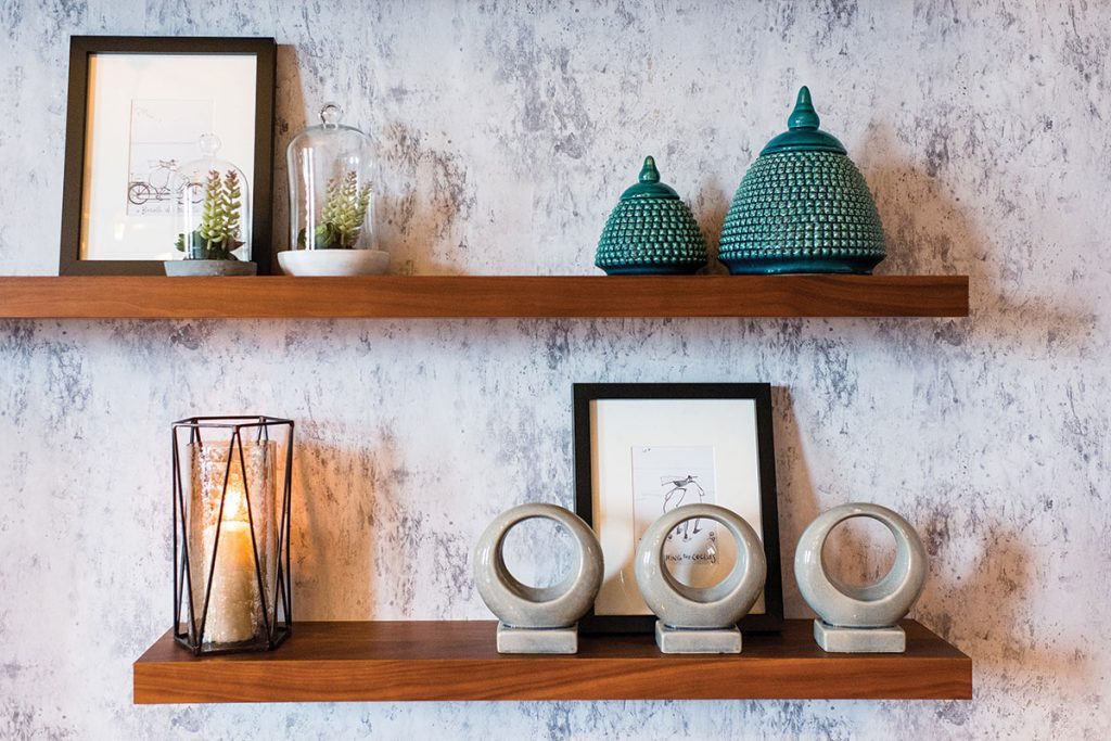
Since this was not the owner’s main residence, she admits she felt free to be playful: “It meant I could bring more luxurious fabrics into the mix. I used mainly velvets and silks, which had the bonus of adding great warmth to the space. Designers Guild’s Michaux Thistle wallpaper brought a lot of texture too, which softened all the hard lines.”
The client was also a big fan of the colour blue, which Fotheringham took on board in her selections. To stop the bold hue from taking over, she balanced it with accessories and brass and gold accents. The sofa and armchair are in a matching deep-blue velvet that immediately makes the room feel connected. Incorporating just a few statement pieces, such as the coffee table, gives a modern and uncluttered look.
Attention was also paid to function, with a snug reading nook arranged at the bay window, while sufficient space was left around the coffee table for four people to comfortably sit and chat.
This simple approach and contemporary look, paired with layered, luxurious fabrics, has produced a beautifully cohesive space. “The secret,” confides the designer, “is that the more texture (but not pattern) you add, the more lush your space will feel.”


