Accentuating original features through the subtle use of colour has transformed this Glasgow tenement
Love this project? Steal the style with our moodboard
DETAILS
What A three-bedroom flat
Where Hyndland, Glasgow
Interior designer Margot Paton & Abigail Crowther, Chelsea Mclaine
Photography ZAC and ZAC
Words Catherine Coyle
The concept of the student flat takes up little room in the world of interior design. The very words conjure up shared bathrooms, beans on toast and space-saving futons. Soft furnishings tend to be sparse or nonexistent, cutlery and crockery is nearly always from a bland starter pack, and any notion of a design scheme usually begins and ends with a pot plant or a poster tacked to the wall. So how do you approach a student flat when the student in question is not an 18-year-old away from home for the first time, but a retired lawyer going back to university?
It was a rather unusual meeting that brought this mature student together with the team at Chelsea Mclaine Interior Design. He had been renting in the area close to Glasgow University in the west end, keen to familiarise himself with the neighbourhood before beginning his honours degree in art history and English literature. One day, having just purchased an apartment nearby, he was strolling past the firm’s Hyndland showroom when he popped in to ask for advice about decorating. His chat with design director Margot Paton and interior designer Abigail Crowther opened his eyes to a world of new possibilities.
“I’d originally rejected this flat because I didn’t think it ticked the right boxes for me,” says the owner. “But having lived in a city-centre loft apartment for 14 years and knowing that I wanted a traditional tenement this time round, I went back and took a second look at it.
“I was clear from the start that I’d need to use an interior designer,” he adds. “I would never have been able to visualise what could be done here or to understand the dimensions the way Margot and Abigail have done.”
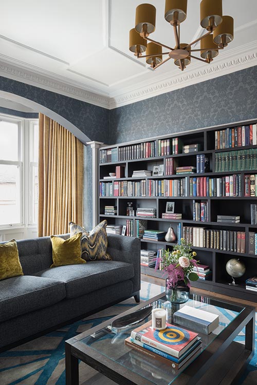
The apartment had been marketed as a three-bedroom flat, but its new owner only required one bedroom, so the designers have fashioned a study and a relaxed TV room to sit alongside the formal drawing room to better meet his needs. “The property was not in a bad condition – it was just bland and neutral and a bit unloved,” recalls Margot who, along with Abigail, had to get to know their new client’s style pretty quickly. “The project escalated quite rapidly from his initial approach for decorating ideas,” she says. “Nevertheless, he had very clear ideas about what he liked and what his home needed, which was useful.” One of those ideas was bespoke shelving in both the drawing room and the study for his extensive collection of books.
The team began by stripping everything back to basics and replastering the walls and ceilings. Although the apartment is in a conservation area, the building itself is not listed. It’s part of a purpose-built block constructed around the turn of the century by renowned Glasgow architect John McKellar, and is unusual in that there is just one flat per landing.
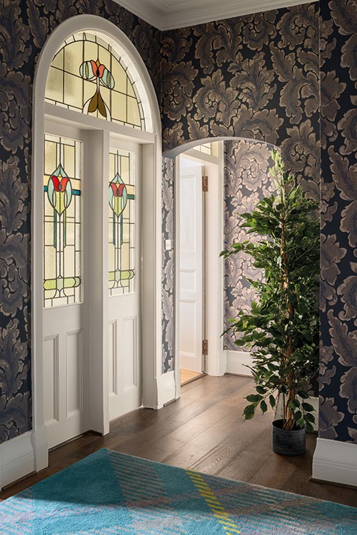
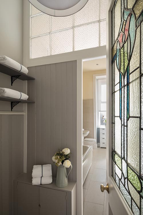
The original features were in good condition – arched window architraves, picture rails and a unique wooden detail around the skirting perimeter all hint at the flat’s provenance. “We got Hugh Stirling, a specialist carpenter, to work on the skirting where it had been damaged. He managed to make it look as though it had always been there. It’s a very unusual timber detail and was well worth saving.”
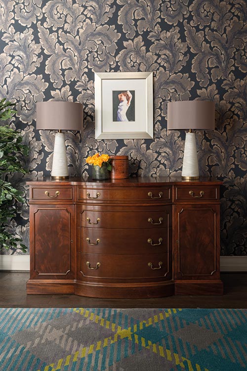
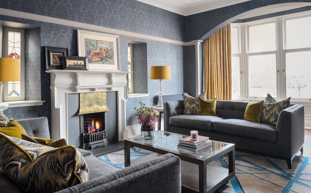
Dark-stained oak flooring was installed to help give the rooms to the feel of a classic gentleman’s club, and has helped produce an overall sense of drama. Being on the top floor and having large original windows in each room means the flat receives lots of natural light, but the palette and furnishings have combined to create a dark, sultry ambience. In the drawing room, for example, Zoffany’s Crivelli wallpaper in Como Blue, a navy hue, provides the backdrop against which rich but pared-back colour accents such as the Indra Gold Jane Churchill curtains (double-lined for warmth – the original windows are beautiful but draughty) have been introduced. These simple yet luxurious fabrics allow the apartment’s exceptional craftsmanship – the bookcases, Edwardian stained glass and original artworks, for example – to take centre stage.
Working with moodier, atmospheric tones and bearing in mind the owner’s academic leanings, lighting was an important consideration. But rather than installing lots of dimmer switches to create ambient lighting (the client had made it clear that he was not keen on this kind of scheme), Abigail decided that task lighting, specifically for reading and to subtly draw attention to the art on the walls, would be the best way to balance his tastes with a solution sensitive to the flat’s heritage. Hanging chandeliers in each room has added a tongue-in-cheek gravitas, for instance.
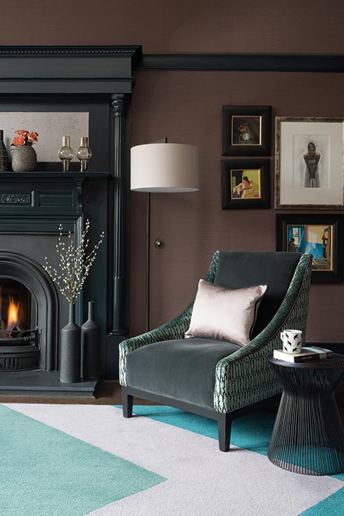
The TV room follows suit, with a dark wallcovering (Plum Purse, by American designer Phillip Jeffries) and woodwork painted in Zoffany’s almost-black Ink. By exposing the ceiling beams and retaining but revamping the original turn-of-the-century fireplace, the room now has outstanding features. “The client initially asked us to get rid of the fireplace,” recalls Abigail, “but I managed to persuade him, by painting it and replacing the inset mirror with a subtle metallic wallpaper (Arte’s Metal X Stellar), that removing it would be a mistake.”
By introducing a rug (made bespoke by Turnberry Rugs) in a vibrant geometric pattern, there’s a modernity and lightness to this room that liberates it from its dark palette. “There were a few elements that the client couldn’t envisage,” points out Abigail, “so I drew them to show him how the contrasting fabrics, for example, would work.” She gestures to the Whitehead Arque armchair that has been covered in Pierre Frey’s greenish Lecco cut velvet and complementary Jane Churchill charcoal-toned Emile velvet. The understated Michelle corner sofa by Charlotte James, upholstered in Larsen’s Powell fabric, has slate-grey piping from Jim Thompson, and Abigail added art-inspired cushions in Pierre Frey’s bold Shaman print to lift the neutral base tones of the sofa.
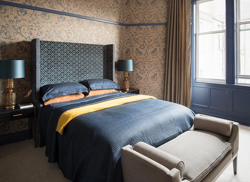
Assured masculinity emanates from every room in this carefully curated apartment. The two designers were guided by the owner’s desire for a clubhouse look, without sticking too rigidly to that style. They have injected a more up-to-date flavour through bespoke painted cabinetry, hints of pattern and rich, saturated hues. The bedroom is a great example of this. Its furnishings are relatively sparse but the overall feeling is nevertheless sumptuous, like an extra-special boutique hotel room, without being filled with unnecessary clutter or staged furniture settings.
The custom-made headboard (in Sahco’s blue Clark velours) and bed base (in Dedar’s dark-toned Aplomb wool satin) is a commanding feature and befitting of the space. Inky tones, such as Zoffany’s Como Blue paint, bring the woodwork to life, while the discreet pattern seen in the Landseer wallpaper by Zoffany and the Reverso Casamance drapes never overpower the composition of the room. A considered choice of colours has meant that the space is masculine in tone but doesn’t sacrifice furnishings or accessories to achieve this.
“We didn’t have to incorporate any of the owner’s belongings into the scheme,” says Margot. “His previous home was very modern, so he came here with just his books, his artworks and the clothes on his back.”
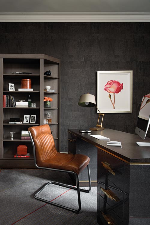
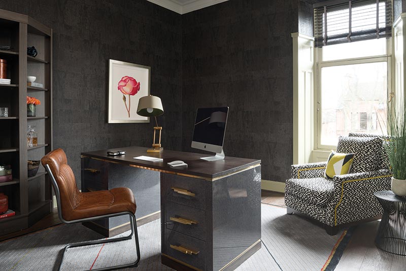
The Michael Northcroft Blondell desk in the study is a substantial piece – it took three people to bring it in and install it. It certainly makes a statement: the high-gloss grey croc finish gives texture and depth, while the wenge top works in harmony with the bookshelves that were designed by the Chelsea Mclaine team and made by their in-house carpenter. The tropical wenge wood has a distinctive grain that looks chic and expensive; unlike more traditional dark timbers, this contemporary finish works well in properties with period elements, preventing them from appearing too fussy or old-fashioned.
One area where the involvement of the interior designers reaped particular rewards was in the sensitive integration of the owner’s art collection into his new home. By deliberately considering the artwork as an extension of not only his personality but as part of the overall design scheme, Chelsea Mclaine have produced an arrangement that thrills the owner. He is happy to admit that it’s thanks to them that he is now viewing his collection through new eyes. “I’d been looking at these paintings in a different environment for a long time,” he explains. “I didn’t think they’d work here at all, but the unexpected way they’ve been hung means it’s like looking at new paintings.”
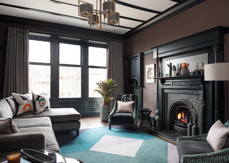
By grouping varying sizes of pictures in dark-coloured frames, Abigail has created clusters of works in the TV room that don’t take centre stage but create interest and complement the apartment’s period features.
“The client said he wanted the sort of ambience you’d get in a gentlemen’s club – something like Turnberry or One Devonshire Gardens – that would feel Scottish, traditional and high-end but also warm and inviting at the same time,” says Margot.
“Previously, the whole place was magnolia. Now you walk in and you think, ‘wow’.


