Red tape, local resistance and a misshapen site all forced the architect of this beachfront house to come up with something truly inventive

DETAILS
What A three-bedroom beach house
Where Elie, Fife
Architect Jim Simpson, Designworks
Contractor West End Cladding & Joinery Ltd, Dundee
Structural engineer Clancy Consulting
Quantity surveyor Brown & Wallace Construction Consultants
Photography Neale Smith
Words Catherine Coyle
It’s not Malibu or Montauk, but the Scottish coast can nevertheless be intoxicating. Whether it lures us for the therapeutic qualities of the sea air, or the childhood memories, or the sleepy fishing villages with their quaint architecture seemingly preserved from another era, there is no doubt that being by the sea is a fantasy which many of us share. Some get to live the dream for a week or two on holiday; others, though, create something more permanent, turning that fantasy into reality.
When the owners of this new-build home in Elie started out on their journey, they already had a connection to the East Fife fishing village, having bought a turn-of-the-century cottage that had been used as servants’ quarters for the grand Victorian villa next door. The location, the private access to the beach and the extensive, uninterrupted views out across the waves towards the Bass Rock had seduced them, but the dilapidated property itself failed to live up to its surroundings. They knew they had to come up with a solution if they were ever to be able to enjoy their escape from the city.
They approached Designworks for help with the project, as they already had a strong relationship with interior designer Henrika Ritchie and architect Jim Simpson, directors of the Glasgow-based company. The pair had worked on the clients’ previous properties, and their good understanding of the couple’s style and design preferences made this an easy transition. Not so simple, however, was what lay ahead on the road to gaining permission to build an entirely new beachfront property.
“The owners had initially intended to renovate and reuse the original cottage,” recalls Simpson, “but the building was in such a poor state of repair and had such an awkward internal layout that they eventually realised that demolishing it and replacing it with a purpose-built beach house would make more sense.”
Obtaining planning permission to do this was not straightforward. Elie is a popular destination – particularly with holidaymakers drawn to the historic buildings and slow-paced seaside life – and the local community is increasingly contesting developments in the town. This project came up against the same resistance, even though the original cottage had no listed status nor any particular architectural protection. “The cottage had been used for a number of years as a holiday home,” says Simpson. “It had been poorly extended and, over time, due to a lack of proper maintenance, it had become dilapidated and was suffering from some serious structural and dampness issues.”
It was surrounded by listed properties, however, and its demolition was strongly opposed by the townspeople. “We spent the first two or three years dealing with planning issues, developing the design concept and gaining the necessary statutory approvals,” says the architect.
In the end, a design that was sensitive to the local vernacular, as well as evidence that the surrounding properties would not suffer as a result of the proposals, was the key to getting this project passed through the necessary red tape. It was only once a 3D model of the intended structure was presented, proving that the neighbours’ rights to light would not be compromised, that Designworks got the go-ahead.
Clients and architect alike were relieved to be able to proceed. Simpson had put a lot of work into interpreting their wish list for this once-in-a-lifetime build. He had incorporated the site’s idiosyncrasies into the design, using the narrow, sloping site to its best advantage.
“The clients wanted the design concept to reflect the engineering background and ethos of the owner,” he says, “and, since it was to be a seaside house, the building was also to have a beach influence. Their main request, though, was to have a view of the Bass Rock from the front door, right through the house.”
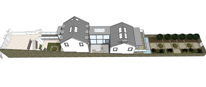
Although the site covers a sizable 400 sq.m. (the footprint of the house itself is just a quarter of this), it is only seven metres wide. Simpson took advantage of the length, stretching from the main street all the way down to the beachfront, to create two connected buildings that would make best use of the long, narrow piece of land. Rather than allowing it to limit his design, he worked with the shape to come up with something quirky and unique.

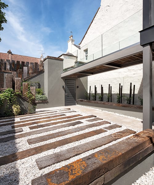
The house is set back from the main road and barely visible from the street. It is accessed through a gate, then via a bridge that leads to the first structure. From the gate, a staircase perpendicular to the bridge leads down a level to a lower courtyard that extends underneath the glazed bridge.
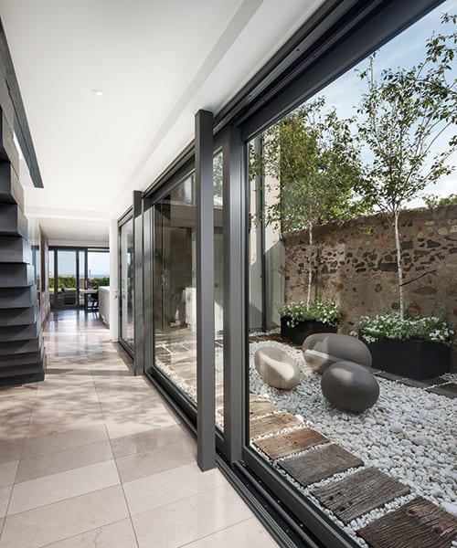
The two blocks are connected by a glazed corridor; the first contains the bedrooms (over three storeys), while the kitchen and living area are found through the corridor in the second structure, which looks out to sea. This arrangement meant that a zen garden could be created for the owners; an internal/external garden that makes good use of the space below (and the microclimate) and which can be accessed from both blocks.
“From the main entrance door, the view to the sea and the Bass Rock opens up through the whole building,” says the architect. “Natural light penetrates the house and surrounds the internal zen garden. Maximum use has been made of the ridge rooflights to filter natural light down into all the internal spaces.”
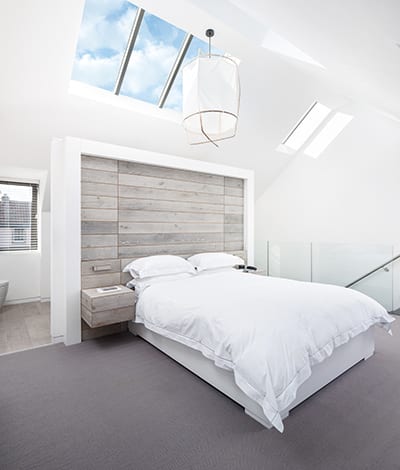
Both of the blocks have been designed with cathedral-style ceilings. The ones over the main lounge and the master bedroom suite have skylights, and there is a vented lantern light in the glazed link. It all helps to meet the clients’ desire to have the maximum natural light possible brought into the whole house.
By reducing the palette of materials to a minimum – both in the structural and the decorative schemes – attention remains on the awe-inspiring location.
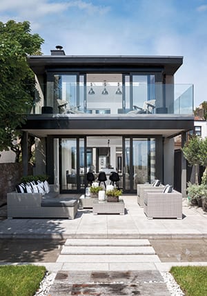
To cope with the beach conditions and the area’s deceptively high winds, a concrete raft framed in a steel construction proved the best solution. The exterior walls are rendered and the double-glazed Schueco screens and windows have marine-grade VM Zinc cladding on the fascias, canopies and window reveals. The zinc around the built-out windows seen from the beach reference a style of architecture common to this coast. The sea salt in the air and the weather conditions helped inform the choice of zinc, too; an application of oil helps to prevent any salty deposits forming.
Inside, Burlington limestone tiles create continuity across the ground floor, extending out onto the canopied terrace and stepping stones. The canopied areas provide cover – the property might look at home in the Hamptons, but Scotland’s climate makes such protection essential – and also serve as warmer spots to sit out as the sun moves across the sky.
The washed, distressed finish of the stained wood flooring by Havwoods on the upper ground level is reminiscent of an elegant American seaside retreat. This plank effect has been used throughout to unify the two blocks. The bespoke kitchen cabinetry, designed by Simpson and Henrika Ritchie and installed by Allan Hume Cabinetmakers, favours the look, too, and even the headboard in the master bedroom adopts the plank-style pattern, similar to the wainscoting that’s so prevalent in beach homes.
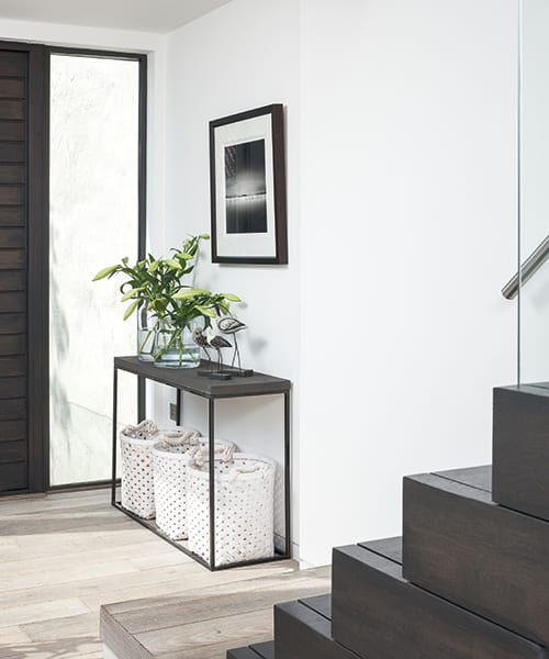
Reclaimed Australian jarrah railway sleepers connect the use of wood indoors and out, with the slatted bridge at the entrance, the walkway down to the back courtyard and the extended walkway (which has been made to look like a traditional boardwalk) onto the beach all sharing this beautiful material and giving the property a sense of togetherness.
By sticking to muted greys and whitewashing the walls, the focus is drawn to the subtle textures in the soft furnishings and then to the vivid colour beyond in the spectrum of blues of the waves and the skies. There’s a blurring of boundaries between inside and out which, in Scotland, is no mean feat.
