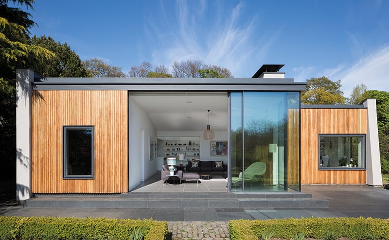
Millbuies House, a fine example of Mid-Century Modernism on the outskirts of Edinburgh, has been revitalised and made ready for 21st-century living
DETAILS
What A Grade-B listed house and garden
Where Gogarburn, Edinburgh
Renovation architect Cameron Webster Architects
Photography Dapple Photography
Words Caroline Ednie
A tiny ‘Garden for Sale’ advert in a local newspaper was the unlikely starting point for a project that has seen not only the restoration of an impressive three-acre garden that once belonged to the National Trust for Scotland, but also the loving revitalisation of the B-listed Millbuies House, which was designed in the 1950s by the architect of London’s Royal Festival Hall.
Textile designer Robert Gillan spotted the ad in 2011 when he and his partner David Gillan-Reid were looking for ‘a project’ to take on. Their initial reconnaissance visit to the site on the outskirts of Edinburgh made a very positive impression. “The garden is really beautiful and diverse – it had been used as a horticultural teaching garden for many years,” recalls Gillan. “As for the house, when I first walked through the front door, I thought, ‘This is it.’ It was one of these lucky moments when you arrive at the right place at the right time.”
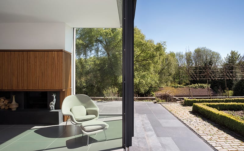
The couple put in an offer and were soon the owners of Millbuies House, along with its gardens, greenhouses, pond, gardener’s cottage and classroom. The house, which sits of a sloping site that leads down to the Gogar burn, is the former home of philanthropist and environmentalist George Boyd Anderson, for whom it was designed as an innovative early eco-home in 1957 by Sir Robert Matthew. Among the state-of-the-art features suggested by Anderson were areas of triple and quadruple glazing positioned to catch maximum sunlight, underfloor heating, and a sun room and inner courtyard that brought the garden’s greenery into the house.
By the time it was sold in 2011, however, the house was deteriorating and needed a lot of work. “Some of the original elements were still there,” recalls Gillan. “The original boiler was still in and the kitchen was usable, but it would never have met modern building standards.”
Keen to the retain the Modernist spirit of the original timber-framed house but make it more practical for contemporary life, the couple appointed Glasgow-based specialist practice Cameron Webster Architects to take on the revitalisation project.
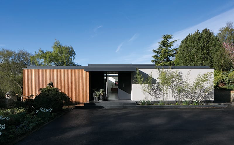
Project architect Peter Harford-Cross recalls the carefully considered approach to the redesign: “Externally, we kept the original timber cladding, which was in very good condition, stripping it back and oiling it,” he says. “We also kept the window openings, apart from in a few places where new ones were made for the updated room layouts. We’d hoped we could keep the roof but it turned out that all the timbers were rotten, so these had to be stripped back and a new roof put on. But we followed the same crisp straight lines of the original building.” The practice also designed the chimney, to service the back-to-back stoves in the library and living room.
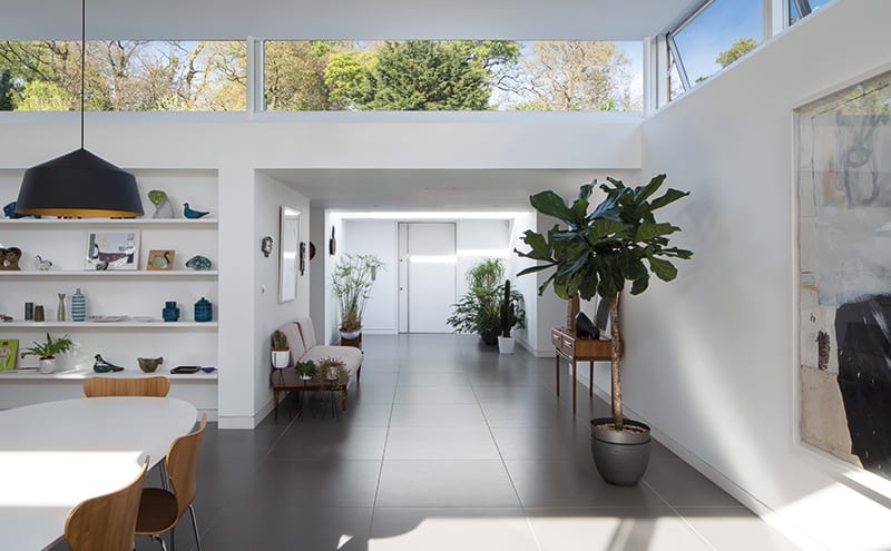
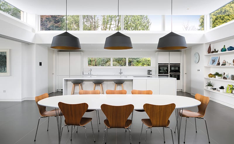
One of the key elements of the redesign was to retain the courtyard, but to cover it with a raised roof and clerestory windows and make it an internal rather than an external space. “It still feels light and airy,” explains Harford-Cross. “It has become the open heart of the house – not open to the elements but open to the light and the views.”
“We already had three acres of garden, so we didn’t really need another courtyard garden,” adds Gillan, “so we thought we’d make it part of the house – the new kitchen-diner. The clerestory has given us a lot of garden and sky views, and meant we could have a big dining table.”
The new layout respects the footprint of the original house, with a few tweaks. The old carport, for example, has been incorporated into the building and turned into an en-suite bedroom and cloakroom, and the spacious main bedroom was created by combining two smaller rooms. “We also kept the spirit of the original conservatory in the open-plan living room, where the glazed doors can be pulled back to link the garden to the house,” says the architect. Overall, Millbuies now has three bedrooms, four bathrooms, two studies and a library.
“One of the reasons the building was listed was because it had some pioneering insulation and renewable internal ventilation systems,” goes on Harford-Cross. “Unfortunately, these systems no longer worked, so our challenge was to replace them with updated technology. The house now has an advanced home-automation system and we’ve upgraded the insulation. The clients didn’t want radiators, but as we could only bring the floor up a certain amount before it became impractical, we had to find an underfloor heating system that wasn’t too thick. In the end, we got a slim system from Schluter.”
Despite the reservations of certain preservation societies, the plans for the rejuvenated Modernist property were viewed sympathetically by the planning department and were duly passed. The couple stayed in the gardener’s cottage on the site during the redevelopment. (“The first thing we did was refurbish it so that we could move in. And we lived there for two years,” says Gillan.)
As construction progressed, they took on a lot of the sourcing of the internal finishes. The simple white walls and ceramic floor tiles used throughout provide a minimalist backdrop to the classic furniture and artworks. “I studied textiles at Glasgow School of Art and I’ve always collected furnishing fabrics from the 1950s, ’60s and ’70s,” says Gillan. “The cushion covers in the living room are by the well-known Mid-Century textile designer Robert Stewart, who was my lecturer at art school, and I designed the rug.”
A large TV has been hidden in the living room’s walnut wall panelling, made by joiner Darren McMillan, which has the same width of timber as the external cladding. The Home Control Scotland automation system allows everything from the underfloor heating to the sound system to be controlled by an iPad.
Despite these 21st-century interventions, Millbuies’ new owners were determined to respect the integrity of the house. “We could see that it was a well-balanced building,” says Gillan. “The proportions of the rooms are just right, and we get so much light. The judges for an architectural award came to look at the house recently and said, ‘There’s not a bad space in this house,’ and I think that’s very true.”

He is also pleased with the entrance, which feels deliberately low-key and minimalist. “It means that when you open the front door you get this amazing surprise with the way the skylights and clerestory windows open up the courtyard – it’s like having a moving picture. Because the house is in the middle of the garden, we get to see the changing seasons constantly.”
Those spectacular grounds have been a major project for the couple. “The garden was overgrown when we arrived but we’ve kept the original design – it is essentially the same as it was in the 1950s. I’ve been working with garden designer Nick Burton and we’ve done a lot of replanting. There’s always something beautiful to see, and I think it’s good for human beings to be surrounded by nature,” he concludes. “The only spectators are roe deer. It’s a hidden gem.”


