Starting with a completely blank canvas can be a terrifying prospect for a kitchen designer. With nothing to react against or improve, it can almost feel as if there are too many possibilities – where do you begin? Mark Williamson of Pitlochry-based cabinetmaker Birkwood was faced with just such a challenge when he was commissioned by the owners of this flat in the west end of Glasgow to convert a large bedroom at the front of the tenement into a kitchen. Cabinets designed in Birkwood’s signature plywood and laminate style were a key part of the brief, along with plenty of storage to avoid a cluttered feel.
“Given a space measuring 6m x 4.5m, the clients could have opted for any number of layouts, with easily enough room for a generous island,” says Mark. “But, with two young children, they wanted to leave room for a dining table and chairs, a small sofa and space for a safe play zone.”

[sociallocker id=”19988″]
With a 3.2m ceiling height, Mark was tempted to propose extra-high wall cabinets teamed with a sliding library ladder. But he rejected this idea: the cornicing was too beautiful to hide – indeed, he wanted to find a way to enhance it.
“The solution was an L-shaped layout using the full length of two walls, which left a generous area for the table, sofa and play zone,” he says. “The wall cabinets were kept almost a metre below the cornicing, which turned it into a genuine period feature.”
Cabinets
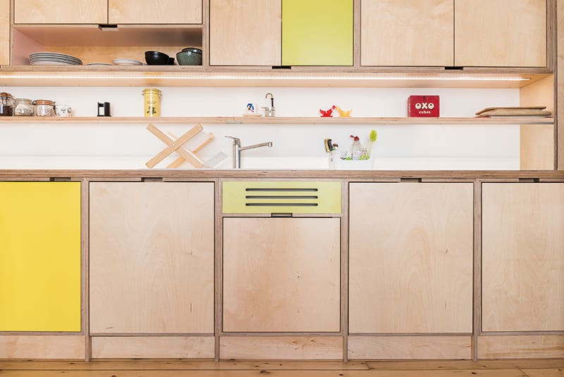
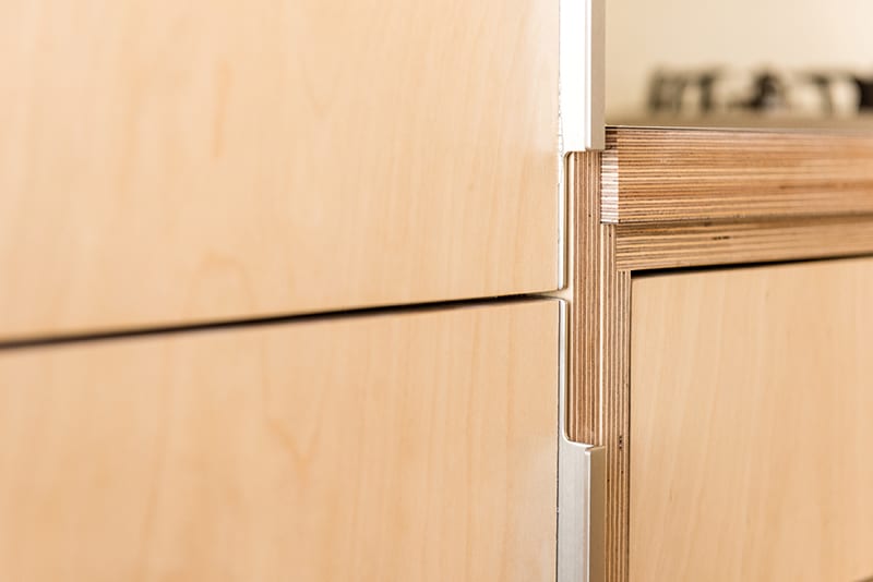
The cabinets, doors and drawers are manufactured from 18mm and 12mm UV lacquered Latvian birch plywood. The edges, with their distinctive stacked appearance, are sanded down and oiled. Colour (1850 Lime and 463 Giallo Pom Pom from the HPL Colours collection) was added by applying laminate.
Appliances
• A standard Neff oven is paired with a Rangemaster Hi-Lite re-circulating cooker hood. “We needed to specify this as planning restrictions on the exterior of the property meant there was no method of extraction through the wall.”
• Tap: Grohe Eurosmart Cosmopolitan.
• Sink: Franke Basis Fragranite.
Finishes
• Painted glass splashback in pure white.
• The floor is the original pine flooring which has been stripped back, sanded and varnished.
• The work surface is 35mm birch plywood bonded with white laminate. The edges of the plywood are left exposed and are sanded and oiled.
He couldn’t use the full length of the wall leading to the window as the wide architrave meant there wasn’t enough room for a standard cabinet depth of 600mm. “The clients asked for a semi-freestanding dresser for this area,” he says. “It has been designed to fit the space exactly.”
While the big window brings in plenty of natural daylight, Mark had to find a way to add task lighting without damaging the ceiling’s ornate plasterwork. He placed concealed LED strips both beneath and above the wall cabinets on both walls. “This gives warm and practical lighting to the work surfaces and also casts a glow on the plasterwork above,” he explains. The open area surrounding the hob, splashback and extractor hood are lit by LED downlights, as is the dresser. Freestanding lamps take the place of ceiling lights elsewhere in the room.
The most striking feature of the room is, of course, the cabinets themselves. “The use of birch plywood sets this kitchen apart from virtually all other kitchens in the UK,” points out Mark. “Being able to see the exposed edges in all their naked glory reminds us that it is a solid timber kitchen but presented in a fresh, modern way.”
The two colours chosen for the units came after the clients had spent many weeks stripping back a century’s worth of wallpaper, progressively revealing the popular hues of the 1970s, 1950s and 1930s. “The colours were applied sparingly to various drawers and doors to give a random feel,” says Mark. “We didn’t want to overpower the beauty of the naked birch plywood. Instead, the colour adds interest and warmth as well as giving a nod to the flat’s history.”
The owners couldn’t be happier with the way it has turned out: “It’s an honest, open kitchen and hangout space where the family spend most of their time,” says Mark. “Friends who visit are reported to ‘stroke the cabinets’, as the nature of the exposed grain birch plywood lends itself to a good feel!”
The Designer’s notebook
Mark Williamson explains some of the background to this design
- As this room used to be a bedroom, plumbing needed to be introduced and the electric supply needed upgrading. This was handled by a great team of local trades, while a stubborn fireplace was expertly removed by an architectural salvage yard.
- We liaised extensively with the clients during the design phase to make sure the cupboards, doors, drawers, handle notches and shelves were in exactly the right place; one year into living here, they say they wouldn’t alter anything.
- Clutter has been kept to a minimum thanks to a shelf along the length of the sink wall, where the bits and pieces that families need on an hourly basis can be easily reached but don’t consume vital workspace.
- The clients had always wanted a plywood kitchen. Influenced by mid-century and modernist design, they already had a firm idea of the look they wanted to achieve.
[/sociallocker]
DETAILS
Brief To create a practical and beautiful birch plywood and laminate kitchen with plenty of storage for a family with two young children.
Works required Everything – there wasn’t even any plumbing. Local trades were brought in to prepare the room.
Biggest challenge Finding solutions to the need for a huge amount of storage space while leaving the room uncluttered. “The clients are very pleased with the result and haven’t quite filled every cupboard, even after a year of living there.”
Budget £30,000. This covered the cabinets, dresser unit, worktops, appliances and fitting.
Supplier Birkwood
Photography David Brown
Words Judy Diamond


