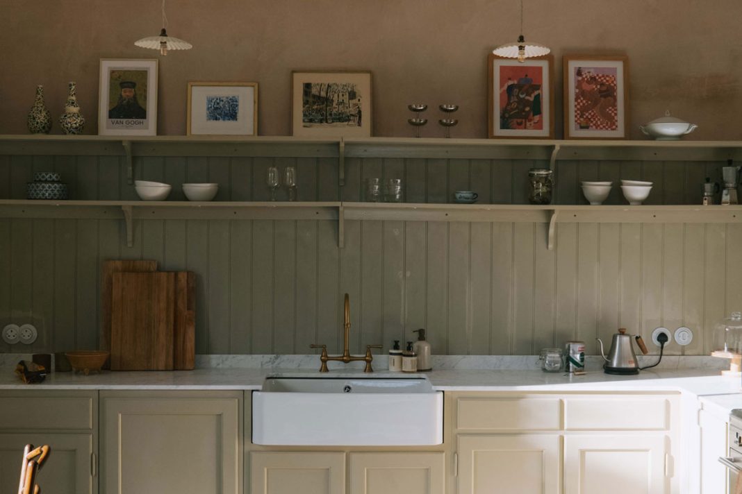
In the second instalment of Patricia Rodi’s column, she shares the story of her kitchen renovation and the one question she always asks before starting a design project
“I‘ll be honest with you: when we first moved in, I felt so overwhelmed that I broke down and cried. Perhaps it was a reaction to all the stresses of buying a house, packing up your whole life and moving somewhere new; mostly, however, I felt daunted by the scale of the renovation project we were about to undertake.
I couldn’t help thinking, “What have we gotten ourselves into? This is BIG.”
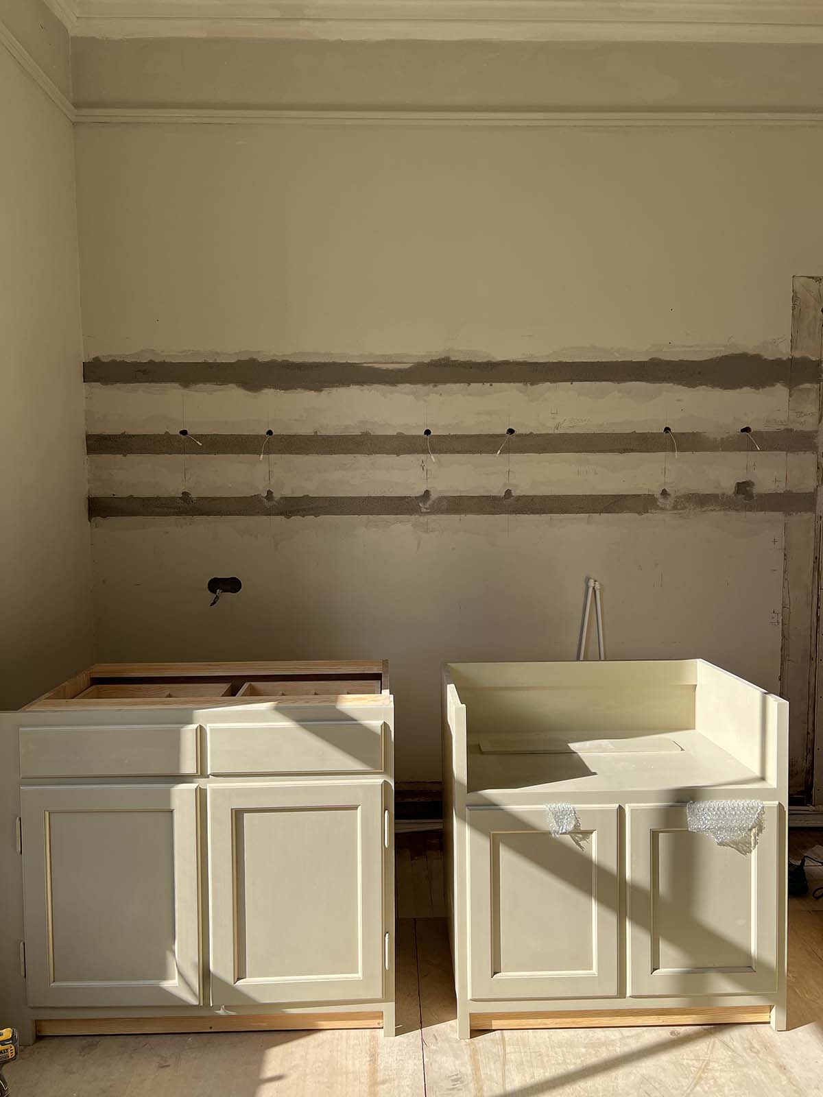
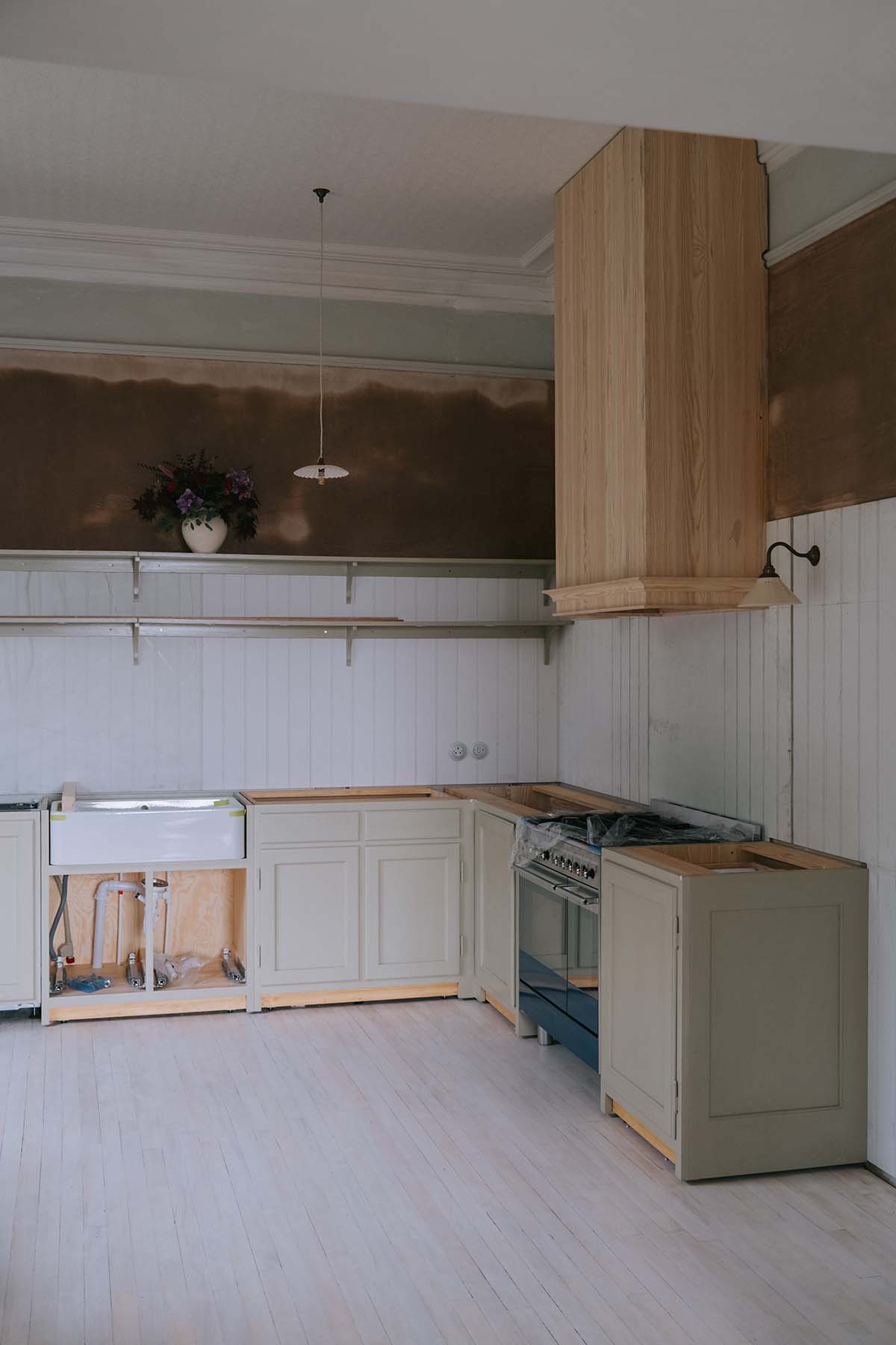
And I wasn’t wrong – this kitchen renovation was difficult. Living through a renovation project is never easy, but it’s even tougher when you can’t cook or wash up properly. It was pretty miserable and we lived off of pot noddles for the three weeks it took to do the kitchen. But now that the kitchen is all done it seems like a distant memory!
FIRST THINGS FIRST
There are so many things to consider when renovating and restoring a house that it can be totally paralysing.
When taking on any design project, the first thing I do is to ask myself, ‘Why?’ – why have you taken this on and what are you hoping to accomplish? Do you need more space? More seating? Better light?
Answering this seemingly simple question will help you stay focused when it comes time to start making decisions.
For us, the room that needed sorted most urgently was the kitchen. However, it was also one of the most overwhelming tasks because there’s huge pressure to get it right, especially since it can be extremely expensive. I therefore started planning the kitchen (layout, aesthetics, function, budget: the lot!) months before we even moved in.
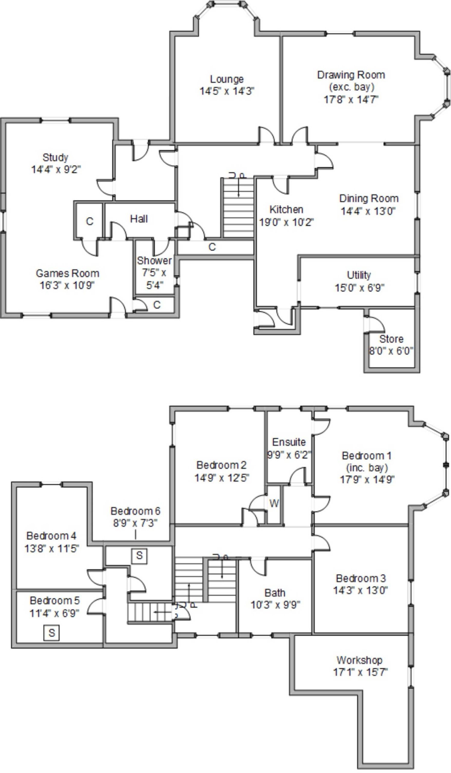
When we moved in there was an opening between the kitchen, dining room and drawing room, making it a big, open space. It sounds like a good idea, but in reality, it was a dysfunctional space. It felt very dark, largely because the ceiling had been lowered in the kitchen and plywood cladding had been put on top of the original ceiling, which also damaged the original cornicing and ceiling structure.
We were determined to restore it and reinstall the wall between the kitchen and dining room to create a more cohesive and brighter space. The former kitchen would become a utility room; the former dining room, a kitchen; and the drawing room, a big dining space.
FINDING YOUR STYLE
When I start a new project, lists are my best friends. I make a list of every decision I need to make from start to finish, covering flooring, countertops, hardware, sinks, appliances and lighting.
The next thing I turn to is Pinterest. Browsing on Pinterest is a really good platform to start working out the aesthetics you’re drawn to. I always create different Pinterest folders for different rooms and then analyse the imagery.
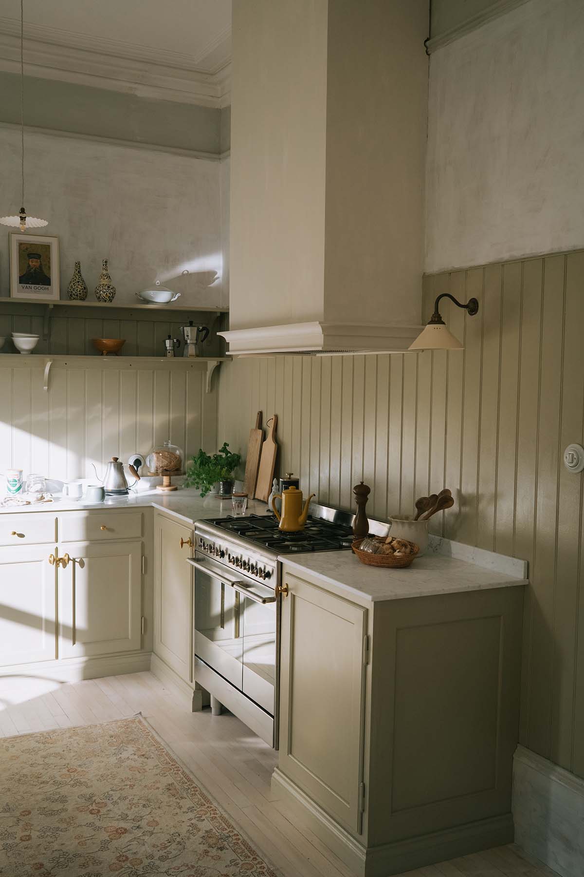
There are so many inspiring pictures of interiors out there and it can be overwhelming to try to hone in on, and stay true to, your personal taste. The key is to analyse what it is in the image you are attracted to, and would like to recreate.
For example, is it a specific colour in the image you like? Is it the mood of the image? By asking these questions, you stay away from trying to recreate a Pinterest picture that might not work for your home, and instead pick the bits within the image that you really love.
MADE TO LAST
A new kitchen isn’t like getting a new pair of pyjamas – you won’t be getting a new one each Christmas, so every decision counts! My goal was to create a kitchen that felt lived in with a look that stood the test of time.
Practical and aesthetic considerations were of equal importance to me. The kitchen in our old home was made of MFC, or melamine-faced chipboard, and although it was totally fine, it looked very tired after a couple of years and is not the easiest material to repaint. So this time around, I really wanted a kitchen made out of wood.
Being half Swedish, I was determined to introduce some Swedish craftsmanship to our new home. My best friend Natalie is a kitchen designer at the amazing Swedish kitchen company Kulladal kitchens. I’ve been swooning over their 1800s inspired kitchens ever since I started working within interiors.
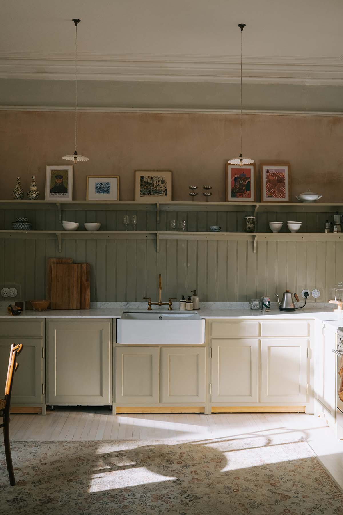
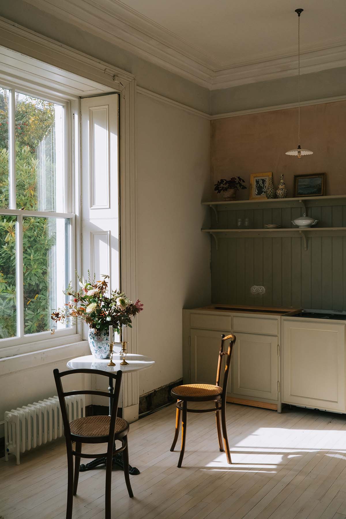
To my dismay, they didn’t ship to the UK. After some back and forth – thanks, Brexit! – I managed to convince Natalie to trial their first UK shipment on me. If anything went wrong, it would be ok since we’re friends. Luckily, it all went perfectly, and Kulladal are now shipping kitchens to the UK!
Kulladal and I worked together to create a kitchen that ticked all our boxes, with ample storage, really good lighting and all the fittings we needed. By putting a wall between the kitchen and the dining room, we managed to get an additional room which we turned into a massive utility room.
I’m very happy we started the renovation as soon as we did because our builders found so much poorly done work that made the house unsafe: electrics that had been installed by a total cowboy and nearly electrocuted our poor electrician; and water dripping from the boiler onto live electric wires.
To top it all off, our boiler broke – a very nasty and very costly surprise.
IT’S ALL IN THE DETAILS
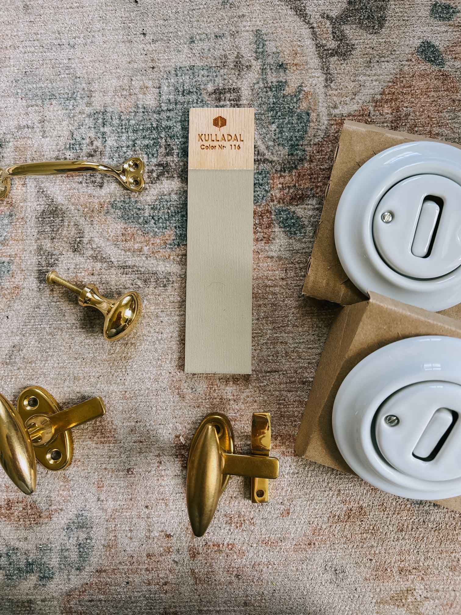
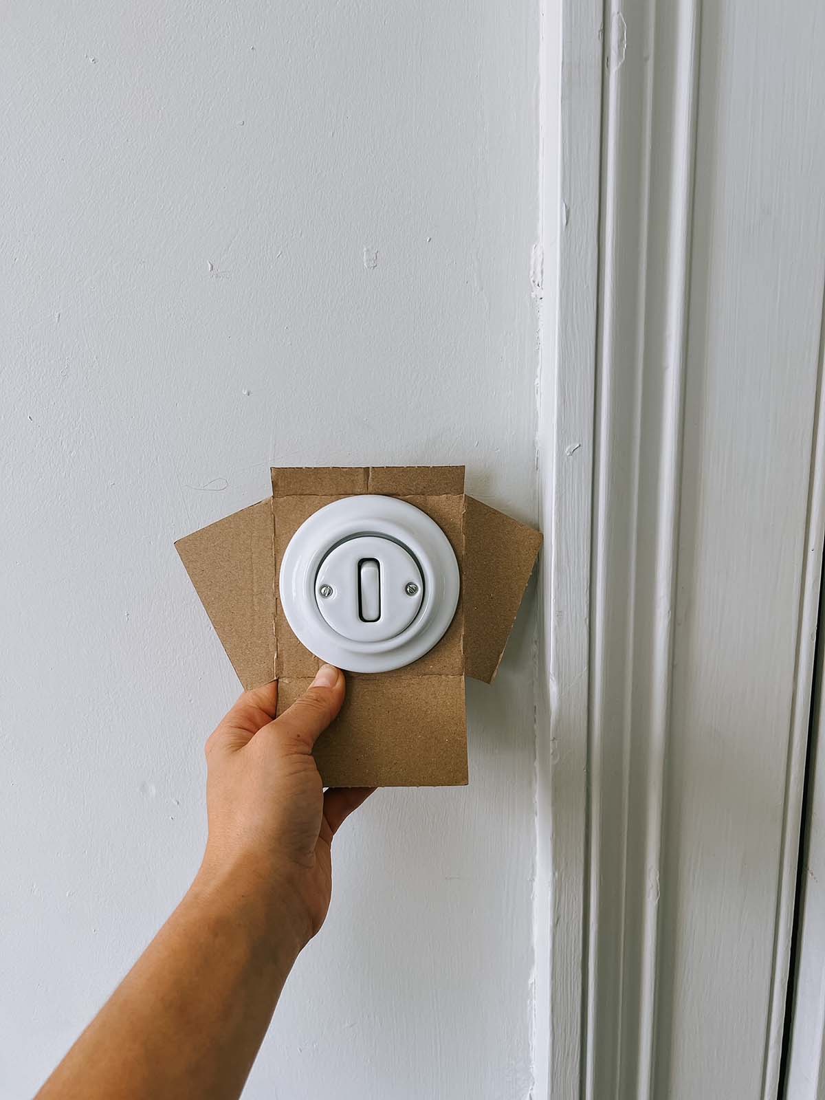
I could go on for days talking about the kitchen renovation but I’ll end with two tips. First, splash out on fittings (sockets, switches and handles) as these are things that you will always note and see. I opted for round toggle switches and sockets, and polished antique brass handles from Sekelskifte, another Swedish company.
Second, consider how your lighting will need to adapt to the different ways you use your space. You might need a brighter light when cooking, and want some dimmer options when creating a cosy ambiance for hosting or relaxing.
We chose spotlights, pendant lights and wall lights, and although I was sceptical to begin with I can’t stress the importance of thinking about lighting when you plan for your kitchen.”
Top tip: When buying a property, make sure to get your own independent survey done on top of the sellers home report. This should help prevent any nasty surprises down the road!


