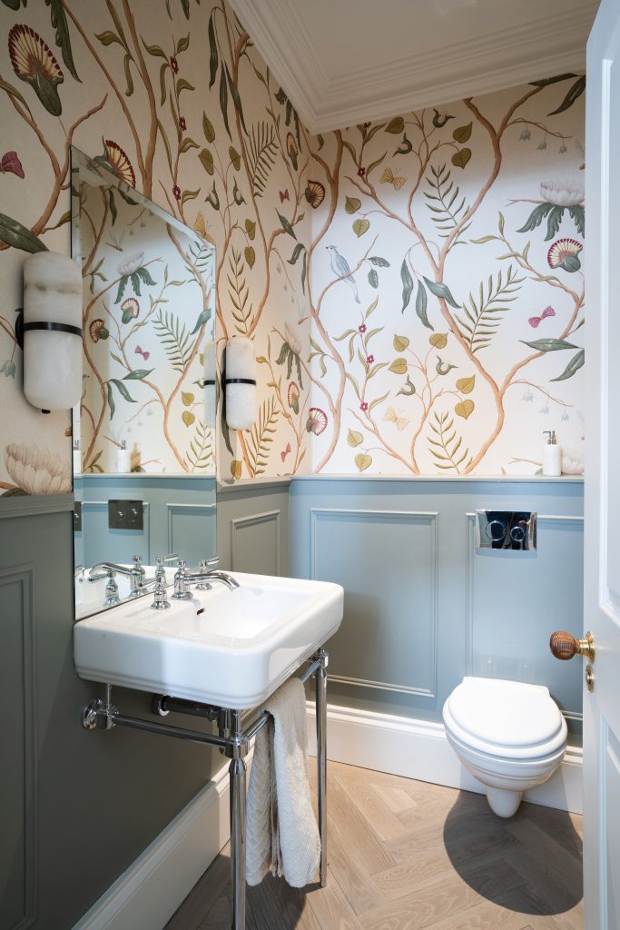
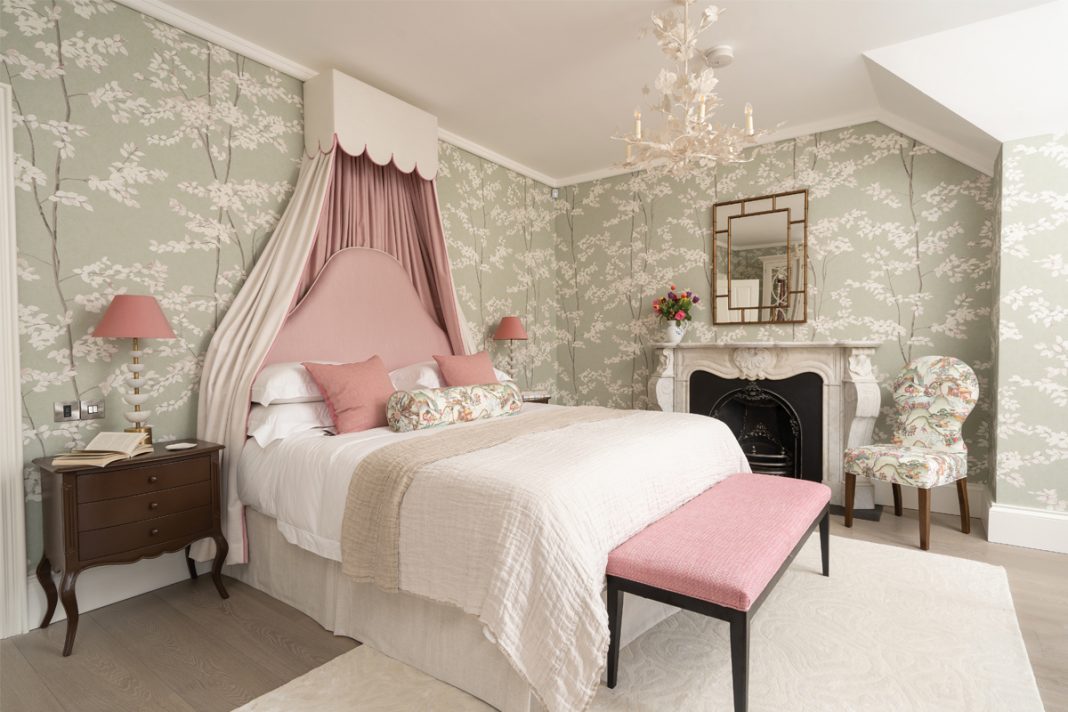
A down-at-heel townhouse now sparkles with life, thanks to a colour-led renovation that has brought personality to every room

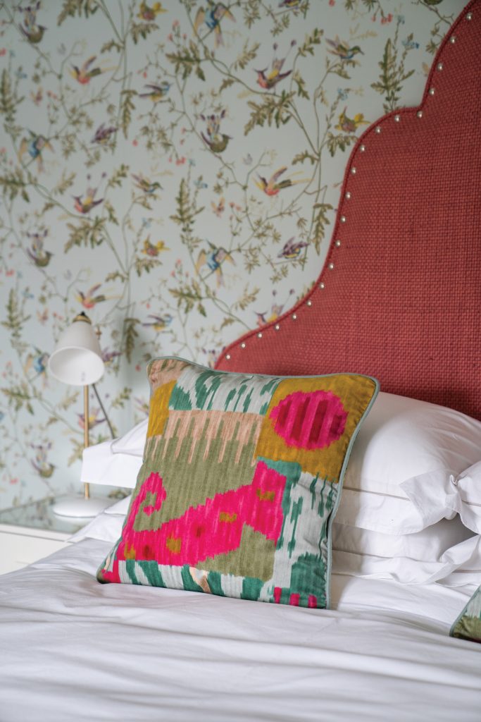
cushions by Jennifer Manners and Pierre Frey add a grown-up note, topped off by a pink canopy and headboard available from Thompson Clarke.
Photography Bradley Quinn
Words Judy Diamond
What A Victorian terraced house over three storeys
Where Northern Ireland
Design Thompson Clarke Interiors
Colour’s impact on us goes far beyond its visual appeal, getting into our heads and manipulating our emotions. It has the power to lift us up and calm us down. It can
awaken the senses, sharpen the appetite and soothe our troubles. Yet what we like is utterly personal. So making colour a central plank of your decor scheme is a risk, especially when your client is on the other side of the world, with only Zoom to see what you’re doing. Sara Thompson, design director at Thompson Clarke Interiors, was undeterred by any potential pitfalls. She had discussed a palette with the owner of this house in Northern
Ireland the first time they’d met, and the direction had been clear from the start. Covid’s arrival might have complicated things (the client, who travels abroad frequently for business, was stuck in the USA for the whole of the first lockdown), but it didn’t derail her studio’s ambitious plans to create a bright, fresh and welcoming scheme to revive the fortunes of this characterful Victorian townhouse.
“We wanted to create flow and ambience through colour, carrying the same tones throughout the house – flow is essential to create cohesion and calmness in a busy family home,” recalls the designer. “The owner told us he wanted impact, so we steered clear of anything too washed-out. We kept adding more colour as we went.”
There’s no danger of being overwhelmed, however. She started with a neutral base (Farrow & Ball’s Skimming Stone in the kitchen and Purbeck Stone in the lounge) that allows the stronger tones to sing, with much of the impact coming from the artwork and soft furnishings. “The only thing the owner brought with him to this house was his art – he has a large collection that he has bought from around the world. We had an inventory of the works, so we knew how bold and dramatic they were in colour and content, which pushed us to be bolder in the interiors, from emerald greens and zesty yellows to strong pinks and blues throughout the ground floor and beyond.”
While the Thompson Clarke team were busy planning and organising, the fabric of the three-storey red-brick property was being thoroughly upgraded following years of neglect. A sympathetic renovation led by Simon Adeyinka of ASI Architects saw the building of a new extension, creating a joined-up space for cooking, dining and socialising, and connecting to the calm of the city garden. A striking roof lantern that runs the length of
the kitchen showers the room in natural light. Among the other changes, a guest room was created on the first floor so there are now four bedrooms and three bathrooms.
The brief for both architect and interior designer was to retain as much of the house’s original layout, character and panache as they could. “We looked after many of the most significant interior architecture elements,” says Thompson. “The largest of these was the fully fitted kitchen, but we also took care of all of the bespoke cabinetry.”
The owner has strong links to Northern Ireland and was keen to use local firms and craftspeople where possible, so Thompson Clarke commissioned a number of talented artisans to contribute to the scheme. One such was Todd Gfeller, a specialist joiner originally from Los Angeles who relocated to Northern Ireland in 1994. Thompson Clarke designed the kitchen layout and cabinetry and Gfeller made it by hand.
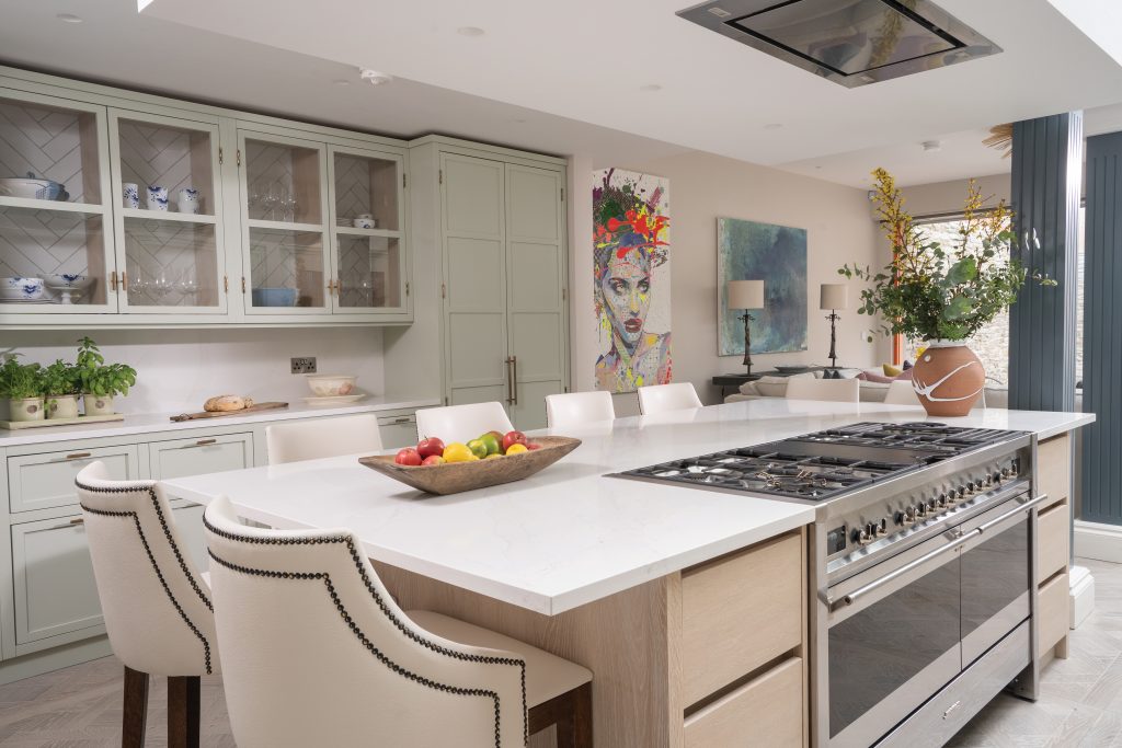
Although this is a generous room, its shape meant it was a challenge to fit everything in. The owner is a keen cook, so a well-equipped workstation was a priority. Rather than try to squeeze in a separate dining table, the designer specified an island that could accommodate luxurious bar stools for everyone to sit at. It’s a sociable, comfortable way for the household to be together.
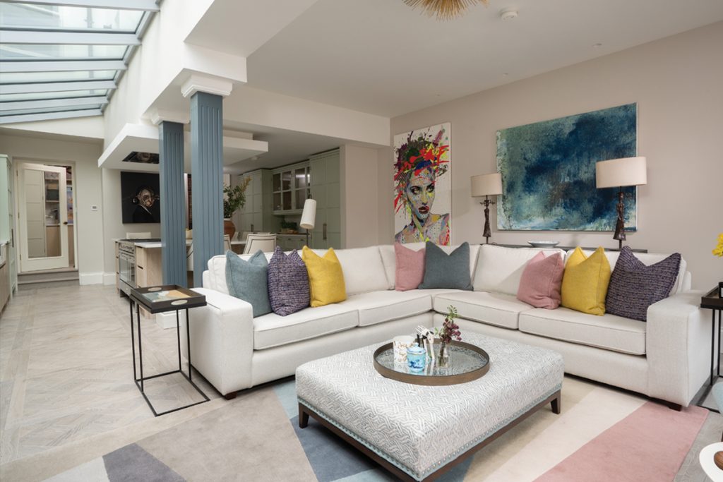
A change in ceiling height designates the sitting area, a bright space for conversation and TV. On the wall opposite the large modular sofa is a special cabinet housing a wine fridge –wine is another of the owner’s passions, and he had requested a stylish place to store his bottles and glassware. Around the walls are selected pieces from his art collection, bold portraits and abstracts that stand out against the neutral background.
Tying it all together is the soft green painted woodwork (Zoffany’s Double Ice Floes). “The owner loved this pistachio tone – the idea came from him at the start and we built around
it,” says Thompson. “It feels light and fresh and airy, but also has a real sense of warmth and drama, making this a perfect place for both entertaining and relaxing.”
Equally eye-catching are two structural steel beams disguised as Doric-style columns. “We didn’t want to expose the beams or go for the industrial look, and yet on plan they felt they could cut the room in half and become a real obstacle. It was the client, inspired by his travels, who suggested trying something more fanciful and classical. We painted them in Farrow & Ball’s De Nimes to match the TV unit, so they felt part of the room. At one
point they were going to be bright orange, but we vetoed that!”
Bright orange does make an appearance in the living room – alongside hot pink and navy blue – as part of a brightly patterned sideboard. This beautiful south-facing room is big enough to take such a punchy combination, though. It also has a fireplace sourced from local company Ryan & Smith, chosen to faithfully reproduce the look and style of the original. This room has beautiful stained-glass windows, now fully restored, whose
colours are echoed by decorative accessories such as the Julian Chichester lights. Most impressive of all is the stunning hand-knotted silk rug designed by Diane Von Furstenberg for The Rug Company, where a fabulous monochrome leopard prowls across
a rich emerald-green background.
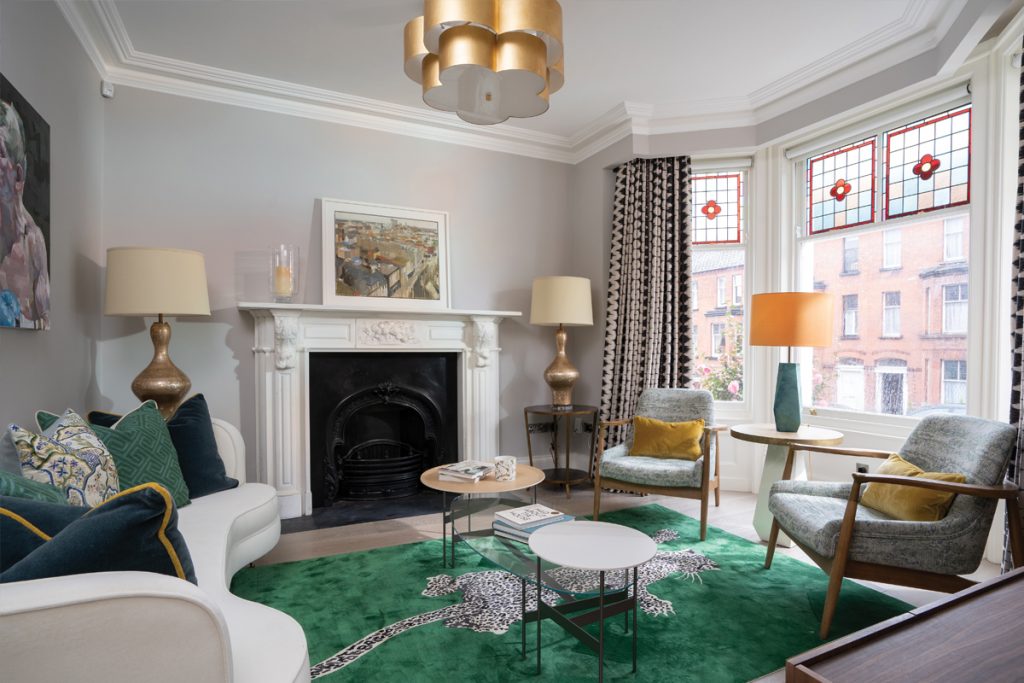
Julian Chichester lamps, tables by B&B Italia and a Lightsource pendant. The monochrome curtains are Larsen’s Myrthus fabric.
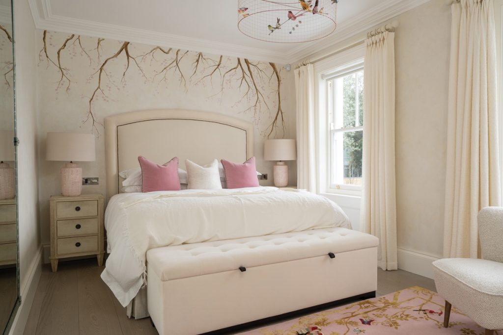
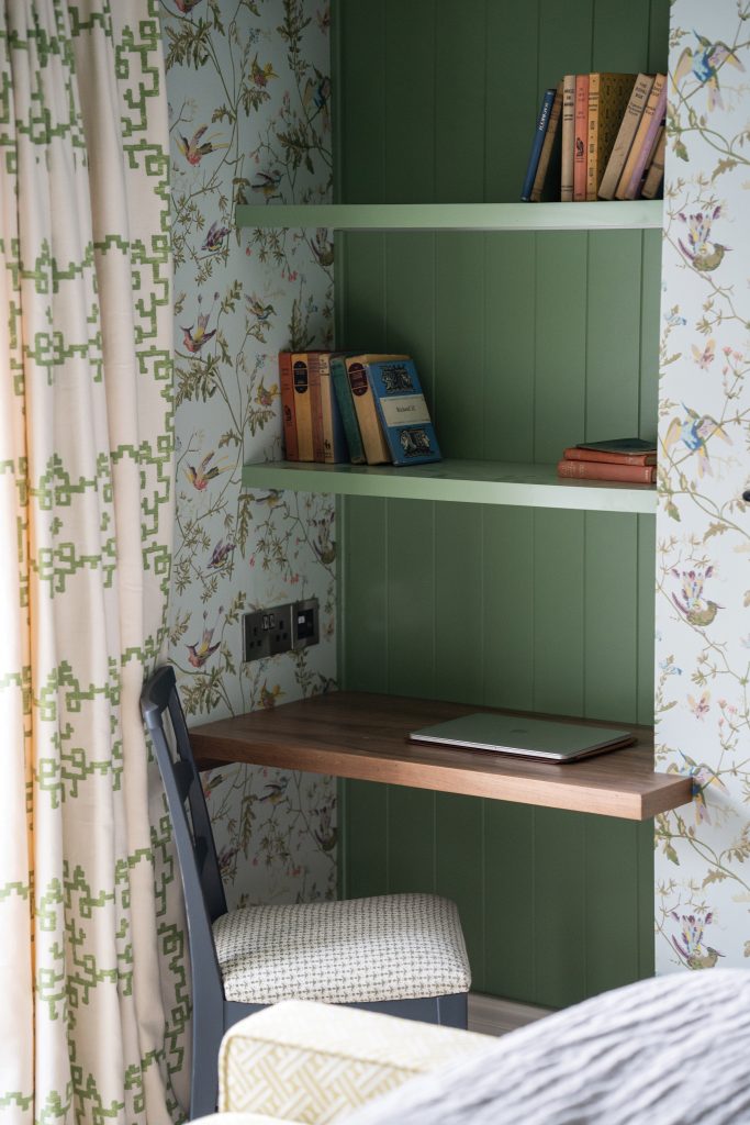
The hallway is decorated with a soft yellow wallpaper, with grey panelling running up through the floors. As you go into each bedroom, the colour becomes more individual and deliberately linked to the person who sleeps there. “The owner has two daughters – one is quite girly and the other is more arty – and the guest room is neutral with pops of pinks,” says Thompson. “The master bedroom has cinnamon textured linen wallpaper for warmth and richness, balanced by soft blue curtains.”
This is a high-spec home full of superb craftsmanship and luxury finishes, but it’s also liveable and practical. Even more important than that, it’s personal. The clever kitchen is made for memorable family meals, the sofas are comfortable enough to kick back and relax on, and the bedrooms are sanctuaries that have individuality at their heart. The period features shine but not at the expense of easy modern living, and that precious sense of flow has been built into every room.
“It combines lightness with drama and warmth,” Thompson says. “It tells a story – the story of the people who live here.”
