This coolly glamorous Edinburgh pad is a masterclass in beautiful and bold decor
DETAILS
What A two-bedroom flat
Where Edinburgh
Interior designer Sam Buckley, Mr Buckley Interiors & Stuff
Photography Zac and Zac
Words Catherine Coyle
Steal this project’s style here
Sam Buckley’s home is a celebration of all the things he loves. It’s how all homes should be – a true reflection of our personality and our passions, as well as a conduit to helping us to live our lives simply and straightforwardly. His philosophy combines the notion that the things we choose to surround ourselves with can be beautiful and bold and life-affirming but they must also enhance the way we live. “For me,” he says, “when it comes to design, it has got to work well and look amazing.”
Buckley has the Italian designers of the 1950s to thanks for that concept. The likes of Castiglioni, Ponti, Sottsass and Mollino all used engineering principles to create buildings, cars and pieces of furniture with sound architectural origins, while injecting their designs with colour, ornamentation and life.
Buckley has encountered their work at close quarters: as a qualified architectural technician (having studied at Edinburgh University), he went to Milan after he graduated to do a Masters in interior design. “It’s where all of the designers I respect come from,” he explains.
Studying at the Scuola Politecnica di Design appealed because the course combined interior design and architecture with allowing the students to undertake world-class internships, rather than being desk-bound writing dissertations.
“I worked at Adidas HQ in Germany for six months for my final project,” he recalls. “It allowed me to use my skills in commercial design and corporate branding, as well as fashion and architecture. It showed me that I like to problem-solve and that I’m good at space planning but that I enjoy the aesthetic, more glamorous side that interior design offers.”
He has since set up his own design studio, Mr Buckley Interiors, having experimented on his own home in Edinburgh and refined his ideas. He purchased the two-bedroom first-floor flat in the west end in 2011, seduced by its unspoilt form. “I’d seen so many townhouses that had been bought by greedy landlords who’d butchered them to squeeze in six or seven bedsits,” he recalls. “Here, though, I saw a place whose quirkiness lay in the fact that it hadn’t been carved up.”
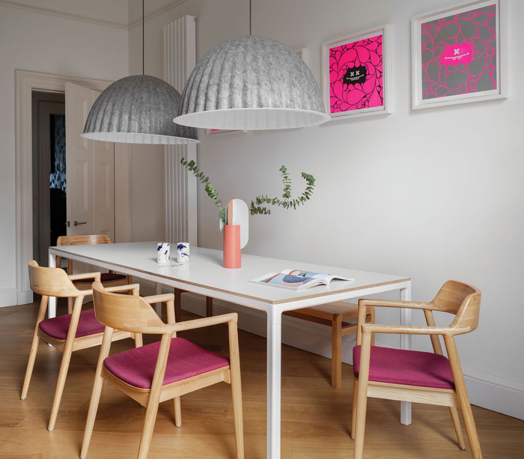
Once he’d lived in the flat for a while and had a feel for the light and the noise, Buckley made a couple of layout changes (moving the kitchen to the front in order to give the guest room a quieter spot, and creating a separate utility room to allow the new dining-kitchen more space). He was working on a rug project around this time and it was this that sparked the design concept of the whole flat.
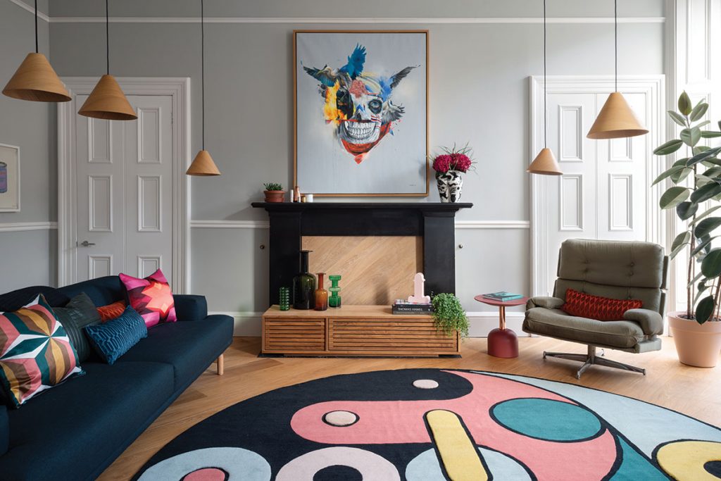
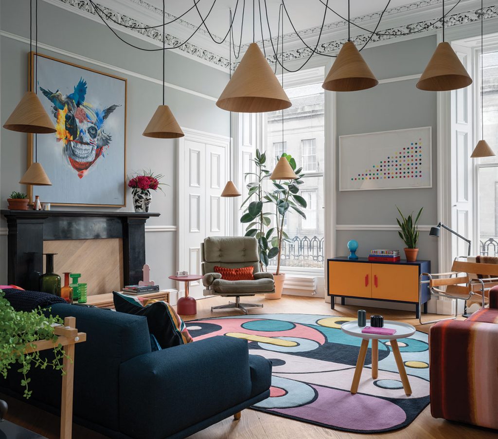
The rug is question, which takes pride of place in the living room, was a piece that Buckley had designed before handing it over to some contemporaries from his Masters course to have it made (Nelcya Chamszadeh and Fabrizio Cantoni, together with Daniele Lora had relaunched the renowned CC-Tapis in 2010).
The shapes, the colours and the quality all reference Buckley’s appetite for Milanese design, both in the schooling he received and in the legacy of the creatives he finds himself rediscovering every day. “In a lot of ways, I think, the concept of interior design belongs to Milan,” he reflects. “There’s a timelessness to what those designers made; these pieces are now antiques, yet they’re still very, very modern.”
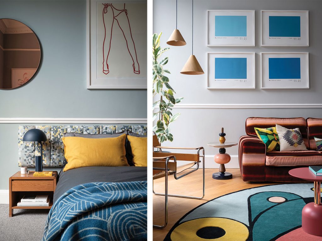
Describing it as a space for beautiful items rather than a room to be decorated, Buckley’s living room encapsulates his ethos that functionality and decoration can, and should, co-exist. He owns several pieces by Banksy – bought before the artist became so covetable – as well as works by Hirst, Australian graffiti artist Deams and Dutch visual artist Piet Parra.
The sofa was found in a charity shop and reupholstered in a Lelievre velvet, and the eye-catching light installation is his own design. “In period properties like these, there’s often just a central light with a ceiling rose,” he explains. “I read a lot so I wanted to find a way to ensure that wherever I sat in this room, there would always be a reading light above me, instead of me needing to have lots of side tables with lamps. I bought the lampshades from Hay and took a day and a half to hang them like this.”
Buckley describes visiting Villa Panza during his time in Italy (the 18th-century country house just outside Milan that has been given over to contemporary art) to see a light installation by artists Dan Flavin and James Turrell, who used fluorescent tubes covered in acetate to fill large spaces such as the Villa’s corridors and stables. “The only light source is the tubes and it’s very disorientating,” recalls the designer.
“Seeing that environmental art had a profound effect on me. Saturating colour in that way can have a transformative effect on a room – and on a person. Damien Hirst has said that the effect of colour is a lot like taking drugs. There’s an expressiveness about it; it can be exciting, pleasurable, immersive.”
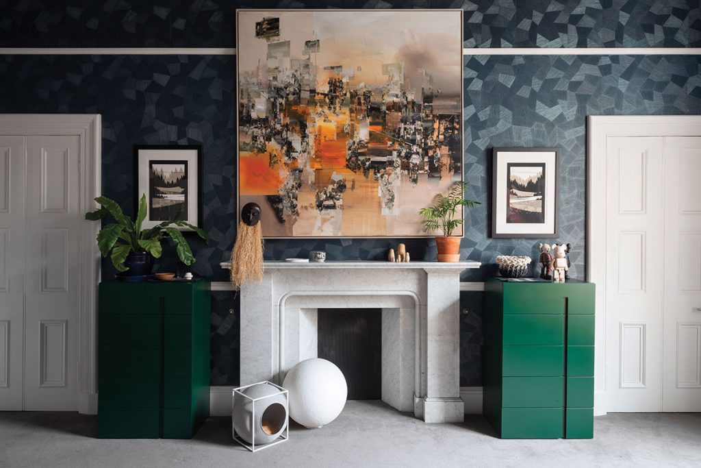
In the master bedroom, Buckley has chosen darker tones conducive to rest and in sync with the textures of the soft furnishings and art that dress the space. The navy walls feel almost woven; the Arte wallpaper takes on the richness of the pigment and offers a dramatic backdrop for a painting by Polish artist Robert Proch, which is flanked by a pair of inky emerald tallboys by MD House.
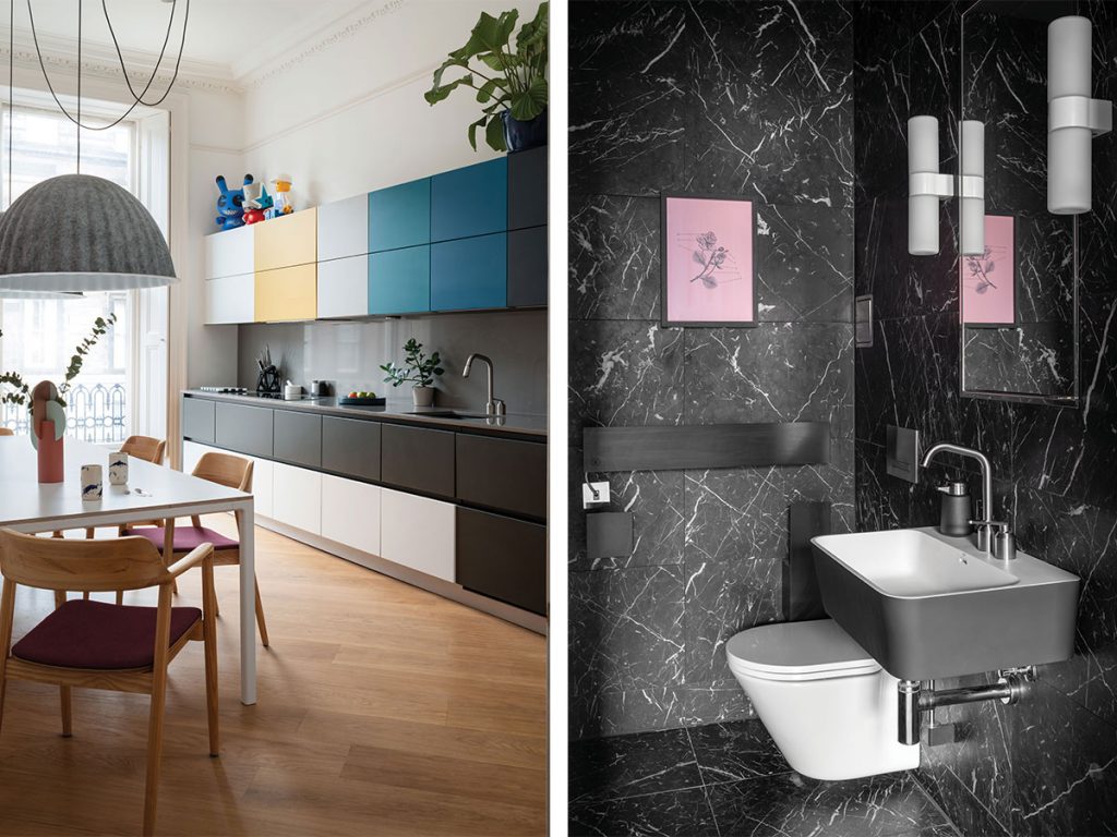
The adjoining wetroom is a masterclass in bold spatial awareness; Buckley has embraced one single colour, in the form of Rockford’s Nero Marquina marble tiles, and used it to cover every surface in the room. Slick architectural pieces like Kundalini’s Pastille lights and CEA Design taps and marine-grade stainless steel means that these are investment pieces that are built to last.
Every part of the flat has been put to good use. Wide door-ways flood the hallway with natural light, making this a great arena in which to display more of Buckley’s art collection. Wide-plank oak flooring by Chauncey connects each room so the apartment feels spacious but also homely and informal.
“The proportions of the hall make it great for hanging artworks,” smiles the designer. “I’ve collected pictures for a long time and street art is fun and exciting.”


