Photography Julie Fraser
Words Miriam Methuen-Jones
BRIEF To create a modern, bright space that is functional for two people to use in the morning rush, and also to fit in as much storage as possible.
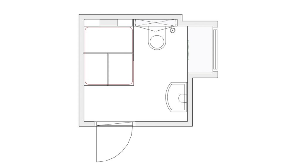
DIMENSIONS 1.88m x 2.07m
BIGGEST CHALLENGE Preventing the large shower enclosure from dominating the room. Just as tricky was scheduling all the various trades to be on site at the right time – there wasn’t enough space for them all to work in the room at the same time.
SUPPLIER Ashley Ann
DESIGNER Gemma Mackillop
Storage is in short supply in most bathrooms. Pretty much all of us prefer to hide away the spare loo rolls and all those unsightly bottles of bleach and disinfectant (why can’t all cleaning products come in uniform amber containers?).
And there’s no chance of creating that spa-like tranquil sanctuary we all crave if every surface is littered with shampoo bottles, conditioner, moisturiser and so much more, cluttering up the place. It means that when two (or more) people are sharing the same small space, good organisation and storage solutions are absolutely vital.
That’s why the owners of this house in Thurso in Caithness brought in the professionals when they decided to renovate the en-suite in their attic bedroom. The main bathroom is on the ground floor of the property, so they needed a smart space upstairs to make their morning routine run more smoothly. They wanted the en-suite to be much more modern than the architecture of the house as a whole, and to feel completely different to the soft tones of the main bathroom.

They turned to kitchens and bathrooms specialist Ashley Ann, which has showrooms across the UK as well as a state-of-the-art manufacturing facility near Wick. “The biggest challenge was always going to be creating a sense of space in a tiny footprint,” says Gemma Mackillop, who led the project. “The room is around 2m x 2m, and the clients wanted a luxuriously large shower.”
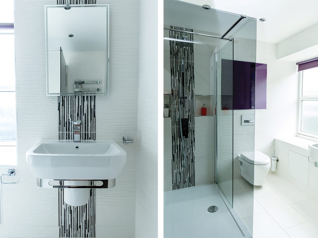
To stop the space from feeling cramped, a wall-hung toilet and basin were specified to leave more of the floor on display. “When you can see more of the floor, it tricks the eye into thinking there’s more space and creates the feel of a bigger room,” explains the designer.
The choice of tiles was another visual trick: large white floor tiles were matched with complementary wall tiles to keep the look cohesive and bright.
White was deliberately chosen for its ability to reflect the light and create an illusion of space. Feature tiles have been used behind the basin and in a strip in the shower, tying the space together and preventing the room from feeling too stark.
The clients’ wish for a large shower was solved by choosing a frameless screen and recessed shower tray.
This neat hack gives the room an open atmosphere – almost like a wetroom but without the hefty cost that would be involved in fully converting and waterproofing the bathroom. Instead, there is a luxurious feel, reminiscent of a walk-in shower, and plenty of space to get clean or enjoy a morning karaoke session.

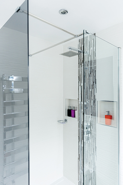
The large showerhead adds a further luxe note. To avoid a slippery pile-up of shampoo bottles and soap, smart pigeonholes were cut into the walls to keep the essentials close at hand and tidy.
Storage was also built in under the window, so cleaning supplies remain out of sight. And, since you can never have too much storage, bespoke Ashley Ann wall units were also hung.
These are a deep purple, the clients’ favourite colour – it’s a bold choice but works well as an accent.
The high-gloss finish ensures they too reflect the light. “We considered every inch of the space,” says Mackillop. “All the surfaces are reflective to take advantage of the large window and allow light to bounce around the room.”
Getting the electric lighting right was just as important – a statement pendant light was never going to suit this space and would have been a fussy addition given the small footprint.
Rather, in keeping with the modern theme, recessed LED ceiling lights were chosen, maximising the headroom in what is after all an attic space.
The result is a bright, modern en-suite that suits its owners and meets their needs. This is one household that will no longer be squabbling over where to keep the toothbrushes.
SHOWER DETAILS
-
Smoked glass wetroom panels were used in place of a framed shower screen to create an open feel in the en-suite.
-
The large showerhead adds a sense of luxury – and is proof that you don’t have to use small things in a small space.
FLOORS AND WALLS
Three different Porcelanosa tiles have been used:
- Madagasca Blanco 33 x 592mm on the floor.
-
Jersey White on the walls.
-
Jersey Mix feature tile was used behind the basin and in the shower as a focal point and injection of colour.
STORAGE
-
Bespoke Ashley Ann wall cabinets were chosen in a deep purple colour. The high-gloss finish amplifies the light around the room.
-
Niches were created in the shower area for hair products and shower gel.
-
Storage was built in under the window to hide cleaning products and essentials.


