BRIEF To create a kitchen which would work in harmony with highly contemporary furniture and that had classic elements which would not date in time. It needed to work for a family of four as well as for entertaining guests.
WORKS REQUIRED In order to get the space they needed, the old conservatory was demolished and a 3m x 9.5m extension was built onto the side of the existing kitchen.
BIGGEST CHALLENGE To design something entirely unique that reflected the clients’ love of American design.
DESIGNER Kitchens International, kitchensinternational.co.uk
Photography Paul Mavor
Words Aemilia Ross
If the mountain won’t come to Muhammad, then Muhammad must go to the mountain. The same can be said of Fraser and Sonya Edgar, whose love of American architecture and design motivated them to export the industrial, warehouse vibes of upstate New York and transplant them into their Elgin home.
The original idea had been to start from scratch, building an entirely new house for themselves and their two teenage children which emulated typical American property styles. However, after they ran into some unexpected issues, the couple decided to take on a new challenge: transforming their existing kitchen into the open plan, state-of-the-art space they craved.
For such a brave project they turned to Fiona Mercer at Kitchens International: “We worked closely with the clients from the beginning, looking at everything from the size and shape of the room to the best design layout.” Creating a room that flowed easily meant some hefty structural changes. The existing conservatory needed to be demolished and a three metre by nine and a half metre extension was built onto the side of the existing kitchen. Not only that, but a connecting wall was also taken down between the old kitchen and dining room.
Now that they had plenty of space on their hands, Mercer and her clients turned to the most exciting part of the project. “I was initially inspired by houses found in the Hamptons, as well as contemporary artists and furniture designers such as Timothy Oulton. The challenge was amalgamating these concepts so that they could fit in effortlessly with the look of more contemporary New York apartments,” explains Mercer.
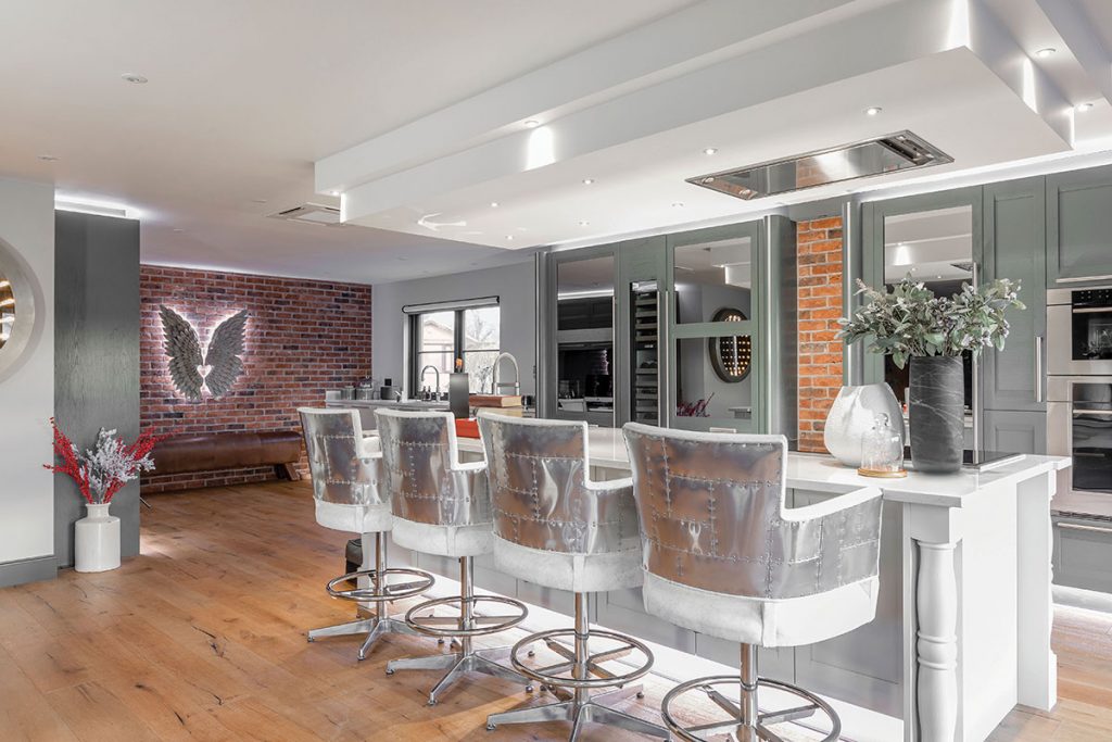
To create the overall effect, brick detailing was introduced along with Timothy Oulton bar stools wrapped in sheets of metal for an industrial touch. Lighting was also designed to mimic the bright and airy apartments of the upper east side, with large glass windows and doors introduced with the new extension to flood the kitchen with natural daylight. The ceiling feature, which provides extra illumination, is also a practical addition: “It was specially designed to bring more light over the cooking area in a style that matched the character of the kitchen.”
More than anything though, the kitchen needed to make a real statement, and for that the focus had to be on quality. Stoneham Kitchens were employed to manufacture the kitchen, with special cornicing and curved panels added to exude elegance.
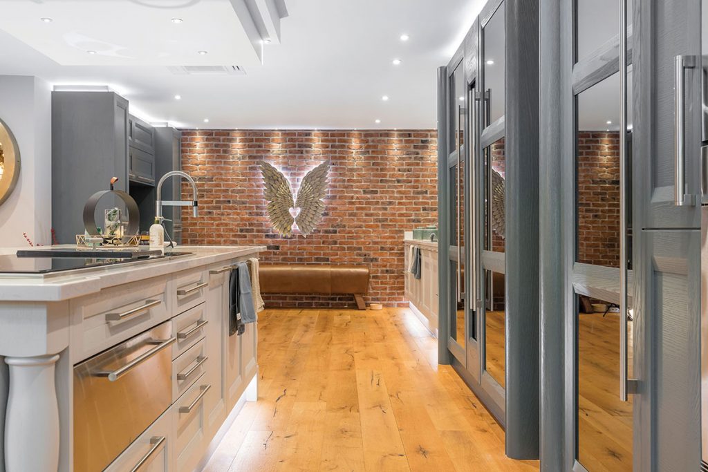
The units were painted in Thunder Grey and Dove Grey which match perfectly with the grey mirrored splashback. American brand Sub-Zero & Wolf supplied the majority of the appliances including the wine cooler, fridge, freezer, warming drawer, hob and ovens, with bespoke units made to Kitchens International’s designs to house them.
Because of its multi-functioning role, every part of the kitchen needed to perform efficiently. Clever storage solutions were introduced to keep the flow without compromising on practicality. Two slide back units provide hidden storage as well as additional worktop space, as this allowed for items that needed to be permanently plugged in to be behind closed doors.
Keeping the kitchen as low maintenance as possible was also an important factor in ensuring the space is free from clutter. The Silestone 30mm lagoon work surface is incredibly hardwearing, while the units have been designed with high load-bearing capacity. Even the mirrored splashback was created with a darker glass to prevent fingerprint marks from showing up.
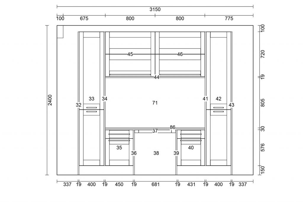
Perhaps the most impressive part of the kitchen though is the surprising addition of an office area. With so many plates to spin, it was a feat of ingenuity to create a corner within the kitchen that could be utilised as and when it was needed. The unit was bespoke made and included a filing system and pull-out table top which was designed to be in-keeping with the kitchen’s overall look and feel.
Having such a sense of cohesion with so many moving parts is a testament to the strength of the original concept, and proves that from the kernel of one simple idea an outstanding final result can grow.
KITCHEN
-
The kitchen has been designed to incorporate several different areas for cooking, preparing drinks, socialising, serving food and eating, all within the one room.
-
American industrial design and more classical elements have been blended to create a timeless look.
BESPOKE DETAILS
-
All of the units housing the Sub-Zero & Wolf equipment had to be made bespoke to KI’s design.
-
The ceiling feature was specially designed to bring additional light over the cooking area.
-
A bespoke office space was added with pull-out table and filing system.
EXTRAS
-
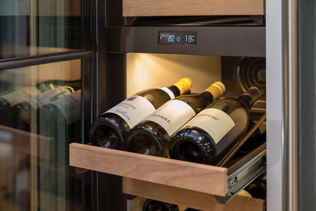
The Sub-Zero & Wolf wine cooler protects the labels from UV damage, perfect for people who collect wine.
-
Blanco supplied the sinks and one of the taps, while the other was by Quooker.
-
Many of the furniture pieces were designed by Timothy Oulton.
THE DESIGNER’S NOTEBOOK
Planning to transform your kitchen? Fiona Mercer offers her expert advice on how to stay on top of the process.
-
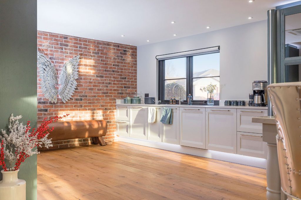
Start from the bottom up: Consider how the kitchen flooring will flow to the adjoining rooms. This is especially important in open plan environments where the flooring will integrate with other social and living space. Once the flooring is chosen, it will provide the canvas for you to design the kitchen on.
-
Compile your own top 10: With so many choices to consider, collate all the things that are important to you and then narrow the list to create a design brief that matters to you!
-
Shine some light: Always make sure to spend time on lighting the space. With the multi functions of the kitchen make sure you consider the practicality and the aesthetics of a beautifully lit space. Proper lighting control is a worthwhile investment.


