


Brilliant colour and bold pattern have turned a gloomy Georgian flat into a vibrant new home
Love this project? Steal the style with our moodboard
DETAILS
What A two-bedroom Georgian flat
Where Edinburgh’s New Town
Interior designer Jessica Buckley
Photography ZAC and ZAC
Words Catherine Coyle
There’s nothing that a bit of TLC can’t fix. When Janet Middleton came to Jessica Buckley in search of help in rejuvenating her Edinburgh pied-à-terre, the interior designer knew that altering the layout would give the flat the purpose it had been lacking. Unleashing colour and texture on what was a rather austere period property, moreover, would accentuate its natural beauty, and it has given the owner a city pad that reflects her vibrant personality.
Part of a William Playfair townhouse, the apartment had kept its classical features when it was converted. This, says Buckley, is what attracted her client to the property: “She was blown away by the Georgian proportions, the high ceilings and the floor-to-ceiling windows with their views of the New Town terraces to the front and the neighbouring mews to the rear.”
Her task was two-fold: to maximise these original features for a 21st-century inhabitant, and to devise an improved layout that would create a better flow between the rooms. The initial discussions were promising: “We immediately established a mutual love of colour and texture,” recalls Buckley. “Janet told me she wanted to be bolder with colour and proportion than she had been in her previous homes, and wanted me to push her beyond her comfort zone.”
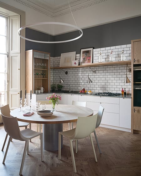
They began by working out a new configuration of the floorplan. The flat had a small galley kitchen tucked away at the back, and a rather large, cold dining room. It was clear that moving the kitchen into the dining room and opening it up into the adjoining sitting room would make a lot more sense.
Sculleries of Stockbridge was commissioned to make bespoke cabinetry that would fit the space effectively without looking too ‘fitted’, a feeling that Buckley has strengthened by incorporating softer elements such as original artwork and accessories. In fact, a painting by James Fisher was the catalyst that makes the kitchen just as colourful as the rest of the flat.
As this is not Janet’s main residence, she and the designer decided to play with the way the space was arranged, making it more reminiscent of a boutique hotel suite. “The room that was best suited to be the master bedroom leads directly off the sitting room, rather than off a hallway as would be more usual,” explains Buckley. “We spent a long time considering this, looking at all the options, and decided to go for it. We then created storage in the second bedroom that’s barely noticeable. It houses white goods and laundry, taking these out of the kitchen to make better use of the space there.”
Buckley, who has worked all over the world and who studied at the Sydney Design School, agrees that she has always been bold when it comes to colour. Her training and her travels have given her a taste for buoyant hues, which she then couples with texture and pattern to create her own very distinctive style. “Colour is life-affirming,” she says. “It saddens me to think that so many people are terrified to use it.”
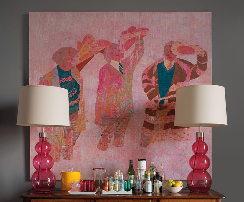
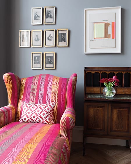
This flat is not all zingy, fresh shades, though: the generous proportions of these rooms mean they can take dark tones, which is what Janet requested for the sitting-room walls. Zoffany’s powerful dark-grey Shetland provides a dramatic backdrop for her art collection, as well as providing an anchor for the many patterns and colour highlights that have been layered throughout the room.
Buckley’s eye for symmetry and scale also helps to balance the bright colours. Charlotte James Furniture manufactured her designs for the sofa, armchairs and ottoman in the main living area. The upholstered coffee table (which pairs Clarke & Clarke’s Palais Chartreuse with Andrew Martin’s Orillo fabric) lifts the space and punctuates its classical features.
With the new floorplan in mind, designer and client looked to unify the space by having a new floor laid; with Strathearn Stone & Timber, they designed an oak herringbone parquet that runs throughout the property: “It doesn’t just look fantastic – it was also a great opportunity to insulate, soundproof, position floor sockets and install underfloor heating,” points out Buckley.
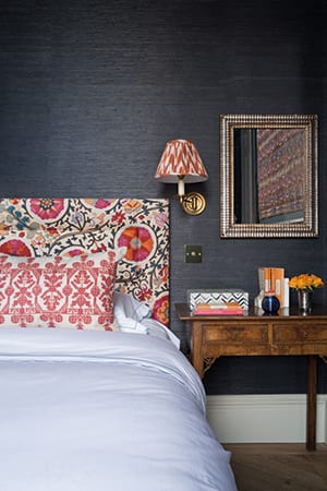
In the rooms to the rear of the property, which don’t get direct sunlight, she advised navy for the walls, demonstrating that deeper tones can still work in spaces that are not blessed with abundant natural light. It takes skill to get this right, though: “Making sure tall ceilings aren’t gloomy at night means careful consideration when it comes to lighting,” says the designer. “It’s important to create attractive pools of light at different heights.
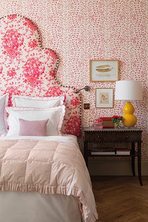
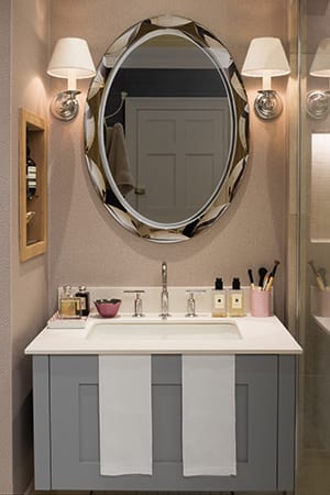
“The mirrors on the walls in the living room are huge but they needed to be in order to work with the scale of the architecture. Similarly, the headboard in the master bedroom and the ceiling light in the kitchen had to be scaled up.”
Bored of beige and taupe, Janet wanted to inject the master suite with vibrant colour, reminiscent of the boutique hotels she stays in when travelling. Fusing the vibrancy of a Kit Kemp hotel suite with the symmetry of one of David Collins’ elegant interiors, she now has an Edinburgh pied-à-terre that is both confident and comfortable. “The joyfulness of mixed and mismatched patterns works well in most contexts,” says Buckley. “Minimalism is not for me.”